Terracotta Color Palette — Terracotta Bloom
A warm five-color scheme led by sun-baked terracotta, softened with oatmeal and clay neutrals and lifted by a sage accent — every color matched to real paint you can buy.
By David Chen · Formulation Lead & Resident Chemist
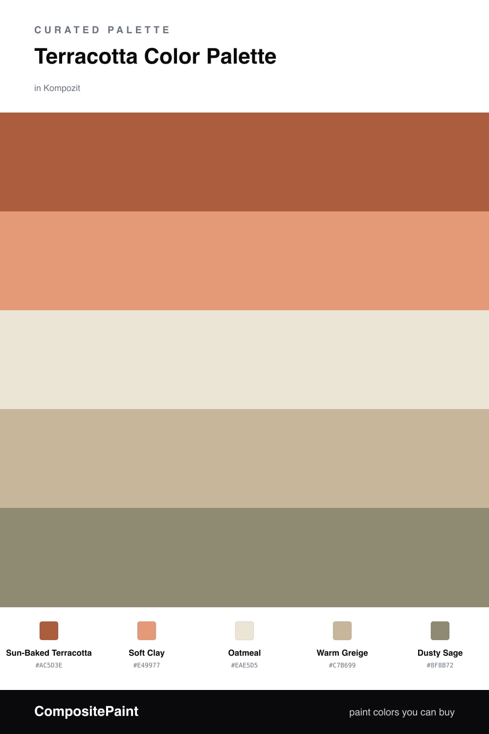
Terracotta is one of those colors that feels like it has been warmed in the sun. Here I let a deep Sun-Baked Terracotta lead, with a lighter Soft Clay right beside it so the warmth has room to breathe instead of sitting flat on one tone.
The quiet work happens in the middle. Oatmeal keeps the walls light and open, while Warm Greige bridges the gap between the clay and the brighter terracotta so nothing jumps out too hard. These two neutrals are what make the scheme feel calm rather than loud.
For 2026 the trick is the cool accent. A muted Dusty Sage pulls the whole palette toward something fresh and grounded, like a potted plant against a clay wall. Use it in small doses — a chair, a throw, a single piece of trim — and the terracotta reads richer for the contrast.
Buy These Colors
Each color matched to the closest real paint in every brand, by ΔE2000. Kompozit first; take any SKU to the store — these mix on demand.
Questions
Terracotta is basically a clay color, so it already carries warm earth tones. Pairing it with oatmeal and greige keeps everything in the same family, and the sage adds a cool note so the warmth never feels heavy.
Let it lead but not take over — think roughly two-thirds terracotta and clay, with the neutrals doing the calm background work and just a small touch of sage as the spark.
Similar Palettes
Closest schemes by color — not by label.