Peach Color Palette — Warm Clay Morning
A soft five-color scheme led by a sun-warmed peach and grounded in clay, oatmeal, and a quiet terracotta accent — every color matched to real paint you can buy.
By Jessica Williams · Color Stylist & Interior Editor
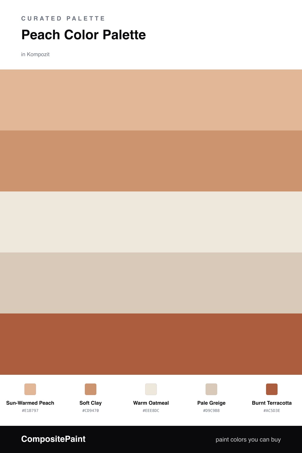
There is a specific hour in early morning when light turns everything the color of warm skin and soft fruit, and that is exactly where this palette lives. Sun-Warmed Peach leads the whole scheme, glowing and gentle, the kind of color that makes a plain wall feel like it is holding light.
Underneath it, Soft Clay adds a little earth so the peach never tips into candy. Warm Oatmeal and Pale Greige are the quiet ones, the linen-and-plaster neutrals that let the peach breathe and feel current rather than nostalgic.
The spark is Burnt Terracotta, deep and a touch smoky, perfect for a single chair, a door, or pottery on a shelf. Use it sparingly and the room reads warm, lived-in, and softly contemporary — peach for 2026, not 1986.
Buy These Colors
Each color matched to the closest real paint in every brand, by ΔE2000. Kompozit first; take any SKU to the store — these mix on demand.
Questions
Peach carries the warmth of pink and the calm of beige at the same time, so it glows in daylight without ever feeling sweet or loud. Pairing it with clay and oatmeal keeps the whole scheme grounded and modern.
Let the peach lead across the largest surfaces, bring in clay and the neutrals to steady it, and save the terracotta for small moments — a roughly 60/30/10 balance keeps it feeling effortless.
Similar Palettes
Closest schemes by color — not by label.