Faded Terracotta
The washed-out terracotta from Farrow & Ball's Kelly Wearstler collection, reviewed honestly: where the sand glows, the light that turns it peach, and what to pick instead.

Jessica has spec'd whites and neutrals for more than 300 rooms and keeps a sample wall of painted drawdowns in her studio. Every color review is checked against real reader rooms in the comments and re-tested when a formula changes. About the testing process →

- 1Caramelized35
- 2Venetian Plaster42
- 3Faded Terracotta52
- 4Colonial Yellow59
- 5Belvedere Cream65
The Fast Verdict
Faded Terracotta is clay with the saturation cooked out — a pale, sandy orange that designers treat like a warm neutral and that most American rooms will still read as color. In south light it looks like a faded pot. In north light it goes peach-beige and a little fleshy. If you want terracotta without painting the room rust, this is the lane — just do not buy it hoping it will disappear.
South-facing living rooms and bedrooms · wall-and-ceiling drenches in decent daylight · kitchens with walnut, brass, and warm stone · anyone who wants terracotta without the rust
You wanted saturated clay · the room faces north and runs on cool LEDs · your floors are grey LVP or Carrara · you need a greige nobody will name as orange
- Terracotta without the rust — sandy enough to live with every day
- LRV 52 keeps bedrooms and living rooms bright, not cave-like
- Wall-and-ceiling drenches work because it is color, not a heavy clay
- Flatters walnut, brass, linen, and terracotta tile
- Designer-famous (Kelly Wearstler collection, Livingetc award) without being a fad pink
- Not terracotta enough if you pictured adobe or rust
- Cool north light and cool LEDs turn it peachy-beige, almost flesh
- Fights grey LVP, grey-washed oak, and Carrara-type stone
- Four walls of pale orange is a commitment people underestimate on the chip
What Color Is Faded Terracotta, Really?
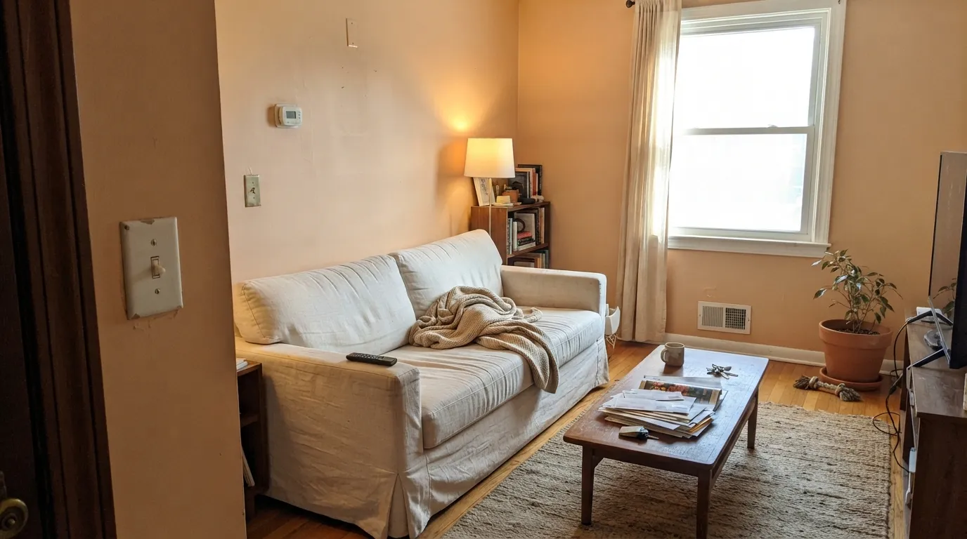
A pale orange with the chroma baked out of it. Farrow & Ball filed it in the Kelly Wearstler Color Collection as No. CC8, and the idea is specific: clay left in hard sun until it goes sandy rather than brick. That is a different job from a true terracotta. Saturated clays (think Cavern Clay territory) hold rust and adobe on the wall; this one holds warmth. On a chip it looks polite, almost beige. That politeness is the trick and the trap.
At LRV 52 it sits dead-center on the scale — not a wash, not a clay wall. It reflects about half the light that hits it, so rooms stay livable, but the orange is always present. On four walls it reads a step deeper and a step more peach than the card, the way every muted orange does once it leaves the fan deck. Livingetc named it Paint Colour of the Year at the Style Awards, which tells you how designers use it: as atmosphere, not as an accent stripe.
Undertone in one line: sandy orange first, peach second — never brick-red, never brown until warm sun hits it. If your sample looks pink, that is cool light or a grey floor bouncing; if it looks like a true pot, you have south or west sun. Both versions are the same paint being honest about the room.
Where It Shines
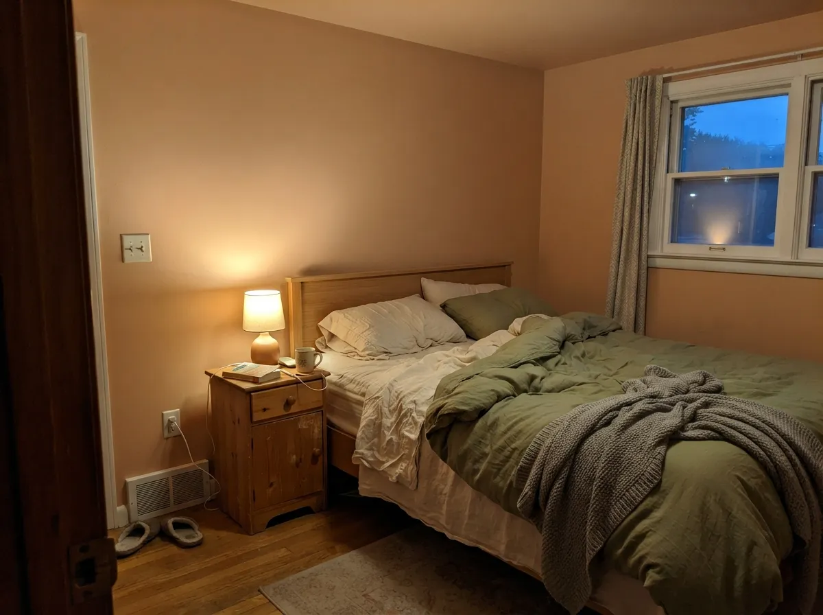
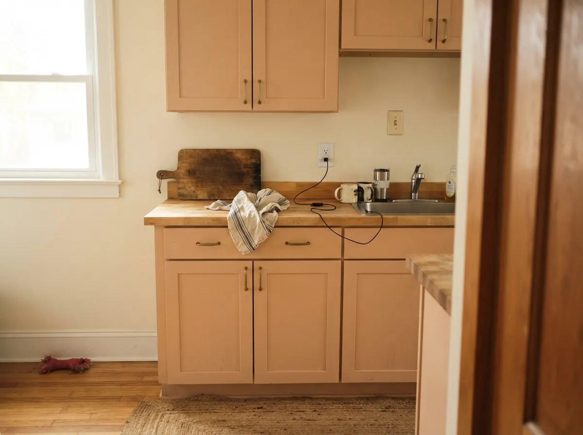
Give it real daylight and this color earns the California story. South and west rooms are its home: the sand comes forward, the peach stays in the background, and linen, walnut, unlacquered brass and clay tile all look as if they were chosen for it. Farrow & Ball itself puts it on walls and ceilings together in bedrooms and living rooms, and that drench is the move — at LRV 52 it can carry a whole envelope without going cave-dark. Kitchens are the second win if the stone and wood are already warm.
Where It Fails
Almost every regret story about Faded Terracotta follows one of three scripts, and all three are visible on a sample board before anyone opens a tin. None of them are the paint's fault — but if your room matches one, this is not your orange, and a bigger sample will only confirm it.
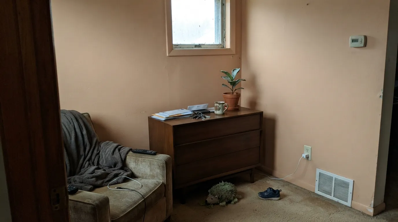
On the chip it looks like a faded clay pot. On four walls in average American light it often reads as a sandy peach-beige, not the sun-baked tile people pictured. Depth multiplies the peach, not the rust. If you wanted adobe, look at Cavern Clay or Baked Clay and accept a much lower LRV; this color will never get there.
Grey daylight strips the orange and leaves a dull peach-beige that photographs like skin. Cool white LEDs do the same after dark. The color did not go pink on its own — the light removed the sand. Warm 2700K lamps are part of this paint job; if the room faces north and you refuse lamps, pick a color that does not depend on warmth.
Grey LVP, grey-washed oak and Carrara-type stone sit at the opposite temperature and push this paint toward yellow-peach. The floor looks colder, the wall looks fleshier, and both sides lose. It wants walnut, terracotta tile, pale white oak or a large warm rug between it and anything blue-grey.
Room by Room
This is the curl-up-with-a-book color. Matte on the walls, same color on the ceiling if you want the drench, Pointing on the trim so the edges stay soft. Under 2700K lamps it goes gently clay-warm at night without ever reading rust. Skip it in a dim north bedroom unless you are committed to lamps.
South or west light keeps the sand honest and makes linen, walnut and brass look deliberate. Eggshell for scuff resistance where sofa backs hit the wall. In an open plan, hand off to Pointing or Dimity next door so the orange does not have to negotiate a grey kitchen.
On cabinets in satin or gloss, with Pointing or Alabaster walls, it is a pale clay box that loves brass and butcher block. A full kitchen of this on the walls works only if the counters are warm stone or wood; cool quartz will pick a fight. Wipeable eggshell or cabinet enamel either way.
Evening rooms flatter it. The peach comes forward under candles and 2700K bulbs, which is exactly what you want at dinner and exactly what you do not want at 8 a.m. in a north-facing breakfast nook. Pair with walnut, linen, and a cream ceiling.
Terracotta tile, unlacquered brass and a wood vanity: lovely, a little Mediterranean without the theme. Grey marble, chrome and cool subway tile: it goes peachy and slightly dirty. Powder rooms can take the drench; full baths need the stone to agree first.
Full sun washes a pale orange toward peach stucco, and from the street it can read as faded rather than chosen. The exception is a shaded front door or a courtyard wall in warm climates, where the sandy clay reads intentional. For siding, pick a true adobe like Baked Clay or stay in cream.
Your Light Is the Risk
Hard daylight keeps it sandy and pot-like, peach in the background. This is the light the color was mixed for.
Cool grey daylight strips the orange and leaves dull peach-beige. Fine if you half-wanted a flesh-toned neutral; disappointing if you wanted clay.
Paler and sandier in the morning, flushed peach-orange through west sun and golden hour. Sample at 6 p.m. if peach is your dealbreaker.
2700K lamps pull it toward clay and make the room feel finished. Cool white LEDs leave a flat peach — swap the bulbs before you repaint.
Most complaints about Faded Terracotta are a light mismatch. Upload a photo of your actual room and see it on your walls — then ask for the same wall in north light or evening lamps before you buy a single sample.
Need It From Another Brand?
Any paint counter can custom-tint Farrow & Ball No. CC8 directly. If you would rather stay in one brand's own deck, these are the closest stock matches, measured as ΔE2000. Under 2 is a difference you will not see on the wall.
| Brand | Closest color | ΔE | LRV | |
|---|---|---|---|---|
| Sherwin-Williams | Soft ApricotSW 6352 · Sherwin-Williams | 1.6 | 50 | Color page → |
| Behr | Honey NougatS250-3 · Behr | 1.3 | 54 | Color page → |
| Benjamin Moore | Cinnamon 'n Spice1215 · Benjamin Moore | 3.2 | 51 | Color page → |
| Valspar | Sunswept Sand8003-16C · Valspar | 2.3 | 51 | Color page → |
| PPG / Glidden | Gentle DoePPG1201-4 · PPG / Glidden | 2.4 | 53 | Color page → |
| Glidden | Asian Apricot70YR 50/225 · Glidden | 3.6 | 50 | Color page → |
Similar Farrow & Ball Colors
The nearest shades to Faded Terracotta within Farrow & Ball's own range, ranked by perceptual color distance — useful when you want the same look a touch lighter, darker, or warmer.
WCAG 2.1: AA is 4.5 : 1 for normal text, 3 : 1 for large text, AAA is 7 : 1.
Faded Terracotta vs the Colors You're Also Considering
Every Faded Terracotta sample board has the same rivals on it. The numbers show the real lightness gap — then it comes down to which risk you would rather live with.
Pick this when you want the sandier, more terracotta read of the same pale-wall idea.
Farrow & Ball No. 231 · LRV 56Setting PlasterPick this if you want the plaster-pink that started the whole dusty-wall trend — similar depth, clearly more pink than orange.
Pick this for the lighter, sandier, more orange version that still leaves the room bright.
Sherwin-Williams SW 9081 · LRV 30Redend PointPick this if you want the deeper clay-pink that split the internet — more color, more pink, less wash.
Faded Terracotta Coordinating Colors
The rule for coordinating with Faded Terracotta: stay warm, keep greys at arm's length, and give the orange a cream to land on. It wants off-whites, paler taupes from the same family, one muted sage, and a single dark note. These are the partners that keep showing up in rooms that work:
Kelly Wearstler, California Clay, and a Magazine Award
Faded Terracotta is not an old Farrow & Ball Classic that suddenly got trendy. It arrived as No. CC8 in the Kelly Wearstler Color Collection — Wearstler's Los Angeles eye on the Dorset deck — and the brief is baked into the name: clay that has already faded. Livingetc later named it Paint Colour of the Year at the Style Awards, which is a magazine prize, not a brand Color of the Year, but it is why the chip started showing up in UK and US mood boards in the same season.
That origin is useful when you are deciding whether to live with it. This is a designer pale-orange, not a builder beige and not a Tuscan-kitchen leftover. It looks expensive next to linen and plaster and a little lost next to builder-grey carpet. Treat it as a California wall color that happens to live in an English tin, and the rooms that work become obvious.
Faded Terracotta With Wood Tones and Floors
This decision gets made at the floor. Walnut and espresso make the sandy orange look smoky and deliberate. Pale unstained white oak keeps it coastal. Terracotta, saltillo and any clay tile are the native pairing — analogous color, same mineral family, no argument. Cream and natural sisal rugs sit comfortably on top.
Honey oak is the maybe: two warm oranges in one room can look rich in south light and pumpkin by 5 p.m. Sample a board against the actual floor at the sun hour you use the room. The honest no is cool grey — grey LVP, grey-washed oak, blue-grey stone. The grey pulls the peach out of the paint and the paint makes the grey look colder. Metals are easier: unlacquered brass and antique bronze belong; polished chrome is the one that leans showroom-cold against it.
Three Ready Palettes Built on Faded Terracotta
A color is never alone on the wall. These are complete combinations in the 60-30-10 pattern, with the reason each one holds together. Every one opens in the visualizer.
A tonal clay envelope is what keeps this from looking like a themed terracotta bedroom: one washed orange on the shell, one greyer pink-beige for a single deeper note, and Pointing so the woodwork stays cream instead of stark.
Try this palette in your roomPale orange cabinets on a cream wall is the Mediterranean kitchen without the mural. Evergreen Fog on the island is the muted sage that keeps the clay from going sweet; brass hardware finishes the argument.
Try this palette in your roomDimity is the pale taupe that shares the peach-in-shade lean, so the handoff from living room to hall does not look like a different house. Hale Navy on the doors is the one dark note a sandy scheme needs.
Try this palette in your roomFaded Terracotta FAQ
Is Faded Terracotta orange or pink?
Orange — sandy, pale, and a little peach on the second look. In south light it reads as faded clay. In cool light the peach comes forward and people start saying pink. It is never brick-red. If pink plaster is what you actually want, Setting Plaster is the sibling; if rust is what you wanted, this is the wrong color.
What trim white goes with Faded Terracotta?
Pointing is the in-house answer — a warm off-white that still holds most Farrow & Ball houses together. Alabaster works if your painter is in Sherwin-Williams. A stark bright white makes the walls look dirty-peach next to the crisp edge. Eggshell on the trim, matte on the walls.
Will it look peach in a north-facing room?
Yes, unless you fight the light. Cool north daylight strips the sand and leaves peach-beige, and cool LEDs lock that in after dark. Warm 2700K lamps pull it back toward clay. If the room stays dim and you will not add lamps, do not buy this color hoping the undertone will behave.
Is it good for kitchen cabinets?
Yes, in doses or as the whole run if the counters are already warm. Satin or gloss on the boxes, cream walls, brass hardware. It is a pale clay, not a novelty color, which is why it works. Cool grey quartz and chrome will argue with it the same way they argue with any orange.
Does Faded Terracotta work with oak floors?
Walnut and pale white oak are excellent. Terracotta tile is the native pairing. Honey oak is the risk: two yellow-oranges stacked make the room read pumpkin, especially in west light. Grey-washed oak is the genuine clash — temperature, not just species.
Faded Terracotta or Setting Plaster?
Same pale-wall idea, different pigment. Setting Plaster is the plaster-pink that started a design trend. Faded Terracotta is sandier and more orange, a step less blush. If your sample of Setting Plaster went too pink, this is the swing. If this sample went too peach, Setting Plaster will not save you — you wanted a greige.
Have you painted with Faded Terracotta?
Rate it — one tap helps the next reader decide.
Ask a Question