CP

Rose Color Palette — Rose Haze

A soft five-color scheme led by a hazy rose, layered with warm greige, milky white, and a clay accent — every color matched to real paint you can buy.

By Jessica Williams · Color Stylist & Interior Editor

Rose Haze
Dominant
Kompozit Moon Goddess · 0090
#D8A7AE
LRV 45
Dusty Mauve
Secondary
Kompozit Prophetess · 0079
#BE8B8F
LRV 31
Warm Greige
Base
Kompozit Ivory Ridge · 0182
#D9C9B8
LRV 60
Milky White
Support
Kompozit Queen Anne's Lace · 0558
#F0ECE2
LRV 84
Soft Clay
Accent
Kompozit Spiced Carrot · 0052
#A4624C
LRV 17
View palette in

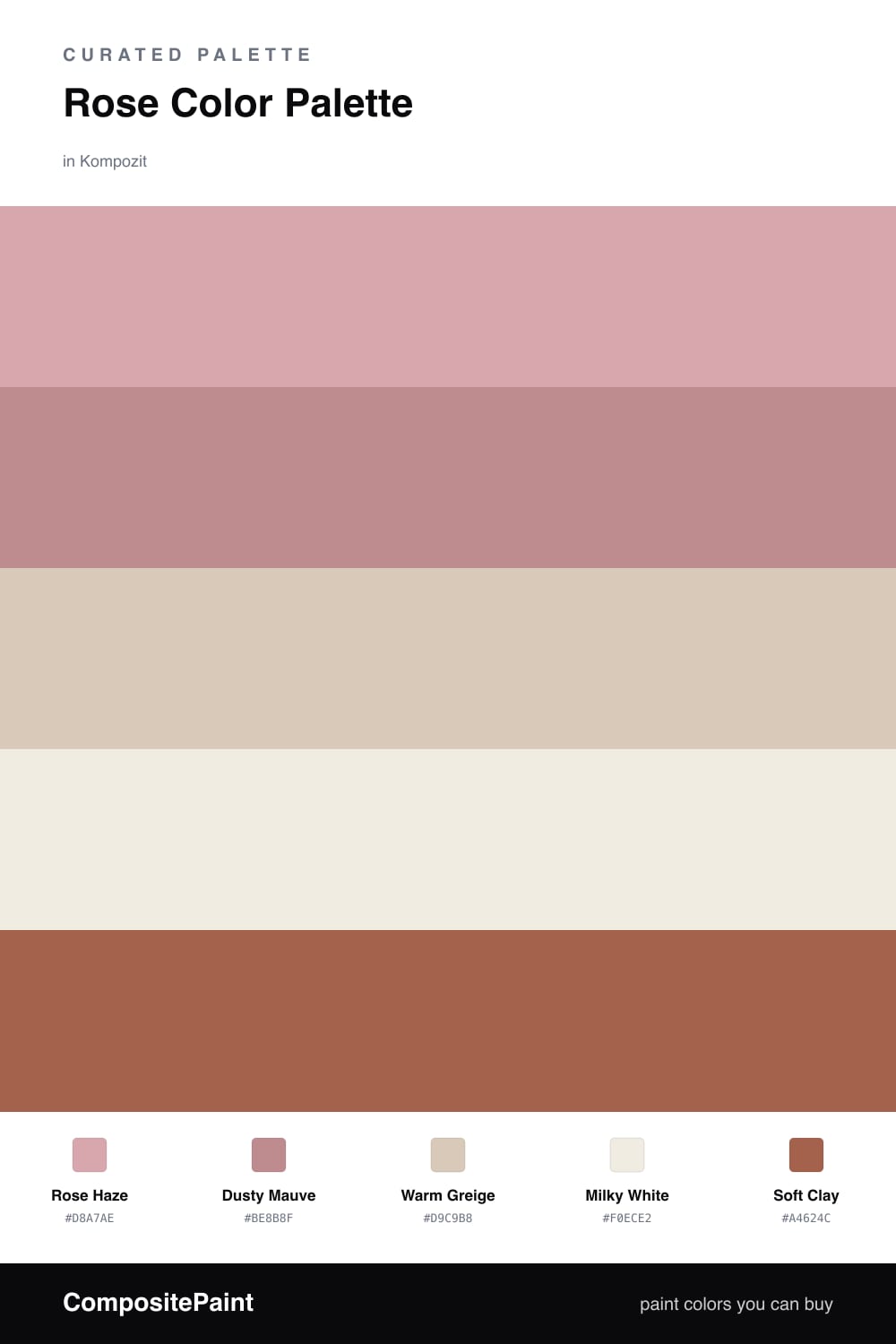
There is a moment just after sunrise when everything looks faintly pink, and that is the feeling I chased here. Rose Haze leads the whole scheme, but it is the dusty, slightly grayed kind of rose that behaves more like a warm neutral than a color you would notice right away.

I layered in Dusty Mauve to deepen the rose without changing its mood, then let Warm Greige and Milky White do the steady, quiet work across the larger surfaces. That softness needs an anchor, so Soft Clay steps in as the accent, a touch of earthy terracotta that keeps the palette feeling current rather than precious.

Let the rose carry most of the room and keep the clay to small doses, a chair, a piece of pottery, a single painted edge. The result feels calm and a little romantic, but with enough warmth and grounding to read modern.

Buy These Colors

Each color matched to the closest real paint in every brand, by ΔE2000. Kompozit first; take any SKU to the store — these mix on demand.

Rose Haze
#D8A9A4 · LRV 46 · Dominant
Kompozit Moon Goddess · 0090 ΔE 4.79
Backdrop Rosita · BD-RO ΔE 2.57
Behr Flowerpot · S180-3 ΔE 2.33
Benjamin Moore Vintage · 1174 ΔE 6.53
Clare Subrosa · PNT100-MD-76 ΔE 4.09
Dunn-Edwards Cedarville · DE5185 ΔE 5.24
Farrow & Ball Cinder Rose · No. 246 ΔE 4.69
Magnolia Home Rosy Pink · JG-154 ΔE 8.39
PPG / Glidden Coral Cove · 1057-4 ΔE 2.06
Sherwin-Williams Insightful Rose · SW 6023 ΔE 6.7
Valspar Terra Cotta Blush · V081-3 ΔE 3.77
Dusty Mauve
#C08E8C · LRV 32 · Secondary
Kompozit Prophetess · 0079 ΔE 2.52
Backdrop Anita · BD-AN ΔE 15.71
Behr Pressed Blossoms · MQ1-18 ΔE 3.36
Benjamin Moore Soft Cranberry · 2094-40 ΔE 4.2
Clare Pink Sky · PNT100-MD-28 ΔE 3.48
Dunn-Edwards Revival Rose · DEC701 ΔE 4.3
Farrow & Ball Dead Salmon · No. 28 ΔE 12.24
Magnolia Home Homebody · JG-136 ΔE 13.34
PPG / Glidden Floral Tapestry · 1052-4 ΔE 1.28
Sherwin-Williams Pressed Flower · SW 6304 ΔE 1.74
Valspar Twice Shy · V079-4 ΔE 2.28
Warm Greige
#D7CABA · LRV 60 · Base
Kompozit Ivory Ridge · 0182 ΔE 1.28
Backdrop Real Real · BD-RR ΔE 3.29
Behr Almond Wisp · PPU5-12 ΔE 0.49
Benjamin Moore Litchfield Gray · HC-78 ΔE 0.88
Clare Flatiron · PNT100-LT-17 ΔE 2.29
Dunn-Edwards Dry Creek · DE6122 ΔE 1.81
Farrow & Ball Cornforth White · No. 228 ΔE 3.91
Magnolia Home Plaster · JG-156 ΔE 2.04
PPG / Glidden In The Buff · 1019-2 ΔE 1.67
Sherwin-Williams Lightweight Beige · SW 6092 ΔE 2.33
Valspar Desert Fortress · 2008-10B ΔE 1.28
Milky White
#F3ECE4 · LRV 85 · Support
Kompozit Queen Anne's Lace · 0558 ΔE 2.03
Backdrop Jane · BD-JA ΔE 2.94
Behr Bleached Linen · PPU5-09 ΔE 0.48
Benjamin Moore Sand Dollar · 877 ΔE 0.97
Clare Wing It · PNT100-LT-24 ΔE 1.21
Dunn-Edwards Tea Biscuit · DE6120 ΔE 1.38
Farrow & Ball Wevet · No. 273 ΔE 2.95
Magnolia Home Silos White · JG-107 ΔE 2.41
PPG / Glidden Cow's Milk · 1053-1 ΔE 1.49
Sherwin-Williams Ibis White · SW 7000 ΔE 0.93
Valspar Dove White · 7002-7 ΔE 1.6
Soft Clay
#A8654F · LRV 18 · Accent
Kompozit Spiced Carrot · 0052 ΔE 1.29
Backdrop Buenos Aires · BD-BA ΔE 12.66
Behr Sun Baked Earth · HDC-CL-08 ΔE 3.87
Benjamin Moore Sedona Clay · 2174-30 ΔE 2.46
Clare Big Apple · PNT100-DP-30 ΔE 7.71
Dunn-Edwards Ruddy Oak · DE5188 ΔE 0.9
Farrow & Ball Picture Gallery Red · No. 42 ΔE 4.93
Magnolia Home Work Worn Wood · JG-35 ΔE 4.55
PPG / Glidden Cinnabar · 1065-6 ΔE 3.51
Sherwin-Williams Roycroft Adobe · SW 40 ΔE 2.11
Valspar Deep Clay Red · 2003-7B ΔE 1.3

Questions

Why does rose work so well as a main color?

A muted rose reads as warm and quiet rather than sweet, so it can carry a whole space the way a soft neutral would, just with more glow. Keeping it dusty rather than pink is what makes it feel grown-up.

How do I keep this scheme from looking too pretty?

Lean on the greige and the warm white for most of the surfaces, let the rose lead, and use the clay accent sparingly. That balance gives the softness a little grit so it feels lived-in, not staged.

Similar Palettes

Closest schemes by color — not by label.