CP

Blush Color Palette — Blush Cove

A soft five-color scheme led by warm blush, settled with greige and cream and lifted by a clay accent — every color matched to real paint you can buy.

By David Chen · Formulation Lead & Resident Chemist

Cove Blush
Dominant
Kompozit Empire Rose · 0069
#E7C5C1
LRV 61
Petal Rose
Secondary
Kompozit Fortune's Prize · 0036
#DAA994
LRV 45
Warm Greige
Base
Kompozit Power Lunch · 0572
#D4D1C7
LRV 64
Linen Cream
Support
Kompozit Nilla Vanilla · 0003
#F1EBE0
LRV 83
Soft Clay
Accent
Kompozit Spiced Carrot · 0052
#A4624C
LRV 17
View palette in

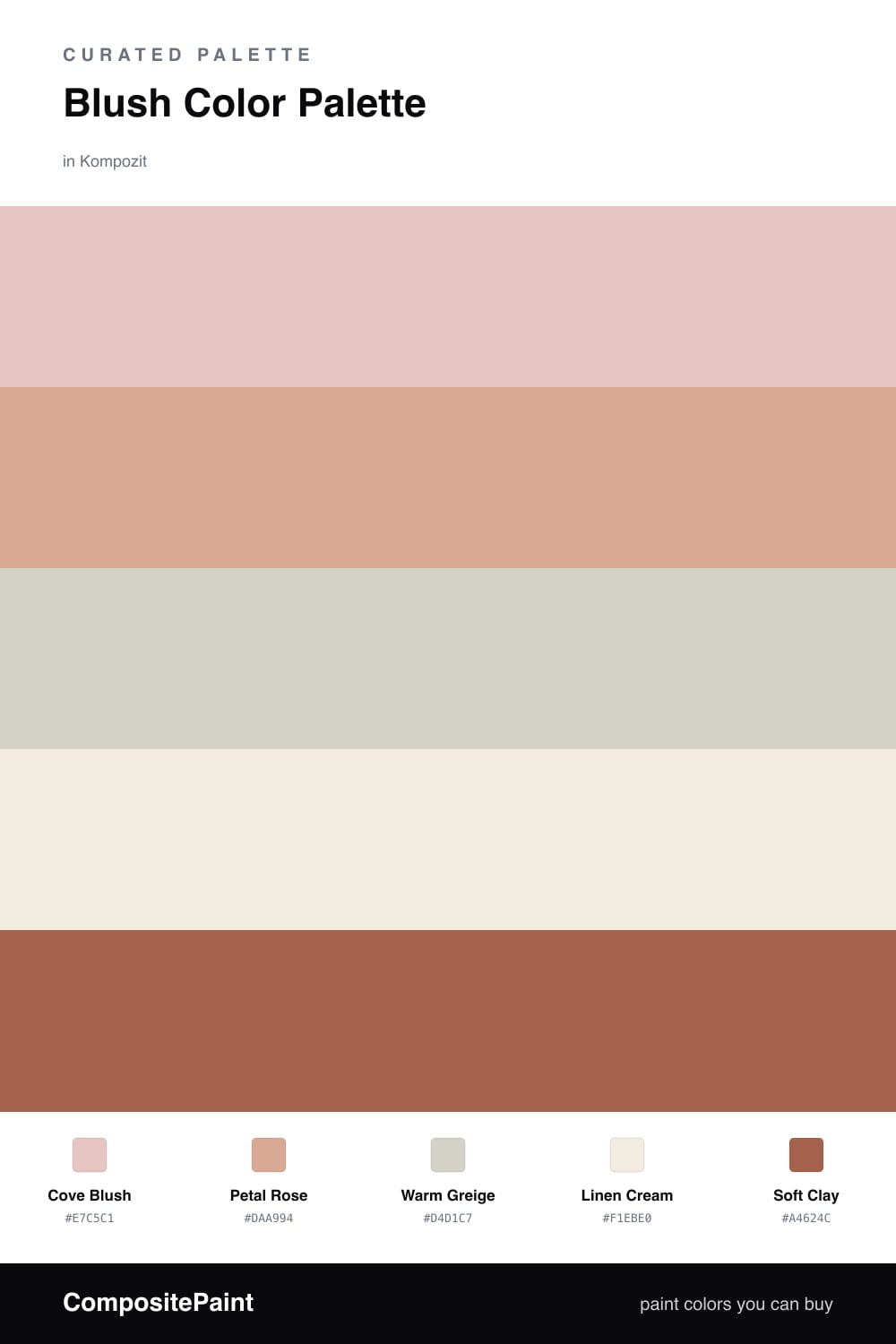
Blush has quietly become a neutral. Cove Blush leads here as a soft, dusty pink with enough warmth to feel like a backdrop rather than a statement, and Petal Rose deepens it a shade for places you want a little more body.

To keep things calm, Warm Greige and Linen Cream do the steadying work — they share the same warm undertone as the blush, so nothing fights. That shared warmth is the trick; pick neutrals that lean the same direction as your color and the whole room settles.

Then Soft Clay is the spark. Used in small doses it picks up the terracotta mood you see everywhere in 2026, and it gives the eye somewhere firm to land. Let the blush dominate, the neutrals carry the middle, and the clay show up just enough to be noticed.

Buy These Colors

Each color matched to the closest real paint in every brand, by ΔE2000. Kompozit first; take any SKU to the store — these mix on demand.

Cove Blush
#E7C6BC · LRV 61 · Dominant
Kompozit Empire Rose · 0069 ΔE 2.78
Backdrop August · BD-AU ΔE 3.93
Behr Tapestry Beige · S210-2 ΔE 1.59
Benjamin Moore Sweet Romance · 1192 ΔE 1.29
Clare Meet Cute · PNT100-LT-60 ΔE 3.03
Dunn-Edwards Galveston Tan · DE6101 ΔE 2.86
Farrow & Ball Setting Plaster · No. 231 ΔE 4.97
Magnolia Home Cabbage Rose · JG-26 ΔE 1.32
PPG / Glidden Sultan Sand · 1068-3 ΔE 2.65
Sherwin-Williams Malted Milk · SW 6057 ΔE 5.51
Valspar Misty Loch · 8003-12C ΔE 4
Petal Rose
#D9A89C · LRV 45 · Secondary
Kompozit Fortune's Prize · 0036 ΔE 3.68
Backdrop Rosita · BD-RO ΔE 2.07
Behr Apricotta · HDC-CT-13 ΔE 2.57
Benjamin Moore Salmon Mousse · 046 ΔE 2.59
Clare Subrosa · PNT100-MD-76 ΔE 2.6
Dunn-Edwards Cedarville · DE5185 ΔE 2.38
Farrow & Ball Cinder Rose · No. 246 ΔE 6.82
Magnolia Home Rosy Pink · JG-154 ΔE 7.03
PPG / Glidden Coral Cove · 1057-4 ΔE 2.71
Sherwin-Williams Pinky Beige · SW 79 ΔE 6.91
Valspar Terra Cotta Blush · V081-3 ΔE 1.44
Warm Greige
#D8CFC2 · LRV 63 · Base
Kompozit Power Lunch · 0572 ΔE 2.87
Backdrop Real Real · BD-RR ΔE 2.3
Behr Aged Beige · PPU7-09 ΔE 0.79
Benjamin Moore Cedar Key · 982 ΔE 0.93
Clare Flatiron · PNT100-LT-17 ΔE 1.31
Dunn-Edwards Fine Grain · DE6213 ΔE 0.45
Farrow & Ball Shaded White · No. 201 ΔE 2.35
Magnolia Home Stoneware Pieces · JG-55 ΔE 4.41
PPG / Glidden Cool Concrete · 1023-2 ΔE 0.91
Sherwin-Williams Modern Gray · SW 7632 ΔE 0.89
Valspar Gentle Shadows · 8005-5A ΔE 1.02
Linen Cream
#F3ECE1 · LRV 84 · Support
Kompozit Nilla Vanilla · 0003 ΔE 0.56
Backdrop Jane · BD-JA ΔE 2.37
Behr Bleached Linen · PPU5-09 ΔE 0.93
Benjamin Moore Winter Sky · 2163-70 ΔE 0.91
Clare Wing It · PNT100-LT-24 ΔE 2.35
Dunn-Edwards Tea Biscuit · DE6120 ΔE 1.69
Farrow & Ball White Tie · No. 2002 ΔE 3.14
Magnolia Home Panna Cotta · JG-111 ΔE 2.97
PPG / Glidden Vanilla Milkshake · 1015-1 ΔE 0.93
Sherwin-Williams Greek Villa · SW 7551 ΔE 1.4
Valspar Cream Delight · 7002-14 ΔE 1
Soft Clay
#A8624E · LRV 18 · Accent
Kompozit Spiced Carrot · 0052 ΔE 1.32
Backdrop Buenos Aires · BD-BA ΔE 13.05
Behr Sun Baked Earth · HDC-CL-08 ΔE 3.39
Benjamin Moore Sedona Clay · 2174-30 ΔE 1.29
Clare Big Apple · PNT100-DP-30 ΔE 6.92
Dunn-Edwards Ruddy Oak · DE5188 ΔE 1.87
Farrow & Ball Picture Gallery Red · No. 42 ΔE 3.77
Magnolia Home On Bosque · JG-36 ΔE 5.61
PPG / Glidden Pizza Pie · 1058-6 ΔE 4.3
Sherwin-Williams Roycroft Adobe · SW 40 ΔE 1.11
Valspar Deep Clay Red · 2003-7B ΔE 1.09

Questions

Why does blush work as the main color here?

Blush reads as a warm neutral once you live with it, so it carries a whole scheme the way beige used to. The greige and cream keep it grounded, and the clay accent stops it from feeling too sweet.

How much of the clay accent should I use?

Keep it small — think one-fifth of the room at most, on a door, a chair, or trim. A little of that warm clay makes the blush look intentional rather than pastel.

Similar Palettes

Closest schemes by color — not by label.