CP

Peach Color Palette — Pearl & Peach Glow

A soft five-color scheme led by warm peach, lifted with pearl and oat neutrals and a clay accent — every color matched to real paint you can buy.

By Jessica Williams · Color Stylist & Interior Editor

Peach Glow
Dominant
Kompozit Spiced Cider · 1035
#F5C5A8
LRV 62
Warm Apricot
Secondary
Kompozit Taste of Summer · 0982
#F2AE73
LRV 50
Pearl White
Base
Kompozit Queen Anne's Lace · 0558
#F0ECE2
LRV 84
Soft Oat
Support
Kompozit Illusive Dream · 0335
#E1D5C2
LRV 67
Burnt Clay
Accent
Kompozit Pretty Parasol · 1039
#AC5D3E
LRV 17
View palette in

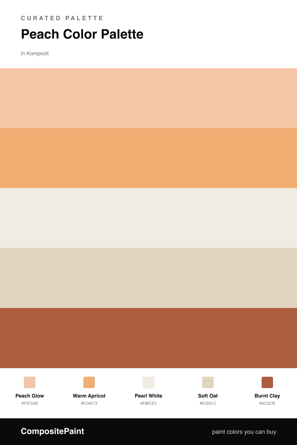
Peach is having a quiet moment in 2026, and this scheme shows why. Peach Glow leads the way as a soft, sun-warmed wall color, with Warm Apricot deepening the same family for a little more presence in adjoining spaces or a feature wall.

Pearl White and Soft Oat sit underneath as the calm base, keeping everything light and easy on the eye. They let the peach feel intentional instead of overwhelming, and they bounce daylight beautifully through a room.

To finish, a small dose of Burnt Clay brings depth and a little grit. Use it sparingly — on a door, a console, or some pottery — and the whole palette feels warm, modern, and lived-in.

Buy These Colors

Each color matched to the closest real paint in every brand, by ΔE2000. Kompozit first; take any SKU to the store — these mix on demand.

Peach Glow
#F2C5A4 · LRV 61 · Dominant
Kompozit Spiced Cider · 1035 ΔE 1.98
Backdrop August · BD-AU ΔE 6
Behr Pumpkin Mousse · HDC-FL13-4 ΔE 3.22
Benjamin Moore Creamy Orange · 2166-50 ΔE 1.5
Clare Before Sunrise · PNT100-LT-71 ΔE 2.54
Dunn-Edwards Sundown · DE5268 ΔE 3.43
Farrow & Ball Setting Plaster · No. 231 ΔE 5.64
Magnolia Home Cabbage Rose · JG-26 ΔE 8.11
PPG / Glidden Citrus Sachet · 1198-3 ΔE 0.66
Sherwin-Williams Avid Apricot · SW 6639 ΔE 1.87
Valspar Special Peach · 2004-6B ΔE 2.28
Warm Apricot
#E8A878 · LRV 47 · Secondary
Kompozit Taste of Summer · 0982 ΔE 3.09
Backdrop Rosita · BD-RO ΔE 13.12
Behr Squash Bisque · M240-5 ΔE 2.45
Benjamin Moore Myrtle Beach · 061 ΔE 3.04
Clare Subrosa · PNT100-MD-76 ΔE 12.06
Dunn-Edwards Yucatan · DE5269 ΔE 3.26
Farrow & Ball Sudbury Yellow · No. 51 ΔE 11.23
Magnolia Home Cottage Feel · JG-40 ΔE 8.64
PPG / Glidden Orange Liqueur · 1198-4 ΔE 2.32
Sherwin-Williams Sun Bleached Ochre · SW 9011 ΔE 2.07
Valspar Sandbar · 2004-6A ΔE 3.66
Pearl White
#F4EDE4 · LRV 85 · Base
Kompozit Queen Anne's Lace · 0558 ΔE 1.75
Backdrop Jane · BD-JA ΔE 2.69
Behr Flurries · HDC-WR14-1 ΔE 0.91
Benjamin Moore Fondant · AF-255 ΔE 1.78
Clare Wing It · PNT100-LT-24 ΔE 1.43
Dunn-Edwards Tea Biscuit · DE6120 ΔE 1.36
Farrow & Ball Pointing · No. 2003 ΔE 2.56
Magnolia Home Silos White · JG-107 ΔE 2.36
PPG / Glidden Cow's Milk · 1053-1 ΔE 1.4
Sherwin-Williams Westhighland White · SW 7566 ΔE 1.58
Valspar Dove White · 7002-7 ΔE 1.24
Soft Oat
#E2D4C0 · LRV 67 · Support
Kompozit Illusive Dream · 0335 ΔE 0.87
Backdrop Cookies & Cream · BD-CC ΔE 3.65
Behr Wax Sculpture · PPU7-17 ΔE 1.1
Benjamin Moore Brandy Cream · 1030 ΔE 0.83
Clare Turbinado · PNT100-LT-21 ΔE 1.35
Dunn-Edwards Oyster · DEC748 ΔE 0.95
Farrow & Ball Off-White · No. 3 ΔE 2.2
Magnolia Home Morning Snow · JG-167 ΔE 2.32
PPG / Glidden Wheat Sheaf · 14-21 ΔE 1.67
Sherwin-Williams Patience · SW 7555 ΔE 0.51
Valspar Honey Locust · 8007-10G ΔE 0.77
Burnt Clay
#B5623E · LRV 19 · Accent
Kompozit Pretty Parasol · 1039 ΔE 2.75
Backdrop Buenos Aires · BD-BA ΔE 14.77
Behr Iced Tea · 230D-6 ΔE 4.14
Benjamin Moore Rust · 2175-30 ΔE 0.5
Clare Sriracha · PNT100-DP-29 ΔE 9.69
Dunn-Edwards Georgia Clay · DE5181 ΔE 2.24
Farrow & Ball Blazer · No. 212 ΔE 10.48
Magnolia Home Work Worn Wood · JG-35 ΔE 3.69
PPG / Glidden Fragrant Cloves · 1199-7 ΔE 2.37
Sherwin-Williams Husky Orange · SW 6636 ΔE 1.51
Valspar Ripe Peach · P045 ΔE 2.35

Questions

Why does peach feel so calming on walls?

Peach carries the warmth of pink and the softness of cream at once, so it glows in daylight without ever shouting. Paired with pearl and oat neutrals, it reads gentle and grounded rather than sweet.

How do I keep a peach room from feeling too pretty?

Let the warm neutrals do most of the work and save the deeper tones for contrast. A touch of burnt clay on a chair, a frame, or trim adds backbone and keeps the whole scheme feeling current.

Similar Palettes

Closest schemes by color — not by label.