CP

Peach Color Palette — Peach Dune

A soft five-color scheme led by warm peach, grounded with sandy neutrals and one terracotta accent — every color matched to real paint you can buy.

By Emily Roberts · DIY Editor & First-Timer's Guide

Sun-Warmed Peach
Dominant
Kompozit Tea Cookie · 1002
#E1B797
LRV 52
Apricot Blush
Secondary
Kompozit Pastel Peach · 1007
#F1CAAD
LRV 64
Dune Sand
Base
Kompozit Illusive Dream · 0335
#E1D5C2
LRV 67
Greige Mist
Support
Kompozit Moth Wing · 0183
#CCBCA9
LRV 52
Terracotta Clay
Accent
Kompozit Orange Ballad · 1019
#B56D41
LRV 21
View palette in

Peach is having a real moment right now, and it is easy to see why. This scheme builds around a soft, sun-warmed peach that feels cozy without being sweet, then leans on warm neutrals so the whole thing stays grown-up and calm.

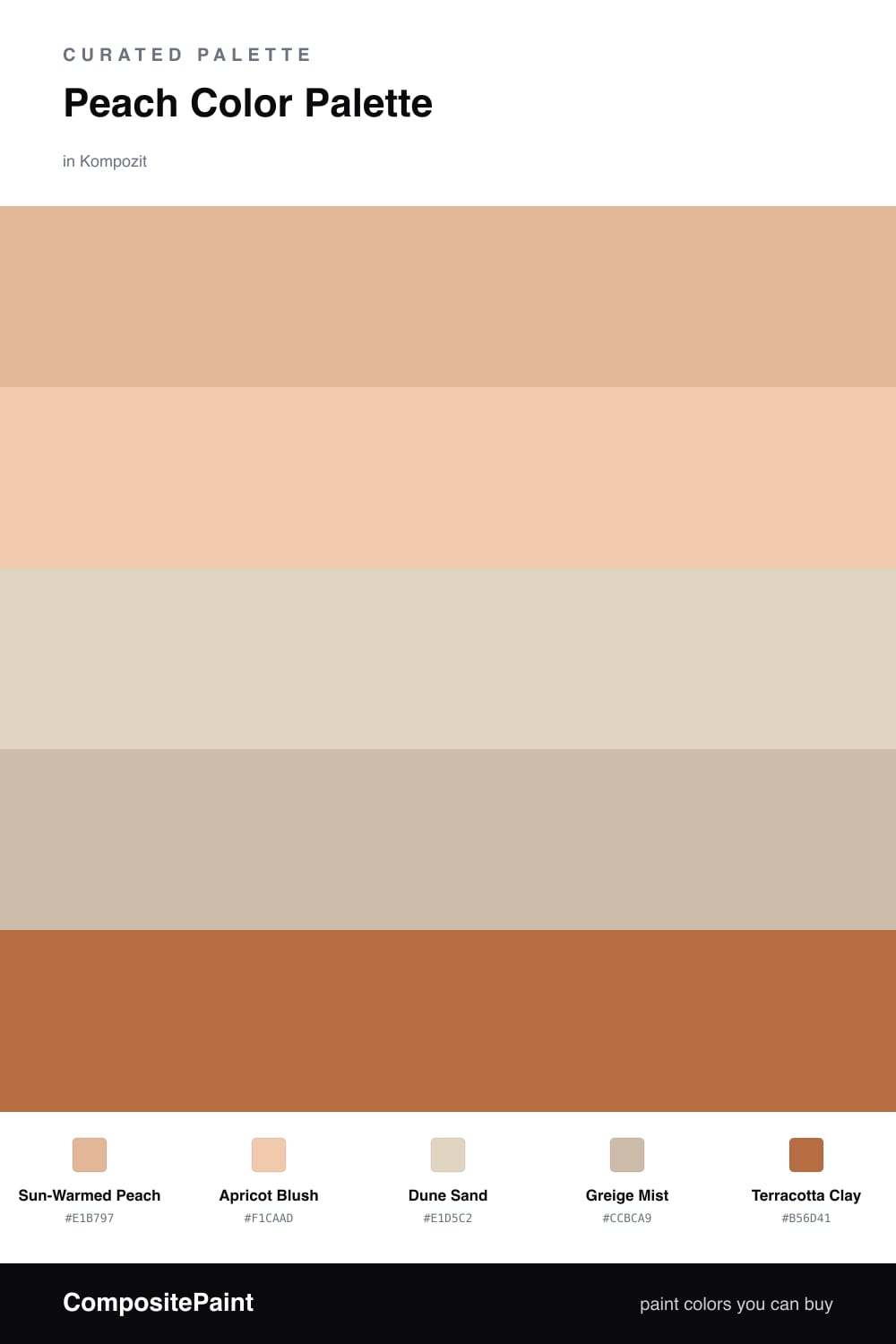
Sun-Warmed Peach does the heavy lifting, with Apricot Blush as a slightly lighter echo for trim or a second wall. Dune Sand and Greige Mist are your quiet helpers — think of them as the colors that let the peach breathe. If you are nervous about color, paint most of the room in these two and use the peach as your feature.

When you want a little punch, reach for Terracotta Clay. It is the deepest shade here, so a little goes a long way — a front door, a single shelf, or some pottery is plenty. Together these five feel like late afternoon light, which is exactly the warm, easy mood so many of us are after in 2026.

Buy These Colors

Each color matched to the closest real paint in every brand, by ΔE2000. Kompozit first; take any SKU to the store — these mix on demand.

Sun-Warmed Peach
#E8B89A · LRV 54 · Dominant
Kompozit Tea Cookie · 1002 ΔE 2.27
Backdrop Boy Meets Girl · BD-BG ΔE 5.95
Behr Fresh Praline · 280C-3 ΔE 1.78
Benjamin Moore Peach Blossom · 2175-50 ΔE 3.05
Clare Meet Cute · PNT100-LT-60 ΔE 8.01
Dunn-Edwards Seasonal Beige · DE5213 ΔE 1.35
Farrow & Ball Setting Plaster · No. 231 ΔE 5.93
Magnolia Home Cabbage Rose · JG-26 ΔE 7.47
PPG / Glidden Gentle Doe · 1201-4 ΔE 1.97
Sherwin-Williams Sumptuous Peach · SW 6345 ΔE 1.16
Valspar Southern Peach · 2006-6B ΔE 2.48
Apricot Blush
#F0CDB4 · LRV 65 · Secondary
Kompozit Pastel Peach · 1007 ΔE 1.58
Backdrop August · BD-AU ΔE 3.28
Behr Sandpoint · 270E-2 ΔE 2.42
Benjamin Moore Melon Cup · 101 ΔE 0.43
Clare Pop · PNT100-LT-26 ΔE 4.26
Dunn-Edwards Cashew Nut · DE5261 ΔE 0.78
Farrow & Ball Matchstick · No. 2013 ΔE 8.22
Magnolia Home Ella Rose · JG-24 ΔE 5
PPG / Glidden Peach Darling · 1201-3 ΔE 0.35
Sherwin-Williams Aristocrat Peach · SW 27 ΔE 1.74
Valspar Bread Basket · 3002-8B ΔE 2.9
Dune Sand
#E4D6C2 · LRV 68 · Base
Kompozit Illusive Dream · 0335 ΔE 0.91
Backdrop Cookies & Cream · BD-CC ΔE 3.48
Behr Wax Sculpture · PPU7-17 ΔE 1.14
Benjamin Moore Bayshore Beige · 1079 ΔE 1.52
Clare Neutral Territory · PNT100-LT-20 ΔE 2.15
Dunn-Edwards Sandcastle · DEC740 ΔE 0.48
Farrow & Ball Matchstick · No. 2013 ΔE 1.82
Magnolia Home Morning Snow · JG-167 ΔE 2.17
PPG / Glidden Bone White · 1085-2 ΔE 1.54
Sherwin-Williams Lotus Pod · SW 7572 ΔE 0.88
Valspar Savoury Beige · 3002-10C ΔE 0.41
Greige Mist
#C9BCAA · LRV 51 · Support
Kompozit Moth Wing · 0183 ΔE 1.31
Backdrop Boy Meets Girl · BD-BG ΔE 11.34
Behr Rustic Rose · BXC-13 ΔE 2.39
Benjamin Moore Brick House Tan · CW-145 ΔE 1.52
Clare Greige · PNT100-LT-13 ΔE 5.39
Dunn-Edwards Birchwood · DEC752 ΔE 0.75
Farrow & Ball Drop Cloth · No. 283 ΔE 1.29
Magnolia Home Solid Wood · JG-109 ΔE 1.54
PPG / Glidden Stonington · 15-25 ΔE 0.49
Sherwin-Williams Shiitake · SW 9173 ΔE 0.49
Valspar Dust Bunny · 2005-10B ΔE 4.35
Terracotta Clay
#B5694A · LRV 20 · Accent
Kompozit Orange Ballad · 1019 ΔE 4.38
Backdrop Old Soul · BD-OS ΔE 24.16
Behr Warm Cider · HDC-FL13-3 ΔE 4.1
Benjamin Moore Montana Agate · 056 ΔE 1.95
Clare Sriracha · PNT100-DP-29 ΔE 8.79
Dunn-Edwards Autumn Umber · DE5216 ΔE 3.49
Farrow & Ball Picture Gallery Red · No. 42 ΔE 8.58
Magnolia Home Work Worn Wood · JG-35 ΔE 1.31
PPG / Glidden Mincemeat · 1200-7 ΔE 4.46
Sherwin-Williams Reynard · SW 6348 ΔE 0.51
Valspar Autumn Ivy · 8002-12E ΔE 0.7

Questions

Why do these colors work together?

They all share a warm, sun-baked undertone, so they blend instead of clash. The peach leads, the sandy neutrals calm it down, and the terracotta adds just enough depth to keep it from feeling flat.

How much peach is too much?

Let peach lead but not take over. Aim for roughly two-thirds peach and apricot, with the sand and greige filling in the rest, and save the terracotta for small touches like a door or a vase.

Similar Palettes

Closest schemes by color — not by label.