Peach Color Palette — Peach Willow
A soft five-color scheme led by warm peach and grounded by gentle willow green, oatmeal, and a clay accent — every color matched to real paint you can buy.
By Jessica Williams · Color Stylist & Interior Editor
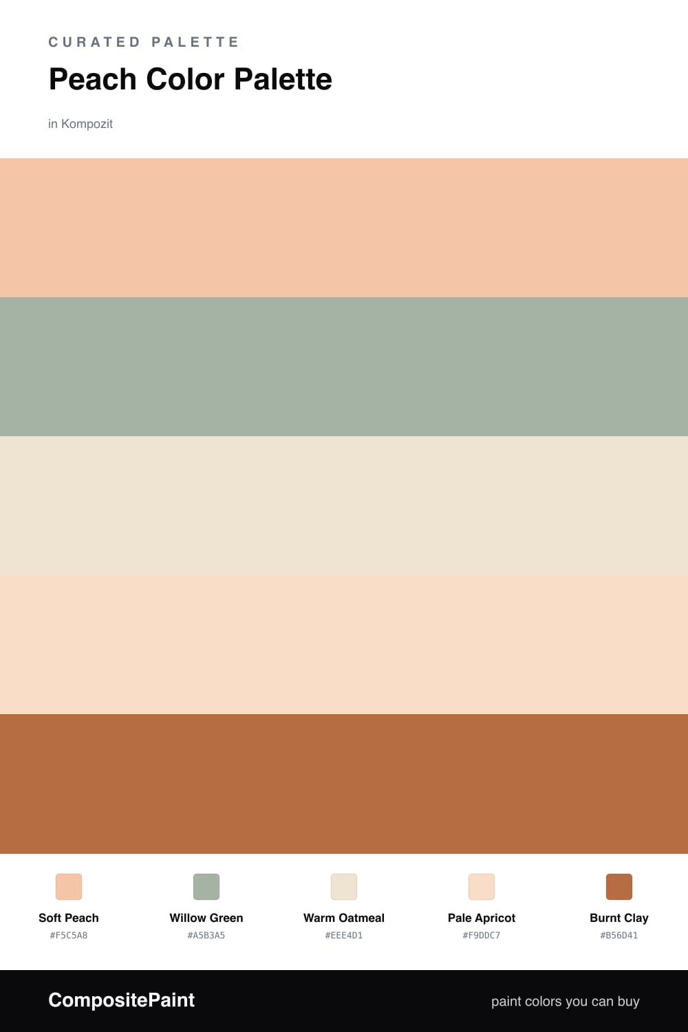
Peach has quietly become one of the most wearable colors in the home, and this scheme shows why. A gentle Soft Peach leads the way, glowing and warm without tipping into pastel cuteness, while Willow Green brings a calm, leafy contrast that keeps everything feeling current.
The neutrals do the steady work. Warm Oatmeal and Pale Apricot soften the whole palette so the peach never feels loud, giving your eye somewhere quiet to rest. Use them across the largest surfaces and let the peach take the lead on the pieces you want to glow.
Then there is Burnt Clay, a deeper terracotta note that grounds the scheme and gives it real warmth. A little goes a long way — a chair, a frame, a length of pottery — and suddenly the whole room feels considered, sunlit, and lived-in.
Buy These Colors
Each color matched to the closest real paint in every brand, by ΔE2000. Kompozit first; take any SKU to the store — these mix on demand.
Questions
Peach is a warm, glowing color, and a muted willow green sits just across from it on the wheel, so it cools the warmth without fighting it. The result feels fresh and easy rather than sweet.
Lean on the neutrals — the oatmeal and apricot — to carry most of the room, then let peach lead and use the green and clay in small doses. That balance keeps it grown-up and calm.
Similar Palettes
Closest schemes by color — not by label.