Fortune's Prize
The dusty clay-pink that shows up under the same name and number in a dozen independent paint decks, reviewed honestly: the light where it glows terracotta, the light where it turns muddy, and what to pair it with.

Jessica has spec'd whites and neutrals for more than 300 rooms and keeps a sample wall of painted drawdowns in her studio. Every color review is checked against real reader rooms in the comments and re-tested when a formula changes. About the testing process →
- 1Determined Orange22
- 2Caramelized35
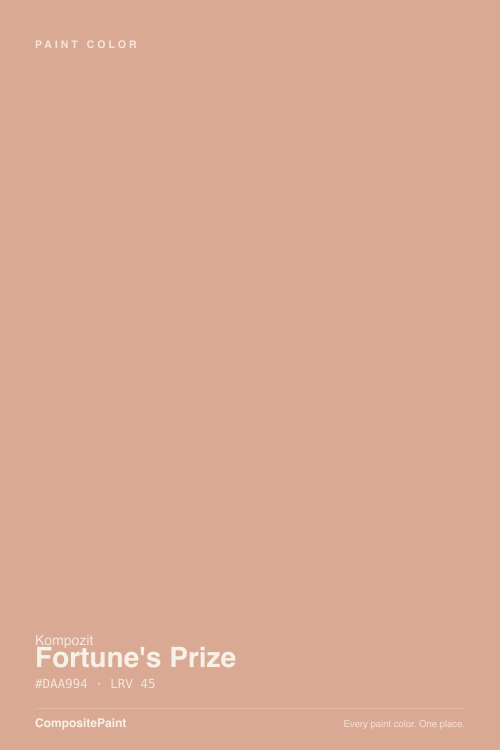
- 3Fortune's Prize45
- 4Beehive51
- 5Colonial Yellow59
The Fast Verdict
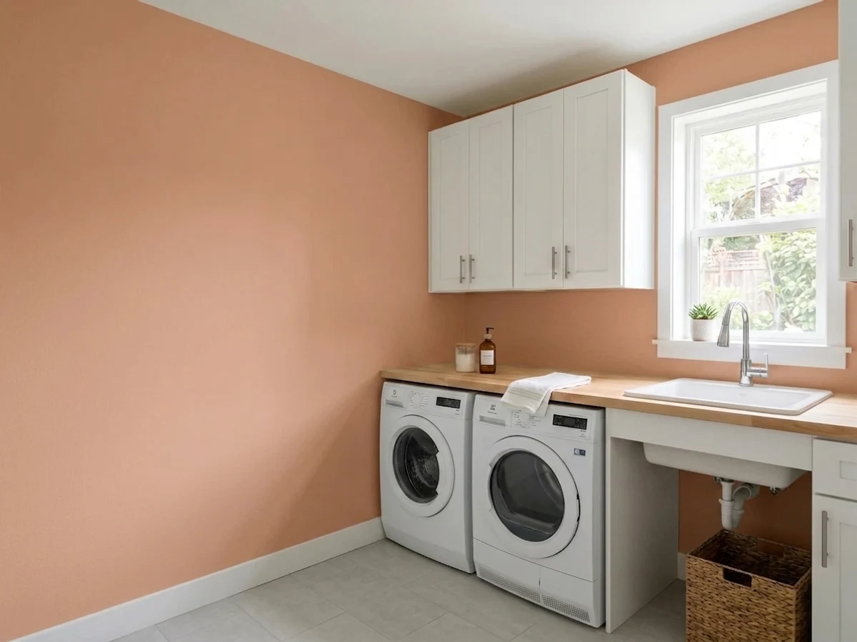
Fortune's Prize is a mid-tone clay pink with a brick-terracotta backbone — closer to a sun-baked adobe wall than a sweet blush. At LRV 45 it holds real color without going heavy, which is why it works so well as a dining-room or accent-wall pick. Give it warm daylight and it glows like sunset on stucco; take the daylight away and it slides toward a muddy mauve-brown fast.
Dining rooms and accent walls · kitchen islands and cabinet fronts · powder rooms · entryways with warm wood or leather · anyone who wants pink without it reading sweet
Your room is north-facing and dim · you actually want a soft blush pink, not terracotta · your floors are already a competing warm honey oak · you're set on cool-toned decor and chrome
- A genuine clay-terracotta, not a generic "dusty pink" — has real character
- LRV 45 holds its color instead of washing out to pastel
- Glows convincingly under warm daylight and lamp light
- Small-room and accent-wall confident — a powder room or island is a weekend project
- The same name and number show up across a dozen independent paint decks, a sign it has real staying power
- Goes flat and muddy in north-facing or dim rooms
- Too warm and brown to double as a soft blush pink
- Competes with honey oak and other orange-leaning wood instead of complementing it
- A whole-room commitment is a bigger bet than reaching for a neutral
What Color Is Fortune's Prize, Really?
Fortune's Prize reads as a dusty clay pink built on a brick-orange base — think a sun-faded terracotta pot more than a rose or a blush. It isn't a Kompozit exclusive: the same name and the same four-digit code, 0036, shows up in the color libraries of a number of independent regional paint companies — Cincinnati Color, Vista Paint, Diamond Vogel, Hirshfield's, Harris Paints in Barbados, Colourtrend in Ireland among them. That kind of cross-network staying power usually means one thing: enough independent color consultants kept reordering it that nobody wanted to drop it from the deck.
At LRV 45 it sits almost exactly in the middle of the reflectance scale — deeper than a true blush pink like First Light (LRV 76), lighter and less saturated than a committed terracotta like Cavern Clay (LRV 24) or Redend Point (LRV 27). That middle position is the whole story: light enough to read as clay-pink rather than brown, dark enough to hold its color instead of washing out to a pastel. It rewards a full accent wall or an island more confidently than most colors at this depth.
Undertone in one line: brick-orange with a rose cast — never a cool pink, never a flat brown. If your sample reads muddy or grayish-brown, that's a dim or north-facing room pulling the warmth out; if it reads sweeter and pinker than you expected, that's warm afternoon light or a 2700K bulb pushing it the other way.
Where It Shines
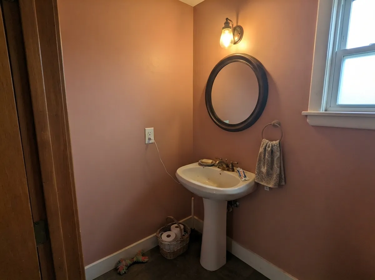
Give it real afternoon sun or a warm bulb and it does exactly what a good terracotta should: it glows, the way a stucco wall or a clay pot warms up at golden hour. It is at its best as a single deliberate move — one accent wall, one island, one powder room — next to plenty of warm white or cream so the color has room to be the statement instead of fighting for attention.
Where It Fails
Almost every disappointed review of a clay-pink like this follows one of three scripts, and Fortune's Prize is no exception. None of them are the paint's fault, but if your room matches one, sample big before you commit.
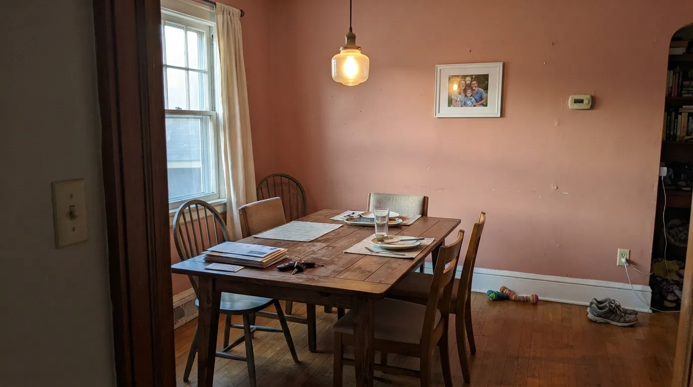
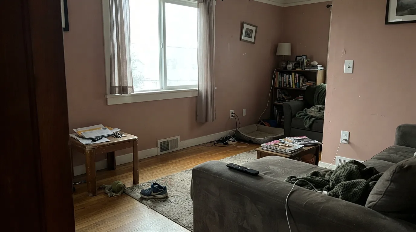
Take the warm light away and the brick-orange base goes flat and slightly muddy — readers describe it as a dusty mauve-brown rather than the clay pink on the fan deck. This is not a paint defect; it's what every LRV-45 warm earth tone does in cool north daylight. Sample it on the actual wall, not just near a window.
This is not Pinterest-nursery pink. The brick-orange undertone keeps it grounded and slightly dusty even in good light, so if the goal was a sweet, cool-leaning blush, Fortune's Prize will read too warm and too brown. Look at Benjamin Moore First Light (LRV 76) instead — same family, far paler and pinker.
Two warm, orange-leaning materials in one room compete instead of complementing. Golden oak floors or cherry-stained trim next to Fortune's Prize walls push the whole room toward orange, and neither the floor nor the paint reads as intentional. Cooler wood — walnut, white oak, ebonized floors — gives the color room to be the warm note by itself.
Room by Room
Warm evening light plus a chandelier is exactly the combination that makes the clay-orange glow instead of mud. Eggshell on the walls, a warm white trim to keep the edges soft rather than stark.
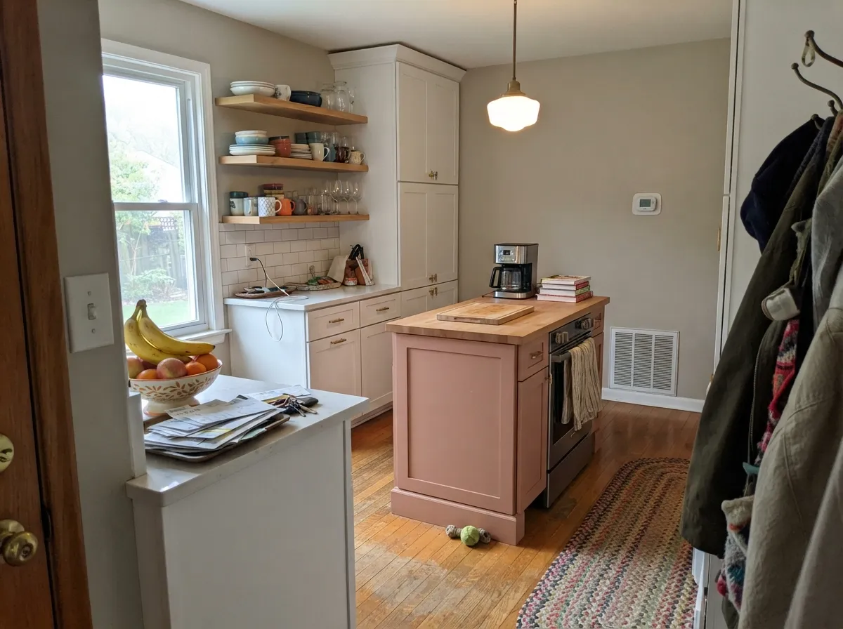
One island or a run of lower cabinets carries the color well against white perimeter cabinets and open shelving; a full kitchen of it is a bigger commitment than most cooks want. Satin or a cabinet-grade enamel for wipeability.
Small rooms take a saturated mid-tone well, and a powder room means the commitment is a weekend, not a whole house. Brass fixtures and a marble or wood vanity top are its natural company.
Under 2700K bulbs at night it turns genuinely cozy and warm; in a north-facing bedroom with no lamps on, budget for it to read duller and browner than the chip. Matte or eggshell hides texture and softens the depth.
One feature wall next to warm neutrals and leather works; four walls of it in an open-plan space has to negotiate with every adjoining room's undertone, which is a harder ask.
On a shaded porch it can look brownish and flat, but a south- or west-facing front door in real sun reads like a confident terracotta against a white or pale-gray house.
Your Light Is the Risk
Full sun brings the brick-orange forward and the color reads like sun-warmed terracotta — its best case by far.
Cool daylight drains the warmth and leaves a flat, muddy mauve-brown. Test on the actual wall before committing.
Cooler and pinker in flat morning light, richer and more orange as the sun moves west. The swing is real — sample across a full day.
2700K bulbs push it warmer and cozier at night; cool white LEDs flatten the clay tone and can make it look slightly gray.
Most complaints about Fortune's Prize are a light mismatch. Upload a photo of your actual room and see it on your walls — then ask for the same wall in north light or evening lamps before you buy a single sample.
Need It From Another Brand?
Any paint counter can custom-tint Kompozit 0036 directly. If you would rather stay in one brand's own deck, these are the closest stock matches, measured as ΔE2000. Under 2 is a difference you will not see on the wall.
| Brand | Closest color | ΔE | LRV | |
|---|---|---|---|---|
| Sherwin-Williams | RosetteeSW 7581 · Sherwin-Williams | 1.6 | 43 | Color page → |
| Behr | Salmon SandQE-02 · Behr | 1.4 | 45 | Color page → |
| Benjamin Moore | Salmon Mousse046 · Benjamin Moore | 2.3 | 44 | Color page → |
| Valspar | Arizona Dust2003-8A · Valspar | 1.3 | 45.1 | Color page → |
| PPG / Glidden | Sombrero TanPPG16-01 · PPG / Glidden | 3.3 | 45 | Color page → |
| Glidden | Londonderry Coral60YR 43/225 · Glidden | 0.9 | 43 | Color page → |
Similar Kompozit Colors
The nearest shades to Fortune's Prize within Kompozit's own range, ranked by perceptual color distance — useful when you want the same look a touch lighter, darker, or warmer.
WCAG 2.1: AA is 4.5 : 1 for normal text, 3 : 1 for large text, AAA is 7 : 1.
Fortune's Prize vs the Colors You're Also Considering
Every Fortune's Prize sample board has the same rivals on it. The numbers show the real lightness gap — then it comes down to which risk you would rather live with.
Pick this for the lighter, more livable mid-tone that still reads clearly warm without taking over a whole room.
Sherwin-Williams SW 9081 · LRV 27Redend PointPick this if you want the deeper, more saturated version of this exact clay-pink family — Redend Point is the one that went viral for it.
Pick this when you want clay pink, not straight orange-brown clay.
Sherwin-Williams SW 7701 · LRV 24Cavern ClayPick this for a deeper, more orange-leaning terracotta built for full sun and exterior confidence.
Fortune's Prize Coordinating Colors
The safest pairings keep at least one element cool or neutral so the clay-pink stays the warm note instead of fighting for the job. Warm whites, grayed sages, and deep near-blacks all let it do the work:
The Color That Traveled: One Name, a Dozen Paint Decks
Most paint colors belong to one brand. Fortune's Prize does not: the exact name and the exact four-digit code, 0036, turn up in the color libraries of Cincinnati Color, Vista Paint, Diamond Vogel, Hirshfield's, Harris Paints in Barbados, Colourtrend in Ireland, and several others — all describing the same warm terracotta-clay shade.
We can't say with certainty why one color ended up this widely shared across independent regional paint companies that otherwise compete with each other. What we can say honestly: a color that many separate, unrelated retailers have each chosen to keep in their own decks, year after year, has earned that spot on customer demand rather than any one brand's marketing push. Treat it as a genuinely tested, well-liked shade rather than a one-off house pick.
Fortune's Prize With Wood Tones and Floors
Walnut, white oak, and darker or cooler-stained floors are the color's best friends — they don't compete with its orange lean, so the wall gets to be the only note in that key. Cork, leather, and aged brass sit naturally alongside it too.
The one flooring to sample carefully is golden or honey-toned oak. Both the floor and the wall want to read as "the warm element," and put together they can push each other toward a heavier orange than either color shows alone. A large rug or a cooler-toned trim color between them usually solves it; if the honey oak is staying and can't be worked around, a grayer cousin like Cinnamon Slate keeps the same mood with less direct competition.
Three Ready Palettes Built on Fortune's Prize
A color is never alone on the wall. These are complete combinations in the 60-30-10 pattern, with the reason each one holds together. Every one opens in the visualizer.
White Dove keeps the trim soft instead of stark so the clay-pink walls stay the star; Wrought Iron on the door or light fixtures gives the room one grounding dark note without competing for warmth.
Try this palette in your roomMuted sage and clay pink sit far enough apart on the wheel to read as a deliberate pairing rather than a clash — both are grayed-down enough to stay calm together. Alabaster on the perimeter cabinets keeps the kitchen from feeling like two competing statements.
Try this palette in your roomLayering Fortune's Prize with its grayer, deeper cousin Cinnamon Slate gives the room depth without switching color families; White Dove overhead and on trim keeps the scheme from feeling heavy.
Try this palette in your roomFortune's Prize FAQ
Is Fortune's Prize pink or brown?
Both, in the sense that a terracotta pot is both — the base is a warm brick-orange with a rose cast layered over it, at LRV 45. It reads more like sun-faded clay than a sweet pink or a straight brown, and the light in your room decides which side comes forward.
Why does the same color show up at so many different paint stores?
The name and the four-digit code, 0036, appear identically across a number of independent regional paint companies, not just Kompozit — a sign this specific color has been popular enough, for long enough, that several separate color libraries kept it in rotation rather than retiring it.
What white trim goes with Fortune's Prize?
A warm white, not a stark one — a soft off-white like White Dove keeps the edges gentle. A bright cool white will make the clay-pink look dustier and slightly dirty by comparison.
Will it look muddy in my room?
Only if the room runs cool and dim. North-facing rooms with little direct light are the one situation where this color consistently disappoints, going flat and brownish instead of glowing. If that's your room, sample a large swatch on the actual wall before committing.
Does it work with oak floors?
Depends on the oak. Walnut, white oak and darker or cooler-toned floors let the clay-pink be the room's only warm note. Golden honey oak competes — both the floor and the wall are trying to be orange, and the room can start to feel like too much of one thing.
What sheen should I use?
Eggshell on walls is the standard, matte if you want to mute the depth slightly and hide texture. Trim in semi-gloss, and satin on an island or cabinets for durability and easy cleanup.
Have you painted with Fortune's Prize?
Rate it — one tap helps the next reader decide.
Ask a Question