Olive Color Palette — Olive Ember
A warm five-color scheme led by deep olive, softened with oatmeal and clay neutrals and lit by an ember-orange accent — every color matched to real paint you can buy.
By Emily Roberts · DIY Editor & First-Timer's Guide
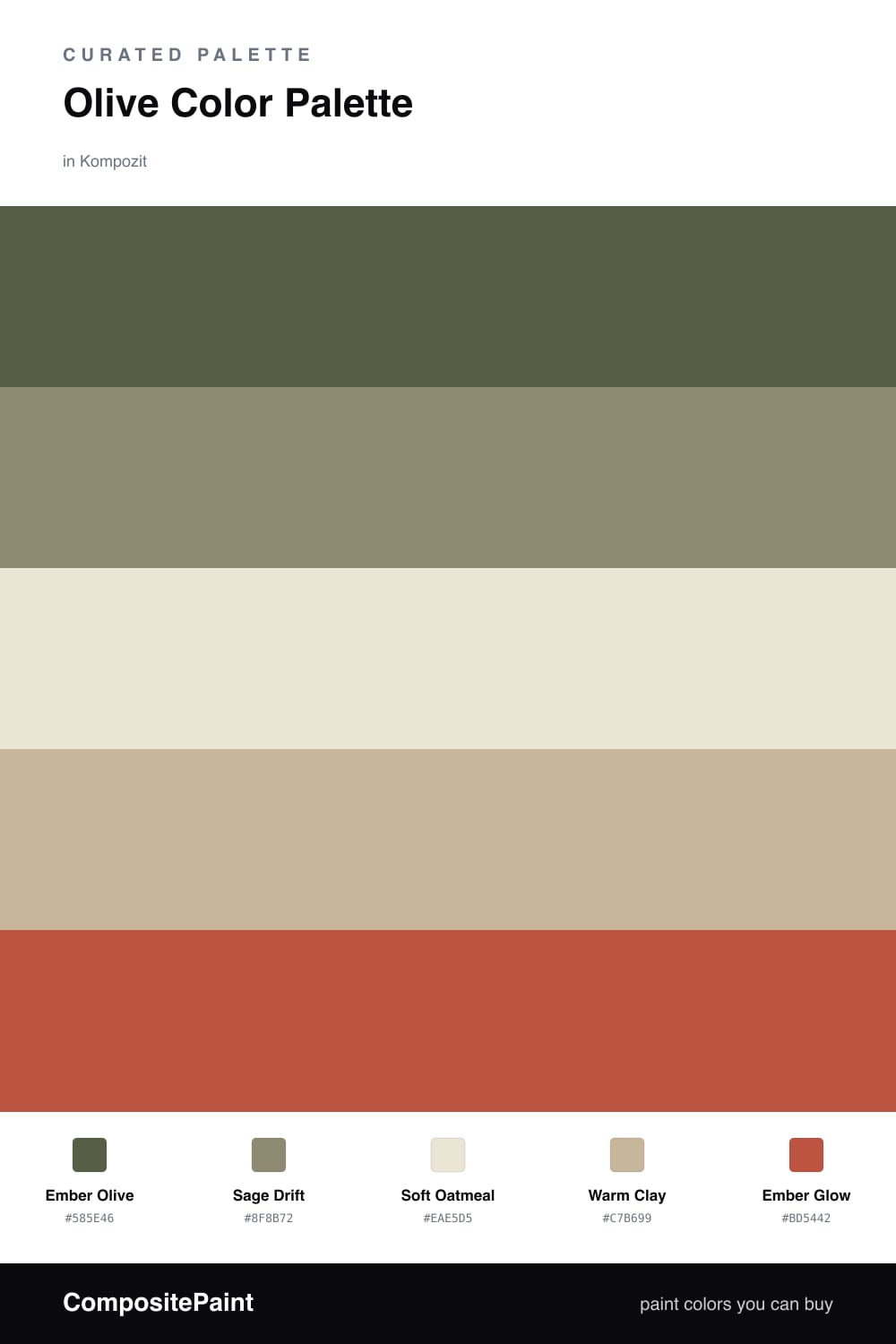
Olive is having a real moment right now, and this scheme leans all the way into it. Ember Olive carries the whole room as the dominant color — it is deep, warm, and surprisingly easy to live with — while Sage Drift steps in as a lighter version of the same family so your walls and trim can flow without feeling flat.
The middle of this palette is where it gets cozy. Soft Oatmeal keeps things bright and open, and Warm Clay adds a little earthy depth so the olive never feels heavy. Together they give your eyes a place to rest.
Then comes the spark. Ember Glow is a burnt, sunset-orange that you use in tiny doses — a pillow, a lamp, one bold chair. That one warm pop is what makes the whole scheme feel modern and intentional instead of sleepy.
Buy These Colors
Each color matched to the closest real paint in every brand, by ΔE2000. Kompozit first; take any SKU to the store — these mix on demand.
Questions
Olive is a green with a lot of warmth baked in, so it feels grounded and a little cozy instead of cold. That makes it easy to live with on a big wall, and it lets the other softer colors do their quiet job around it.
Keep it small — think a single chair, a throw, or a piece of art. The ember orange is there to wake everything up, so a little goes a long way against all that olive and oatmeal.
Similar Palettes
Closest schemes by color — not by label.