Terracotta Color Palette — Cedar Clay Retreat
An earthy five-color scheme led by warm terracotta, softened with oat and clay neutrals and lifted by a cedar green accent — every color matched to real paint you can buy.
By Emily Roberts · DIY Editor & First-Timer's Guide
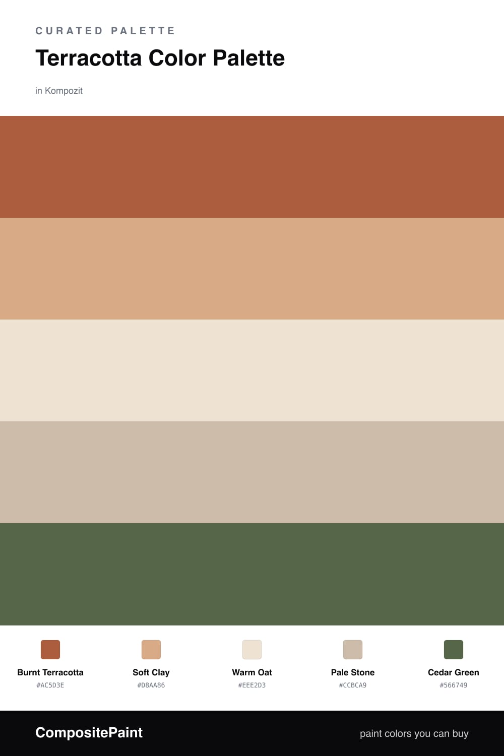
Terracotta is having a real moment right now, and it is easy to see why. It feels sun-warmed and handmade, like clay pots and Mediterranean afternoons. In this scheme a deep Burnt Terracotta does the heavy lifting, with a lighter Soft Clay echoing it a shade or two up.
To keep all that warmth from feeling too much, I leaned on two quiet neutrals. Warm Oat is your gentle base for big walls, and Pale Stone is a slightly deeper companion for trim or built-ins. They give your eyes a place to rest so the terracotta stays the star.
The little surprise here is Cedar Green — a soft, dusty green that plays beautifully against clay tones. Use it sparingly, maybe on a door, a chair, or a few plants and pillows. That one cool note is what makes the whole palette feel fresh and 2026 rather than rustic.
Buy These Colors
Each color matched to the closest real paint in every brand, by ΔE2000. Kompozit first; take any SKU to the store — these mix on demand.
Questions
Terracotta is warm and grounded, so it fills a space without feeling heavy. Surrounding it with soft oat and stone neutrals lets it lead while still feeling calm and livable.
Let terracotta dominate, roughly two-thirds of the look. Use the clay and neutrals to soften it, and add the cedar green in small doses — think one accent wall, trim, or a few decor pieces.
Similar Palettes
Closest schemes by color — not by label.