CP

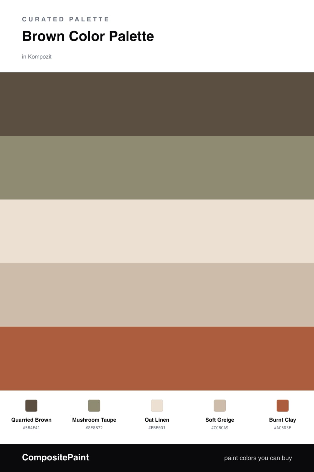
Brown Color Palette — Quarried Stone

A warm five-color brown scheme led by a deep stone brown, softened with mushroom and oat neutrals and lifted by a burnt clay accent — every color matched to real paint you can buy.

By Emily Roberts · DIY Editor & First-Timer's Guide

Quarried Brown
Dominant
Kompozit Brown Suede · 0221
#5B4F41
LRV 8
Mushroom Taupe
Secondary
Kompozit Burning Idea · 0373
#8F8B72
LRV 26
Oat Linen
Base
Kompozit Clover Honey · 0271
#EBE0D1
LRV 76
Soft Greige
Support
Kompozit Moth Wing · 0183
#CCBCA9
LRV 52
Burnt Clay
Accent
Kompozit Pretty Parasol · 1039
#AC5D3E
LRV 17
View palette in

Brown is having a real moment in 2026, and this scheme shows why. A deep, grounded Quarried Brown leads the way, the kind of stony shade that feels solid without turning a room into a cave.

Around it, Mushroom Taupe softens the edges while Oat Linen and Soft Greige keep everything light and breathable. These warm neutrals do the quiet work, so the brown never feels heavy.

Then a little Burnt Clay brings the spark. Use it sparingly — a chair, a throw, a painted door — and you get warmth and energy without losing that calm, earthy feeling. Let the brown lead, and let the neutrals breathe.

Buy These Colors

Each color matched to the closest real paint in every brand, by ΔE2000. Kompozit first; take any SKU to the store — these mix on demand.

Quarried Brown
#5B4A3A · LRV 7 · Dominant
Kompozit Brown Suede · 0221 ΔE 2.94
Backdrop It's a Date · BD-IT ΔE 4.05
Behr Rustic Tobacco · N230-7 ΔE 1.48
Benjamin Moore Ferret Brown · 2108-10 ΔE 1.39
Clare Blackest · PNT100-DP-55 ΔE 11.28
Dunn-Edwards Northern Territory · DEA158 ΔE 5.47
Farrow & Ball Mahogany · No. 36 ΔE 7.49
Magnolia Home Wooded Acres · JG-122 ΔE 4.55
PPG / Glidden Afternoon Tea · 1023-7 ΔE 3.28
Sherwin-Williams Status Bronze · SW 7034 ΔE 1.64
Valspar Buckeye · 8005-8G ΔE 0.94
Mushroom Taupe
#9A8975 · LRV 26 · Secondary
Kompozit Burning Idea · 0373 ΔE 7.66
Backdrop Hartford · BD-HF ΔE 12.97
Behr Toffee Crunch · 700D-5 ΔE 2.96
Benjamin Moore Smoky Ash · 986 ΔE 2.07
Clare Dirty Chai · PNT100-DP-52 ΔE 5.23
Dunn-Edwards Cobblestone Path · DE6068 ΔE 4.75
Farrow & Ball Mouse's Back · No. 40 ΔE 0.49
Magnolia Home Garden Party · JG-53 ΔE 7.88
PPG / Glidden Roasted Chestnut · 15-30 ΔE 2.13
Sherwin-Williams Curio Gray · SW 24 ΔE 0.99
Valspar Stone Manor · 6006-2A ΔE 0.49
Oat Linen
#EAE1D2 · LRV 76 · Base
Kompozit Clover Honey · 0271 ΔE 0.98
Backdrop Cookies & Cream · BD-CC ΔE 3.77
Behr Cascade Beige · N240-1 ΔE 0.43
Benjamin Moore French Macaroon · CSP-335 ΔE 0.84
Clare On Point · PNT100-LT-11 ΔE 4.01
Dunn-Edwards Crystal Haze · DE6219 ΔE 1.93
Farrow & Ball Slipper Satin · No. 2004 ΔE 0.56
Magnolia Home Soft Landing · JG-17 ΔE 2.55
PPG / Glidden Brandied Pears · 1086-2 ΔE 1.13
Sherwin-Williams Steamed Milk · SW 7554 ΔE 0.89
Valspar Totten's Inlet · 7006-9 ΔE 0.48
Soft Greige
#C9BCA8 · LRV 51 · Support
Kompozit Moth Wing · 0183 ΔE 1.68
Backdrop Boy Meets Girl · BD-BG ΔE 11.93
Behr Celery Powder · PPU8-18 ΔE 2.67
Benjamin Moore Brick House Tan · CW-145 ΔE 0.76
Clare Greige · PNT100-LT-13 ΔE 6.18
Dunn-Edwards Birchwood · DEC752 ΔE 1.3
Farrow & Ball Drop Cloth · No. 283 ΔE 1
Magnolia Home Solid Wood · JG-109 ΔE 2.04
PPG / Glidden Stonington · 15-25 ΔE 1.14
Sherwin-Williams Shiitake · SW 9173 ΔE 1.14
Valspar Dust Bunny · 2005-10B ΔE 5.09
Burnt Clay
#B5623C · LRV 19 · Accent
Kompozit Pretty Parasol · 1039 ΔE 3.04
Backdrop Buenos Aires · BD-BA ΔE 14.74
Behr Iced Tea · 230D-6 ΔE 4.66
Benjamin Moore Rust · 2175-30 ΔE 0.99
Clare Sriracha · PNT100-DP-29 ΔE 10.28
Dunn-Edwards Georgia Clay · DE5181 ΔE 2.75
Farrow & Ball Blazer · No. 212 ΔE 11.02
Magnolia Home Work Worn Wood · JG-35 ΔE 3.9
PPG / Glidden Mincemeat · 1200-7 ΔE 3.66
Sherwin-Williams Husky Orange · SW 6636 ΔE 1.86
Valspar Ripe Peach · P045 ΔE 2.02

Questions

Why does this palette feel warm instead of heavy?

The deep brown leads, but the oat and greige neutrals carry most of the light, so the room reads cozy rather than dark. A little burnt clay keeps it from going flat.

How much of each color should I use?

Let the brown anchor the big surfaces, lean on the oat and greige for the rest, and save the burnt clay for small touches — roughly a 60/30/10 split.

Similar Palettes

Closest schemes by color — not by label.