CP

Brown Color Palette — Driftwood Harbor

A grounded five-color scheme led by a deep driftwood brown, layered with warm taupe, soft cream, and a quiet sage accent — every color matched to real paint you can buy.

By Jessica Williams · Color Stylist & Interior Editor

Driftwood Brown
Dominant
Kompozit Deep Shadow · 0445
#514A3D
LRV 7
Warm Taupe
Secondary
Kompozit Gold Taffeta · 0276
#A48B68
LRV 27
Soft Cream
Base
Kompozit Tawny Daylilly · 0327
#EEE4D1
LRV 78
Pale Stone
Support
Kompozit Ivory Ridge · 0182
#D9C9B8
LRV 60
Harbor Sage
Accent
Kompozit Fern Gully · 0436
#838C72
LRV 25
View palette in

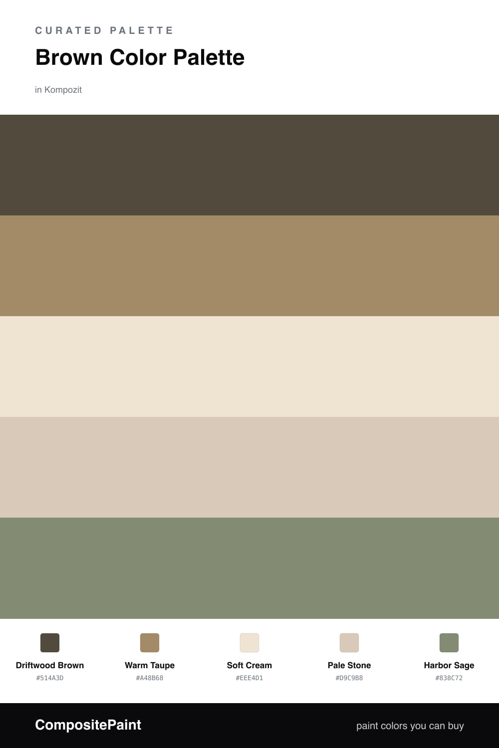
Brown is having a real moment again, and this scheme shows why. Driftwood Brown leads as a deep, slightly weathered anchor — the kind of tone that feels like sun-bleached wood near the water, warm but never muddy.

From there the palette steps up gently. Warm Taupe softens the depth, while Soft Cream and Pale Stone open everything up and let the light move. These three neutrals are the quiet workhorses you can spread across most of a space.

The small surprise is Harbor Sage, a muted greyed green that keeps the whole thing feeling alive and a little contemporary. Use it in the smallest dose — a single piece, some greenery, one painted edge — and let the browns hold the room.

Buy These Colors

Each color matched to the closest real paint in every brand, by ΔE2000. Kompozit first; take any SKU to the store — these mix on demand.

Driftwood Brown
#5A4636 · LRV 7 · Dominant
Kompozit Deep Shadow · 0445 ΔE 7
Backdrop It's a Date · BD-IT ΔE 2.21
Behr Moose Trail · N190-7 ΔE 0.92
Benjamin Moore Taupe · 2110-10 ΔE 1.85
Clare Blackish · PNT100-DP-54 ΔE 10.76
Dunn-Edwards Northern Territory · DEA158 ΔE 4.19
Farrow & Ball Mahogany · No. 36 ΔE 7.4
Magnolia Home Wooded Acres · JG-122 ΔE 5.39
PPG / Glidden Racy Raisin · 16-24 ΔE 6.2
Sherwin-Williams Van Dyke Brown · SW 7041 ΔE 1.5
Valspar Buckeye · 8005-8G ΔE 1.9
Warm Taupe
#A28C72 · LRV 28 · Secondary
Kompozit Gold Taffeta · 0276 ΔE 2.91
Backdrop Anita · BD-AN ΔE 4.92
Behr Rodeo Tan · N240-5 ΔE 0.93
Benjamin Moore Clay · 1034 ΔE 0.9
Clare Shade · PNT100-MD-14 ΔE 11.89
Dunn-Edwards Tuscan Mosaic · DE6208 ΔE 1.86
Farrow & Ball Mouse's Back · No. 40 ΔE 3.25
Magnolia Home Vintage Crown · JG-152 ΔE 5.03
PPG / Glidden Confidence · 1078-5 ΔE 3.32
Sherwin-Williams Sandy Ridge · SW 7535 ΔE 1.46
Valspar Mountain Hideaway · M225 ΔE 2.11
Soft Cream
#EFE6D5 · LRV 80 · Base
Kompozit Tawny Daylilly · 0327 ΔE 0.88
Backdrop Don't Eat the Yellow Snow · BD-DS ΔE 2.95
Behr Rye Flour · HDC-FL13-5 ΔE 0.89
Benjamin Moore Navajo White · 947 ΔE 1.19
Clare Like Buttah · PNT100-LT-62 ΔE 0.89
Dunn-Edwards Rice Bowl · DE6170 ΔE 0.55
Farrow & Ball James White · No. 2010 ΔE 2.47
Magnolia Home Carter Crème · JG-16 ΔE 1.19
PPG / Glidden Elegant Ivory · 1081-1 ΔE 1.21
Sherwin-Williams Restful White · SW 7563 ΔE 1.49
Valspar Double Scoop · V176 ΔE 0.42
Pale Stone
#D8C9B4 · LRV 60 · Support
Kompozit Ivory Ridge · 0182 ΔE 1.96
Backdrop Real Real · BD-RR ΔE 3.76
Behr Studio Clay · MQ2-27 ΔE 0.74
Benjamin Moore Lace Handkerchief · CSP-220 ΔE 2.22
Clare Flatiron · PNT100-LT-17 ΔE 4.09
Dunn-Edwards Dry Creek · DE6122 ΔE 2.31
Farrow & Ball Savage Ground · No. 213 ΔE 2.85
Magnolia Home Plaster · JG-156 ΔE 2.2
PPG / Glidden Armadillo · 14-17 ΔE 0.85
Sherwin-Williams Softer Tan · SW 6141 ΔE 1.08
Valspar Desert Fortress · 2008-10B ΔE 1.99
Harbor Sage
#7C8A72 · LRV 24 · Accent
Kompozit Fern Gully · 0436 ΔE 2.29
Backdrop Hartford · BD-HF ΔE 5.55
Behr Shallot Bulb · PPU11-02 ΔE 1.96
Benjamin Moore Palace Green · CW-520 ΔE 3.24
Clare Dirty Chai · PNT100-DP-52 ΔE 12.54
Dunn-Edwards Wreath · DE5656 ΔE 2.3
Farrow & Ball Calke Green · No. 34 ΔE 2.7
Magnolia Home Magnolia Green · JG-08 ΔE 3.65
PPG / Glidden Shebang · 1127-5 ΔE 3.21
Sherwin-Williams Privilege Green · SW 6193 ΔE 2.4
Valspar Kale · P097 ΔE 1.54

Questions

Why does brown feel so calming in a room?

Brown reads as something natural and solid — wood, stone, leather — so it settles a space the way those materials do. Keeping it warm and layering lighter neutrals on top stops it from ever feeling heavy.

How do I keep an all-brown palette from looking flat?

Vary the depth and let one tone lead. Here the deep driftwood does the heavy lifting, the taupe and stone add middle steps, and the sage accent gives your eye somewhere fresh to land.

Similar Palettes

Closest schemes by color — not by label.