Skin Tone Color Palette — Bare Skin
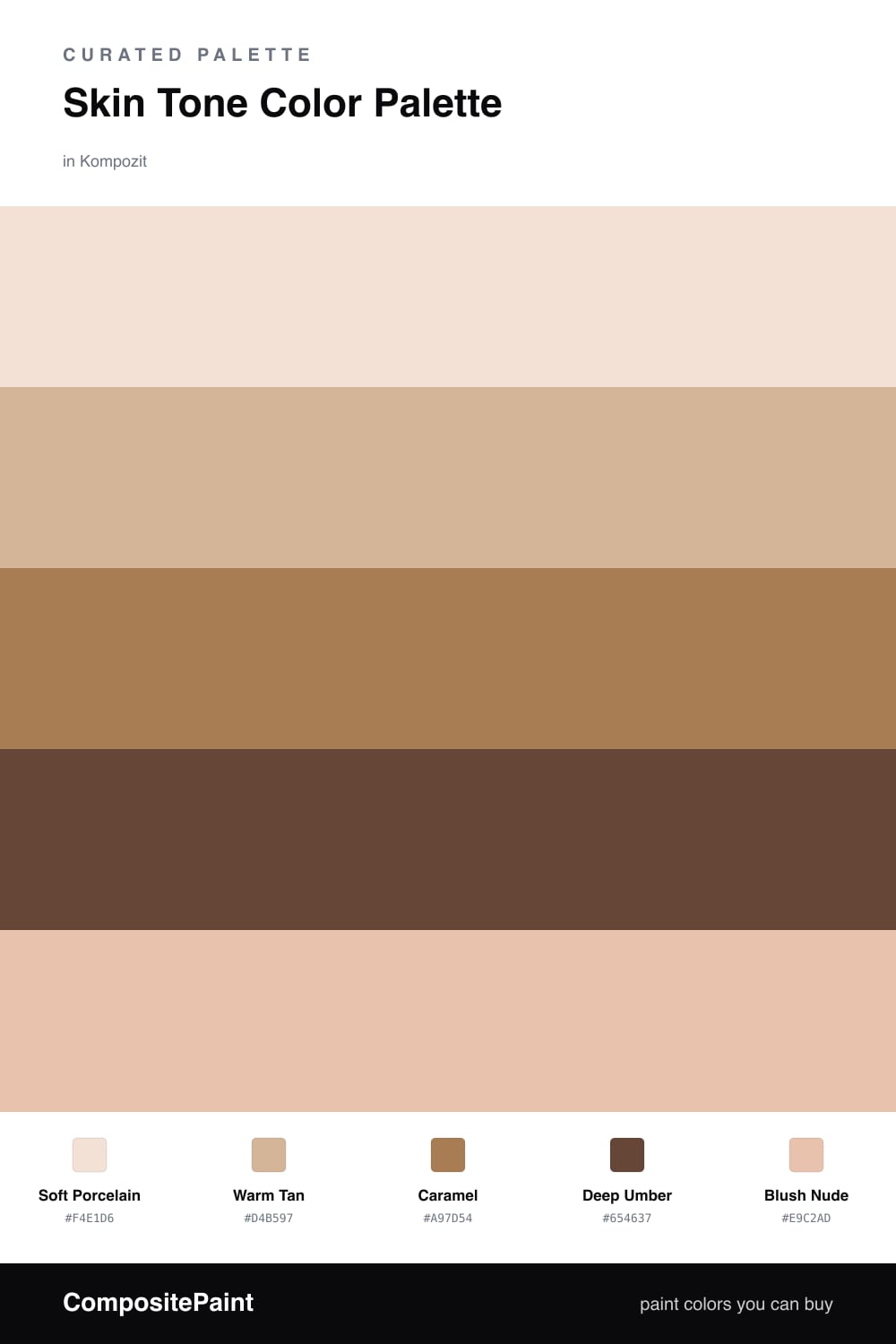
A warm five-color scheme moving from porcelain through caramel to deep umber, the soft range of natural skin and nude tones — every color matched to real paint you can buy.
By Jessica Williams · Color Stylist & Interior Editor
There is a reason skin tones feel so easy to live with. We read them as warm and human before we even name them, and a whole palette built from them carries that same quiet comfort. This scheme runs the full range, from the lightest Soft Porcelain to a rich Deep Umber, with everything in between mixed from gold and a little rose.
Warm Tan leads as the dominant tone because it is the most forgiving of the group, that caramel-touched neutral that flatters almost any light. Caramel steps it up a notch with more pigment and glow, and Blush Nude slips in a soft pink warmth that keeps the whole thing from going too earthy.
For 2026 the move is tonal and skin-near, layering shades that sit close together rather than reaching for contrast. Let the porcelain and blush hold the bright, open areas, bring in caramel where you want depth, and save Deep Umber for the one grounding moment that makes all the soft tones feel intentional.
Buy These Colors
Each color matched to the closest real paint in every brand, by ΔE2000. Kompozit first; take any SKU to the store — these mix on demand.
Questions
This set is firmly warm. Each color carries a little gold or red underneath, which is what makes the palette feel like real skin rather than flat beige. If your space gets cool north light, lean on the caramel and umber so the warmth still reads.
Let the deep umber do real work. A tonal scheme needs one true dark to give the soft tans somewhere to land, so use the umber on something you touch every day and let the porcelain and blush carry the open space.
Similar Palettes
Closest schemes by color — not by label.