CP

Skin Color Palette — Bare Clay

A warm five-color scheme of natural skin and nude tones, from soft porcelain to deep umber, grounded by caramel and clay — every color matched to real paint you can buy.

By Emily Roberts · DIY Editor & First-Timer's Guide

Warm Tan
Dominant
Kompozit Back to Basics · 0255
#C49A69
LRV 36
Caramel Clay
Secondary
Kompozit Semolina · 1011
#B6774F
LRV 24
Soft Porcelain
Base
Kompozit White Meadow · 1055
#F2E7DE
LRV 81
Bare Nude
Support
Kompozit October Bounty · 0252
#E3C6A3
LRV 59
Deep Umber
Accent
Kompozit Hideaway · 0137
#654637
LRV 7
View palette in

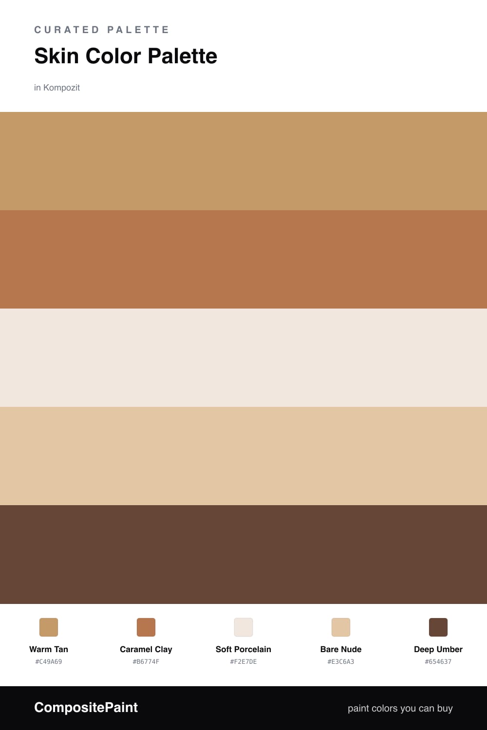
Skin tones make some of the most comforting paint colors you can pick, because your eye already trusts them. This scheme builds on a Warm Tan as the lead, the kind of soft, sun-touched shade that feels welcoming on a big wall.

Caramel Clay steps in as the richer partner, while Soft Porcelain keeps everything light and airy in the background. Bare Nude is the quiet bridge between them, so the move from pale to warm never feels abrupt.

For 2026, this kind of barely-there, lived-in warmth is exactly where things are heading. Save Deep Umber for the small, grounding moments — a door, a frame, a single piece of trim — and let the rest of the palette breathe.

Buy These Colors

Each color matched to the closest real paint in every brand, by ΔE2000. Kompozit first; take any SKU to the store — these mix on demand.

Warm Tan
#C99C72 · LRV 37 · Dominant
Kompozit Back to Basics · 0255 ΔE 2.68
Backdrop Rosita · BD-RO ΔE 13.06
Behr Fresh Croissant · S250-4 ΔE 1.6
Benjamin Moore Butternut Squash · 1090 ΔE 1.51
Clare Good as Gold · PNT100-DP-59 ΔE 5.59
Dunn-Edwards Tan Plan · DE6137 ΔE 2.86
Farrow & Ball India Yellow · No. 66 ΔE 6.72
Magnolia Home Juniper Tree · JG-166 ΔE 12.21
PPG / Glidden Doeskin · 1082-5 ΔE 1.26
Sherwin-Williams Caramelized · SW 9186 ΔE 1.66
Valspar Pale Blush · 3002-7C ΔE 1.78
Caramel Clay
#B07A4F · LRV 24 · Secondary
Kompozit Semolina · 1011 ΔE 2.84
Backdrop Old Soul · BD-OS ΔE 18.67
Behr Circus Peanut · S260-6 ΔE 4.34
Benjamin Moore Dark Mustard · 2161-30 ΔE 2.97
Clare Fire Sign · PNT100-DP-74 ΔE 10.19
Dunn-Edwards Saddle Brown · DE5264 ΔE 2.02
Farrow & Ball Red Earth · No. 64 ΔE 10.63
Magnolia Home Work Worn Wood · JG-35 ΔE 7.27
PPG / Glidden Cowboy Hat · 1082-6 ΔE 1.2
Sherwin-Williams Spiced Cider · SW 7702 ΔE 5.13
Valspar Leather Satchel · 3003-7B ΔE 1.92
Soft Porcelain
#F2E5D7 · LRV 80 · Base
Kompozit White Meadow · 1055 ΔE 2.17
Backdrop Don't Eat the Yellow Snow · BD-DS ΔE 5.48
Behr Chamois Cloth · W-F-110 ΔE 1.56
Benjamin Moore Pensacola Pink · 1184 ΔE 1.59
Clare Like Buttah · PNT100-LT-62 ΔE 2.3
Dunn-Edwards Finest Silk · DE6127 ΔE 0.47
Farrow & Ball Dimity · No. 2008 ΔE 1.65
Magnolia Home Carter Crème · JG-16 ΔE 3.91
PPG / Glidden Uptown Taupe · 1201-1 ΔE 0.5
Sherwin-Williams Crisp Linen · SW 6378 ΔE 1.74
Valspar Antique White · 7002-20 ΔE 1.43
Bare Nude
#E2C3A4 · LRV 58 · Support
Kompozit October Bounty · 0252 ΔE 1.94
Backdrop Boy Meets Girl · BD-BG ΔE 8.55
Behr Craft Juggler · MQ2-45 ΔE 0.85
Benjamin Moore Sycamore · 1137 ΔE 0.97
Clare Meet Cute · PNT100-LT-60 ΔE 7.27
Dunn-Edwards Adobe South · DEC709 ΔE 3.17
Farrow & Ball Savage Ground · No. 213 ΔE 4.04
Magnolia Home Cabbage Rose · JG-26 ΔE 9.44
PPG / Glidden My Love · 1081-3 ΔE 1.5
Sherwin-Williams Toasted Pine Nut · SW 7696 ΔE 3.74
Valspar So Baja · V086-2 ΔE 0.74
Deep Umber
#5A4030 · LRV 6 · Accent
Kompozit Hideaway · 0137 ΔE 3.26
Backdrop It's a Date · BD-IT ΔE 1.51
Behr Breakfast Blend · 280F-7 ΔE 3.21
Benjamin Moore Deep Taupe · 2111-10 ΔE 1.9
Clare Blackish · PNT100-DP-54 ΔE 12.88
Dunn-Edwards Northern Territory · DEA158 ΔE 3.52
Farrow & Ball Mahogany · No. 36 ΔE 8.33
Magnolia Home Wooded Acres · JG-122 ΔE 7.83
PPG / Glidden Racy Raisin · 16-24 ΔE 6.68
Sherwin-Williams Van Dyke Brown · SW 7041 ΔE 4.4
Valspar Roasted Coffee · 2009-10 ΔE 3.31

Questions

Why do these skin-tone colors look so calm together?

They all share the same warm, earthy undertone, so they blend the way real skin shades do — nothing fights, it just feels natural and easy to live with.

How do I keep a nude palette from looking flat?

Lean on the contrast — let the soft porcelain and the deep umber anchor the ends, so the tans and caramel in the middle have room to glow.

Similar Palettes

Closest schemes by color — not by label.