CP

Skin Tone Color Palette — Bare Skin

A warm five-color scheme moving from soft porcelain through caramel and warm tan to deep umber, every color matched to real paint you can buy.

By Emily Roberts · DIY Editor & First-Timer's Guide

Soft Porcelain
Base
Kompozit Antique Candle Light · 0040
#F4E1D6
LRV 78
Warm Tan
Dominant
Kompozit Crowned One · 0238
#D4B597
LRV 49
Golden Caramel
Secondary
Kompozit Gold Metal · 0998
#B17743
LRV 23
Rosy Nude
Support
Kompozit Calliope · 0044
#C89A8D
LRV 37
Deep Umber
Accent
Kompozit Film Noir · 0144
#473933
LRV 5
View palette in

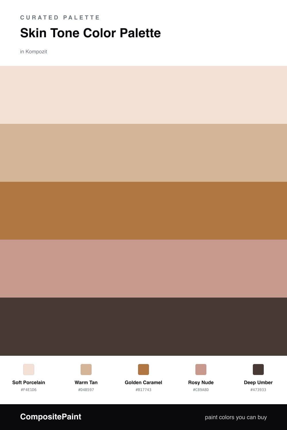
Skin tones make some of the easiest palettes to live with, because they are the colors we are already surrounded by every day. This scheme gathers a full range of them, from the palest Soft Porcelain to a rich Deep Umber, so nothing feels washed out.

In the middle, Warm Tan does most of the heavy lifting — it is that easy, glowing nude that reads warm without going orange. Golden Caramel adds a little more honey and depth, while Rosy Nude brings in the faintest pink blush that keeps the whole group looking alive instead of beige.

For 2026 this kind of soft, warm-neutral mix feels right at home. Let Warm Tan lead, brighten things up with Soft Porcelain, and use just a touch of Deep Umber to anchor it all so the palette has somewhere solid to rest.

Buy These Colors

Each color matched to the closest real paint in every brand, by ΔE2000. Kompozit first; take any SKU to the store — these mix on demand.

Soft Porcelain
#F2E4D7 · LRV 79 · Base
Kompozit Antique Candle Light · 0040 ΔE 2.75
Backdrop Don't Eat the Yellow Snow · BD-DS ΔE 6.29
Behr Chamois Cloth · W-F-110 ΔE 0.78
Benjamin Moore Pensacola Pink · 1184 ΔE 0.79
Clare Like Buttah · PNT100-LT-62 ΔE 3.09
Dunn-Edwards Finest Silk · DE6127 ΔE 1.21
Farrow & Ball Dimity · No. 2008 ΔE 2.37
Magnolia Home Carter Crème · JG-16 ΔE 4.69
PPG / Glidden Uptown Taupe · 1201-1 ΔE 0.46
Sherwin-Williams Crisp Linen · SW 6378 ΔE 2.47
Valspar Nice and Easy · V168 ΔE 1.98
Warm Tan
#D8B795 · LRV 51 · Dominant
Kompozit Crowned One · 0238 ΔE 1.36
Backdrop Boy Meets Girl · BD-BG ΔE 9.41
Behr Creme De Caramel · HDC-NT-04 ΔE 1.06
Benjamin Moore Lingerie · AF-200 ΔE 0.94
Clare Greige · PNT100-LT-13 ΔE 11.34
Dunn-Edwards Terracotta Sand · DE6136 ΔE 1.74
Farrow & Ball Cord · No. 16 ΔE 6.33
Magnolia Home Summer Pear · JG-44 ΔE 9.25
PPG / Glidden Nutmeg Glow · 1080-3 ΔE 0.93
Sherwin-Williams Bagel · SW 6114 ΔE 0.59
Valspar Diplomatic · M125 ΔE 2.17
Golden Caramel
#B07A4E · LRV 24 · Secondary
Kompozit Gold Metal · 0998 ΔE 2.13
Backdrop Old Soul · BD-OS ΔE 18.58
Behr Roasted Cashew · S250-5 ΔE 3.89
Benjamin Moore Dark Mustard · 2161-30 ΔE 2.82
Clare Fire Sign · PNT100-DP-74 ΔE 10.39
Dunn-Edwards Saddle Brown · DE5264 ΔE 2.3
Farrow & Ball Red Earth · No. 64 ΔE 10.9
Magnolia Home Work Worn Wood · JG-35 ΔE 7.49
PPG / Glidden Cowboy Hat · 1082-6 ΔE 1.07
Sherwin-Williams Tigereye · SW 6362 ΔE 3.34
Valspar Leather Satchel · 3003-7B ΔE 1.91
Rosy Nude
#C99B86 · LRV 38 · Support
Kompozit Calliope · 0044 ΔE 3.33
Backdrop Rosita · BD-RO ΔE 5.72
Behr Canyon Dusk · S210-4 ΔE 2.13
Benjamin Moore Nutmeg · 1227 ΔE 2.65
Clare Subrosa · PNT100-MD-76 ΔE 4.21
Dunn-Edwards Tawny Amber · DE5214 ΔE 4.34
Farrow & Ball Dead Salmon · No. 28 ΔE 7.39
Magnolia Home Rustic Oak · JG-110 ΔE 11.67
PPG / Glidden Summer Spice · 16-02 ΔE 4.62
Sherwin-Williams Rose Tan · SW 69 ΔE 1.01
Valspar Naked Clay · 1008-10A ΔE 3.03
Deep Umber
#5A3A28 · LRV 5 · Accent
Kompozit Film Noir · 0144 ΔE 8.56
Backdrop It's a Date · BD-IT ΔE 4.3
Behr Brown Velvet · N160-7 ΔE 5.23
Benjamin Moore Chocolate Sundae · 2113-10 ΔE 4.52
Clare Blackish · PNT100-DP-54 ΔE 15.25
Dunn-Edwards Northern Territory · DEA158 ΔE 5.62
Farrow & Ball Brinjal · No. 222 ΔE 12.44
Magnolia Home Moody Fig · JG-155 ΔE 10.42
PPG / Glidden Dark Granite · 1005-7 ΔE 10.07
Sherwin-Williams Terra Brun · SW 6048 ΔE 3.6
Valspar Brown Hen · M122 ΔE 4.87

Questions

How do I keep a all-neutral skin-tone scheme from looking flat?

Lean on the range. Pair the palest **Soft Porcelain** against the darkest **Deep Umber** so there is real contrast, then let **Warm Tan** and **Golden Caramel** fill the middle. The jump from lightest to darkest is what gives a soft palette like this its depth.

Which color should I use the most?

Use **Warm Tan** as your main color since it is easy to live with on big surfaces, keep **Soft Porcelain** for the brightest spots, and save **Deep Umber** for small grounding touches like trim or a single piece of furniture.

Similar Palettes

Closest schemes by color — not by label.