CP

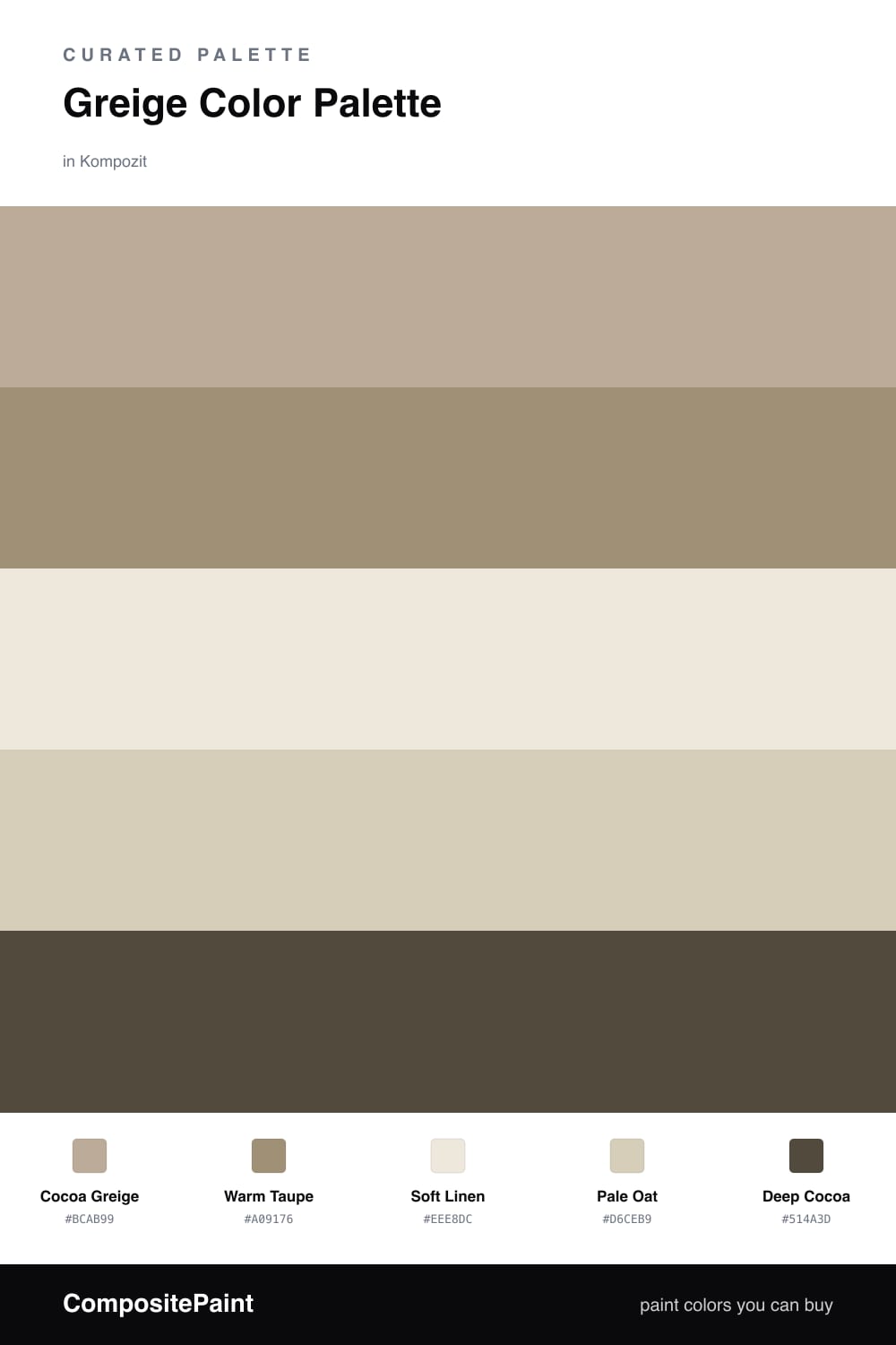
Greige Color Palette — Cocoa Calm

A soft five-color greige scheme led by a warm cocoa-tinted greige, layered with creamy neutrals and one deep cocoa accent — every color matched to real paint you can buy.

By Emily Roberts · DIY Editor & First-Timer's Guide

Cocoa Greige
Dominant
Kompozit Delicate Honeysweet · 0189
#BCAB99
LRV 42
Warm Taupe
Secondary
Kompozit Whipcord · 0338
#A09176
LRV 29
Soft Linen
Base
Kompozit Hint of Vanilla · 0001
#EEE8DC
LRV 81
Pale Oat
Support
Kompozit Velum Smoke · 0342
#D6CEB9
LRV 62
Deep Cocoa
Accent
Kompozit Deep Shadow · 0445
#514A3D
LRV 7
View palette in

Greige is having a long, well-deserved moment, and this version adds a quiet hint of cocoa to keep things cozy. Cocoa Greige leads the whole scheme. It is that perfect not-quite-gray, not-quite-beige tone that makes a room feel calm and put-together without trying too hard.

Around it, Warm Taupe adds a little depth for cabinets or built-ins, while Soft Linen and Pale Oat keep everything light and airy. Think of these three as your supporting cast, the colors that let the greige breathe.

The fun part is Deep Cocoa. Just a touch of it, on a front door, a kitchen island, or a single accent wall, gives the whole palette a grounded, 2026-modern edge. Keep it small and let the greige stay the star.

Buy These Colors

Each color matched to the closest real paint in every brand, by ΔE2000. Kompozit first; take any SKU to the store — these mix on demand.

Cocoa Greige
#B9AC99 · LRV 42 · Dominant
Kompozit Delicate Honeysweet · 0189 ΔE 2.18
Backdrop Le Freak · BD-LF ΔE 10.14
Behr Nile Sand · UL170-19 ΔE 1.86
Benjamin Moore Baja Dunes · 997 ΔE 1.4
Clare Money Moves · PNT100-MD-48 ΔE 8.8
Dunn-Edwards Trail Dust · DE6123 ΔE 3.78
Farrow & Ball Hardwick White · No. 5 ΔE 3.36
Magnolia Home Drawing Room · JG-157 ΔE 2.85
PPG / Glidden True Khaki · 14-27 ΔE 2.31
Sherwin-Williams Portico · SW 7548 ΔE 1.45
Valspar Ivory Brown · 6006-1C ΔE 0.79
Warm Taupe
#A2917C · LRV 29 · Secondary
Kompozit Whipcord · 0338 ΔE 2.95
Backdrop Anita · BD-AN ΔE 2.55
Behr Cozy Cocoa · BNC-13 ΔE 2.01
Benjamin Moore Alexandria Beige · HC-77 ΔE 0.52
Clare Shade · PNT100-MD-14 ΔE 9.58
Dunn-Edwards Bison Beige · DEC750 ΔE 1.71
Farrow & Ball Charleston Gray · No. 243 ΔE 4.64
Magnolia Home Homebody · JG-136 ΔE 6.62
PPG / Glidden Oyster Shell · 14-13 ΔE 0.97
Sherwin-Williams Utaupeia · SW 9088 ΔE 2.6
Valspar Stone Terrace · 8005-5E ΔE 1.17
Soft Linen
#EFE8DB · LRV 81 · Base
Kompozit Hint of Vanilla · 0001 ΔE 0.53
Backdrop Jane · BD-JA ΔE 2.57
Behr Ivory Palace · PPU10-14 ΔE 0.94
Benjamin Moore Candle White · 2164-70 ΔE 2.01
Clare Like Buttah · PNT100-LT-62 ΔE 2.27
Dunn-Edwards Ball of String · DE6190 ΔE 0.81
Farrow & Ball James White · No. 2010 ΔE 2.55
Magnolia Home Antique Rose · JG-23 ΔE 0.5
PPG / Glidden Sugar Soap · 1084-1 ΔE 0.44
Sherwin-Williams Creamy · SW 7012 ΔE 0
Valspar Dover White · 7007-1 ΔE 0.49
Pale Oat
#D8CDBA · LRV 62 · Support
Kompozit Velum Smoke · 0342 ΔE 1.91
Backdrop Real Real · BD-RR ΔE 1.86
Behr Bell Tower · MQ3-15 ΔE 1.09
Benjamin Moore Timson Sand · CW-140 ΔE 0.4
Clare Flatiron · PNT100-LT-17 ΔE 3.26
Dunn-Edwards Heather · DEC773 ΔE 1.92
Farrow & Ball Joa's White · No. 226 ΔE 1.87
Magnolia Home Plaster · JG-156 ΔE 1.12
PPG / Glidden Crushed Silk · 1024-3 ΔE 1.09
Sherwin-Williams Wool Skein · SW 6148 ΔE 1.15
Valspar Rattan Basket · 3007-10C ΔE 1.33
Deep Cocoa
#5A4636 · LRV 7 · Accent
Kompozit Deep Shadow · 0445 ΔE 7
Backdrop It's a Date · BD-IT ΔE 2.21
Behr Moose Trail · N190-7 ΔE 0.92
Benjamin Moore Taupe · 2110-10 ΔE 1.85
Clare Blackish · PNT100-DP-54 ΔE 10.76
Dunn-Edwards Northern Territory · DEA158 ΔE 4.19
Farrow & Ball Mahogany · No. 36 ΔE 7.4
Magnolia Home Wooded Acres · JG-122 ΔE 5.39
PPG / Glidden Racy Raisin · 16-24 ΔE 6.2
Sherwin-Williams Van Dyke Brown · SW 7041 ΔE 1.5
Valspar Buckeye · 8005-8G ΔE 1.9

Questions

What exactly is greige?

Greige is gray plus beige mixed together. It gives you the calm, clean feel of gray with the cozy warmth of beige, so it never reads cold. This one leans warm thanks to a soft cocoa tint.

How do I use these five colors in one space?

Let Cocoa Greige cover the most surface, like your walls. Use Warm Taupe and Pale Oat on trim, cabinets, or furniture, keep Soft Linen for ceilings and crisp moments, and save Deep Cocoa for small accents like a door or a chair.

Similar Palettes

Closest schemes by color — not by label.