CP

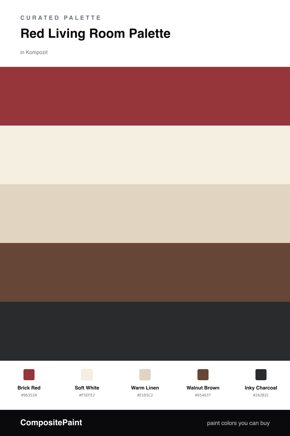
Red Living Room Palette — Brick Red & Warm Linen

A confident five-color living room scheme led by a deep brick red, softened with warm linen and crisp white, grounded by walnut and a near-black accent — every color matched to real paint you can buy.

By Emily Roberts · DIY Editor & First-Timer's Guide

Brick Red
Walls
Kompozit Romantic Night · 1138
#96353A
LRV 9
Soft White
Trim & Ceiling
Kompozit Bunny Cake · 0012
#F5EFE2
LRV 87
Warm Linen
Cabinets or Vanity
Kompozit Illusive Dream · 0335
#E1D5C2
LRV 67
Walnut Brown
Wood & Floors
Kompozit Hideaway · 0137
#654637
LRV 7
Inky Charcoal
Accent
Kompozit Silent Sea · 0515
#2A2B2C
LRV 2
View palette in

Red gets a bad rap for being loud, but a grounded Brick Red is one of the coziest colors you can put on a living room wall. It is warm and a little earthy, the kind of red that glows in lamplight instead of shouting at you.

To keep it from feeling closed in, lean on Soft White for the ceiling and trim and Warm Linen on any built-ins or cabinetry. Those lighter tones give your eyes a place to rest, so the red feels rich and intentional rather than heavy.

Then ground the whole thing with Walnut Brown on floors and wood furniture, and add just a few touches of Inky Charcoal — a lamp base, a frame, a metal shelf. That last dark note is what makes a 2026 red room feel pulled together instead of dated.

Buy These Colors

Each color matched to the closest real paint in every brand, by ΔE2000. Kompozit first; take any SKU to the store — these mix on demand.

Brick Red
#9B3A35 · LRV 10 · Walls
Kompozit Romantic Night · 1138 ΔE 3.62
Backdrop Punk Rock · BD-PR ΔE 2.84
Behr Bijou Red · UL110-16 ΔE 2.15
Benjamin Moore Deep Rose · 2004-10 ΔE 1.93
Clare Vintage · PNT100-DP-67 ΔE 10.35
Dunn-Edwards Scarlet Past · DEA150 ΔE 2.91
Farrow & Ball Incarnadine · No. 248 ΔE 3.81
Magnolia Home Brave And Bold · JG-32 ΔE 3.55
PPG / Glidden Blaze · 13-16 ΔE 2.73
Sherwin-Williams Chinese Red · SW 57 ΔE 2.14
Valspar Pop of Poppy · M253 ΔE 2.73
Soft White
#F4EFE6 · LRV 87 · Trim & Ceiling
Kompozit Bunny Cake · 0012 ΔE 1.68
Backdrop Tabula Rasa · BD-TR ΔE 2.01
Behr Nude W-f-210 · W-F-210 ΔE 1.69
Benjamin Moore Alabaster · 876 ΔE 1.13
Clare Wing It · PNT100-LT-24 ΔE 2.07
Dunn-Edwards Antique Paper · DE6218 ΔE 0.59
Farrow & Ball Pointing · No. 2003 ΔE 2.12
Magnolia Home Silos White · JG-107 ΔE 1.5
PPG / Glidden Crumb Cookie · 18-01 ΔE 1.69
Sherwin-Williams White Flour · SW 7102 ΔE 0.46
Valspar Crisp Cotton · 7007-4 ΔE 0.47
Warm Linen
#E3D6C0 · LRV 68 · Cabinets or Vanity
Kompozit Illusive Dream · 0335 ΔE 1.1
Backdrop Cookies & Cream · BD-CC ΔE 2.57
Behr Wax Sculpture · PPU7-17 ΔE 0.23
Benjamin Moore Muslin · 1037 ΔE 0.87
Clare Neutral Territory · PNT100-LT-20 ΔE 3.18
Dunn-Edwards Sand Dollar · DE6171 ΔE 1.39
Farrow & Ball Matchstick · No. 2013 ΔE 1.14
Magnolia Home Morning Snow · JG-167 ΔE 1.45
PPG / Glidden Alpaca Wool · 14-19 ΔE 1.14
Sherwin-Williams Lotus Pod · SW 7572 ΔE 1.67
Valspar Savoury Beige · 3002-10C ΔE 1.48
Walnut Brown
#5A4231 · LRV 6 · Wood & Floors
Kompozit Hideaway · 0137 ΔE 3.88
Backdrop It's a Date · BD-IT ΔE 1.21
Behr Breakfast Blend · 280F-7 ΔE 2
Benjamin Moore Deep Taupe · 2111-10 ΔE 1.09
Clare Blackish · PNT100-DP-54 ΔE 12.29
Dunn-Edwards Northern Territory · DEA158 ΔE 3.86
Farrow & Ball Mahogany · No. 36 ΔE 8.26
Magnolia Home Wooded Acres · JG-122 ΔE 7.09
PPG / Glidden Racy Raisin · 16-24 ΔE 6.75
Sherwin-Williams Van Dyke Brown · SW 7041 ΔE 3.3
Valspar Roasted Coffee · 2009-10 ΔE 4.56
Inky Charcoal
#262321 · LRV 2 · Accent
Kompozit Silent Sea · 0515 ΔE 3.83
Backdrop Hocus Pocus · BD-HP ΔE 5.13
Behr Beluga · 770F-7 ΔE 7.89
Benjamin Moore Black · PM-9 ΔE 4.02
Clare Blackish · PNT100-DP-54 ΔE 11.57
Dunn-Edwards Black · DEA187 ΔE 7.46
Farrow & Ball Pitch Black · No. 256 ΔE 7.03
Magnolia Home Blackboard · JG-05 ΔE 7.71
PPG / Glidden Black Magic · 1001-7 ΔE 9.37
Sherwin-Williams Tricorn Black · SW 6258 ΔE 4.48
Valspar Tuxedo · 8006-8G ΔE 5.75

Questions

Will a red living room feel too dark or overwhelming?

Not when you balance it. The brick red lives on the walls, but the soft white ceiling and trim lift the room and the warm linen on built-ins keeps it gentle, so the red reads cozy rather than heavy.

How much red should I actually use?

Let red lead on roughly half to two-thirds of the room, mostly the walls. Keep the white and linen as breathing room, the walnut on floors and furniture, and save the inky charcoal for small touches like a lamp base or frame.

Similar Palettes

Closest schemes by color — not by label.