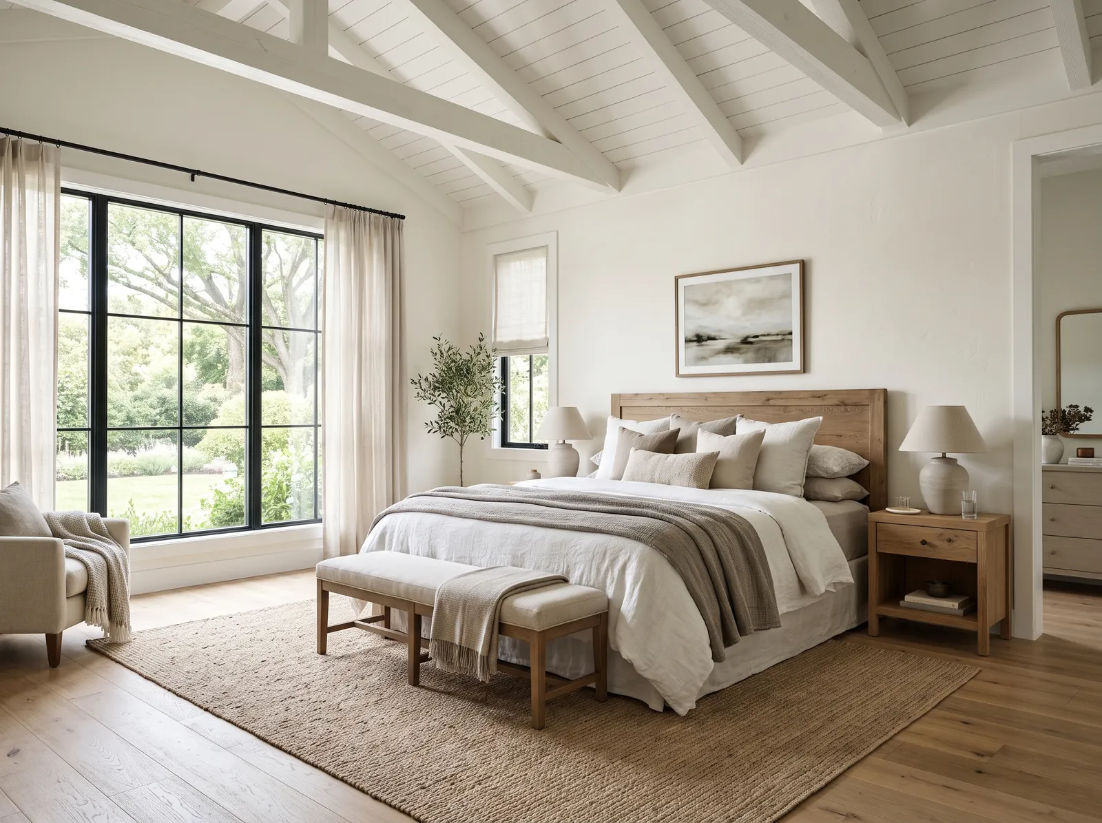
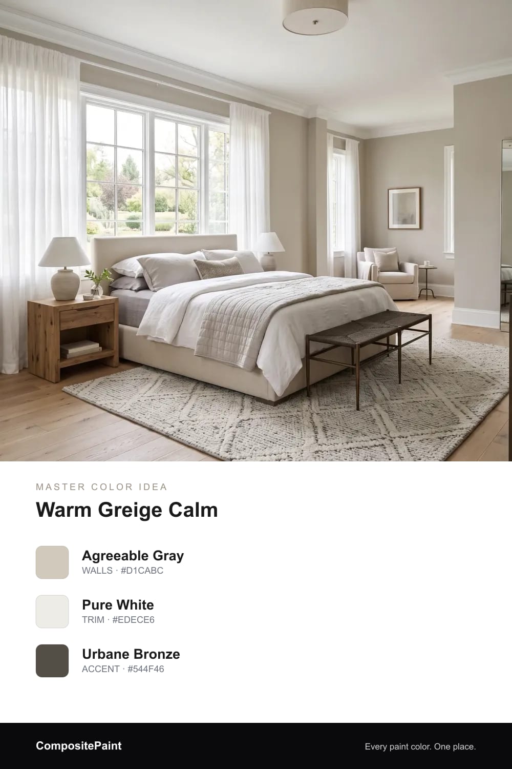
1. Warm Greige Calm
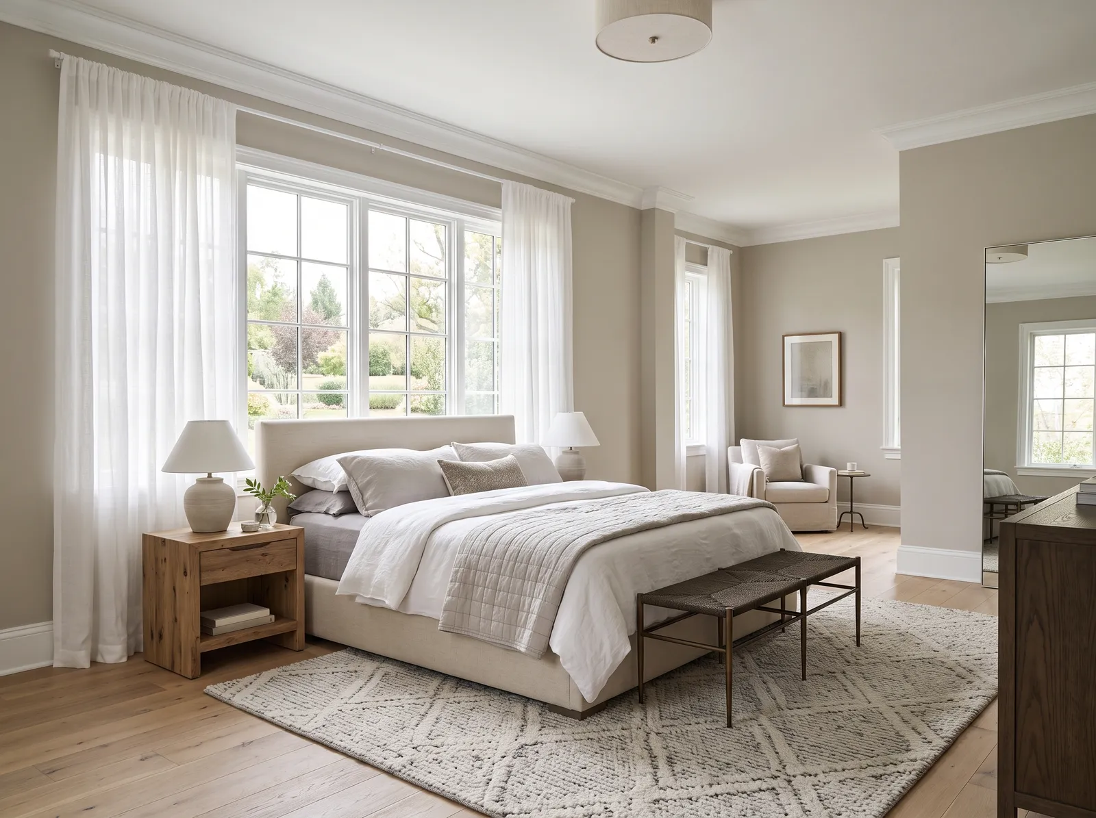
A soft greige that feels warm and quiet, settling the whole room so you relax the second you lie down.
Your master bedroom is the one room that is just for you, so the color should feel calm the moment you walk in. The looks below run from soft, restful neutrals to deep, cocooning shades that a bigger room can easily carry. Take your time and picture each one waking up with you in the morning.
By Jessica Williams · Color Stylist
A soft greige that feels warm and quiet, settling the whole room so you relax the second you lie down.
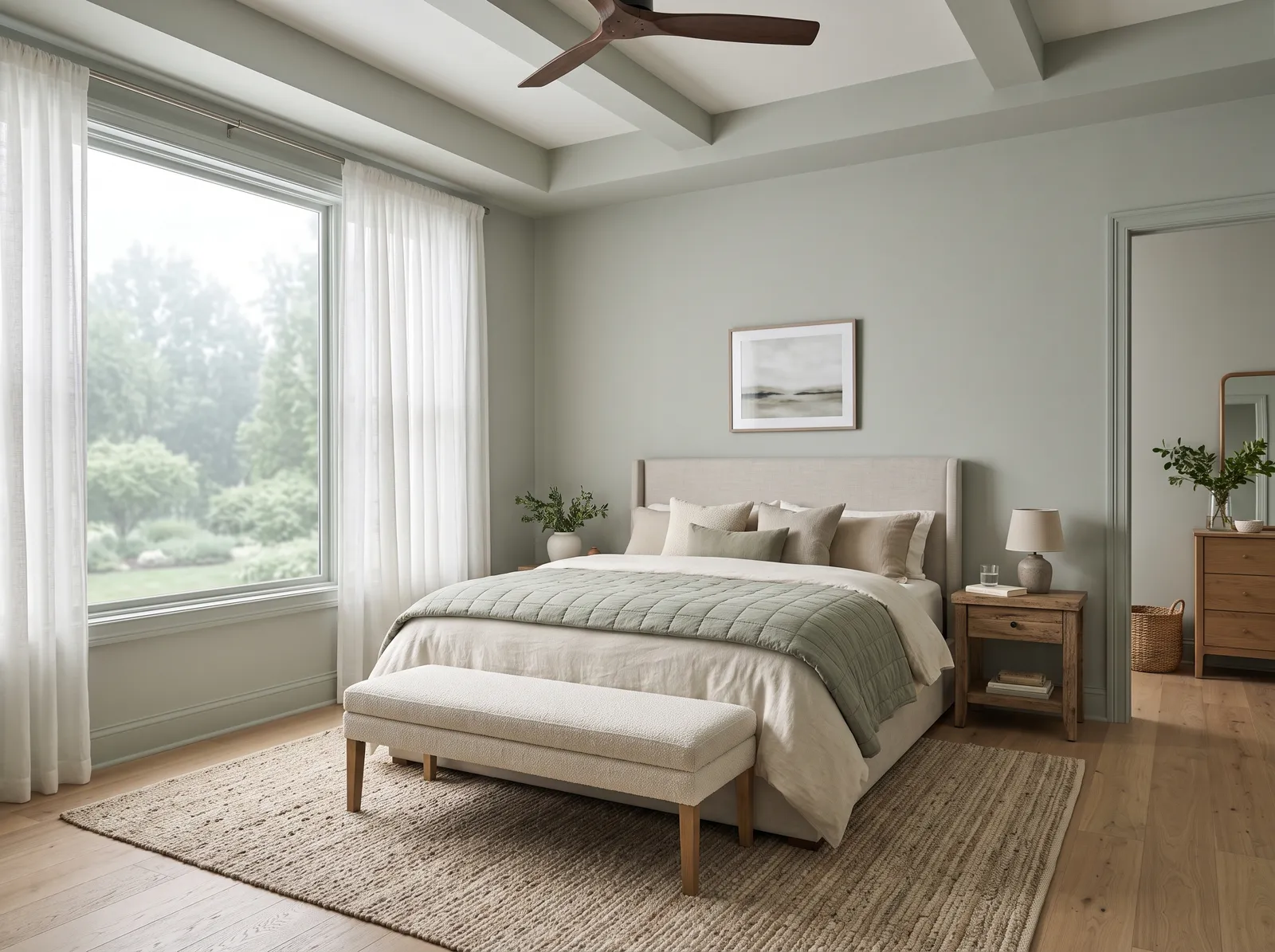
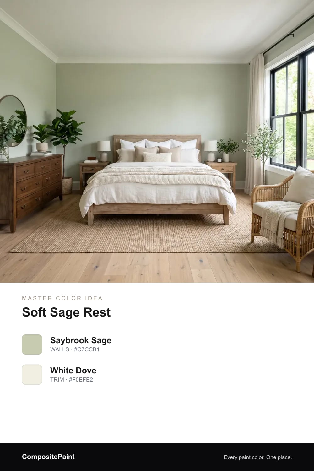
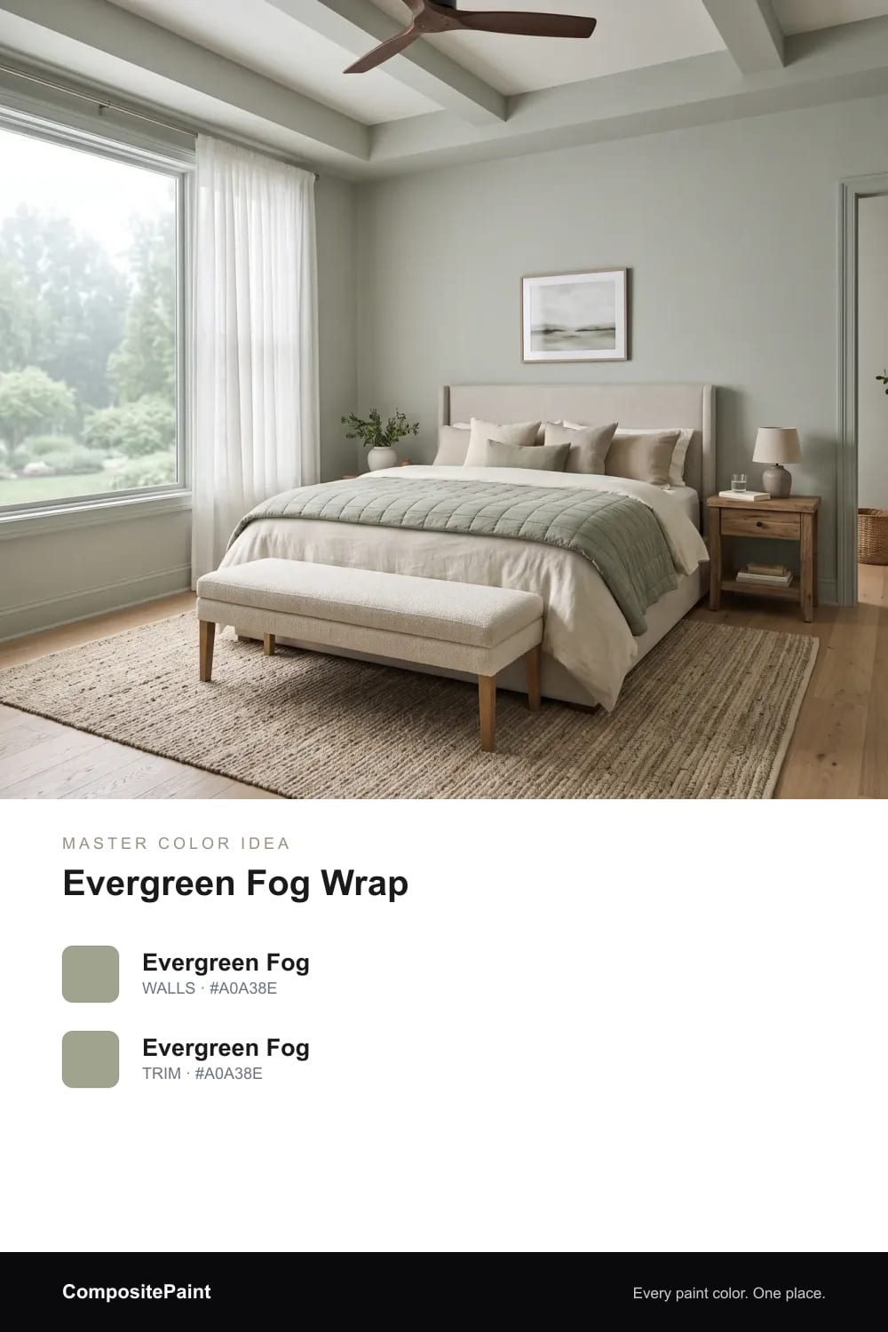
A gentle green-gray sage that brings a little of the garden inside and makes the bedroom feel fresh and easy.
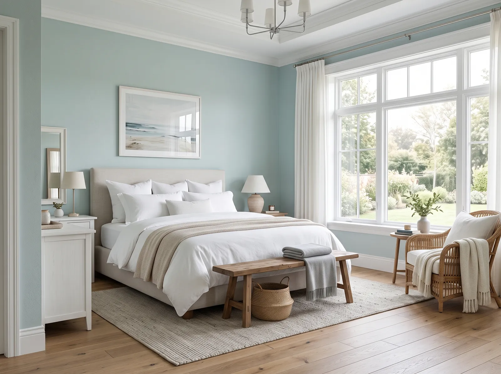
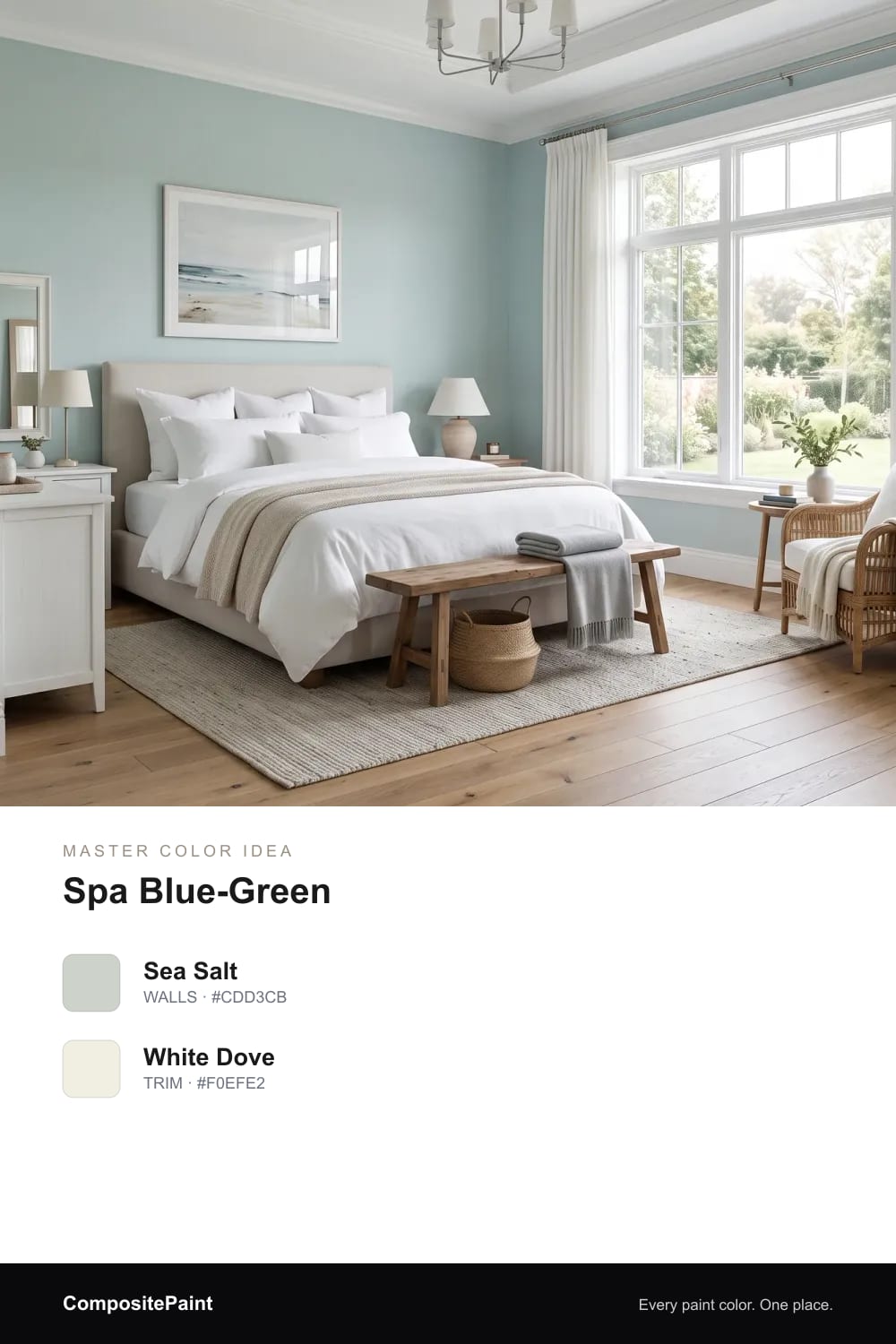
A watery blue-green that feels like a quiet spa, cool and clean and made for slow, restful mornings.
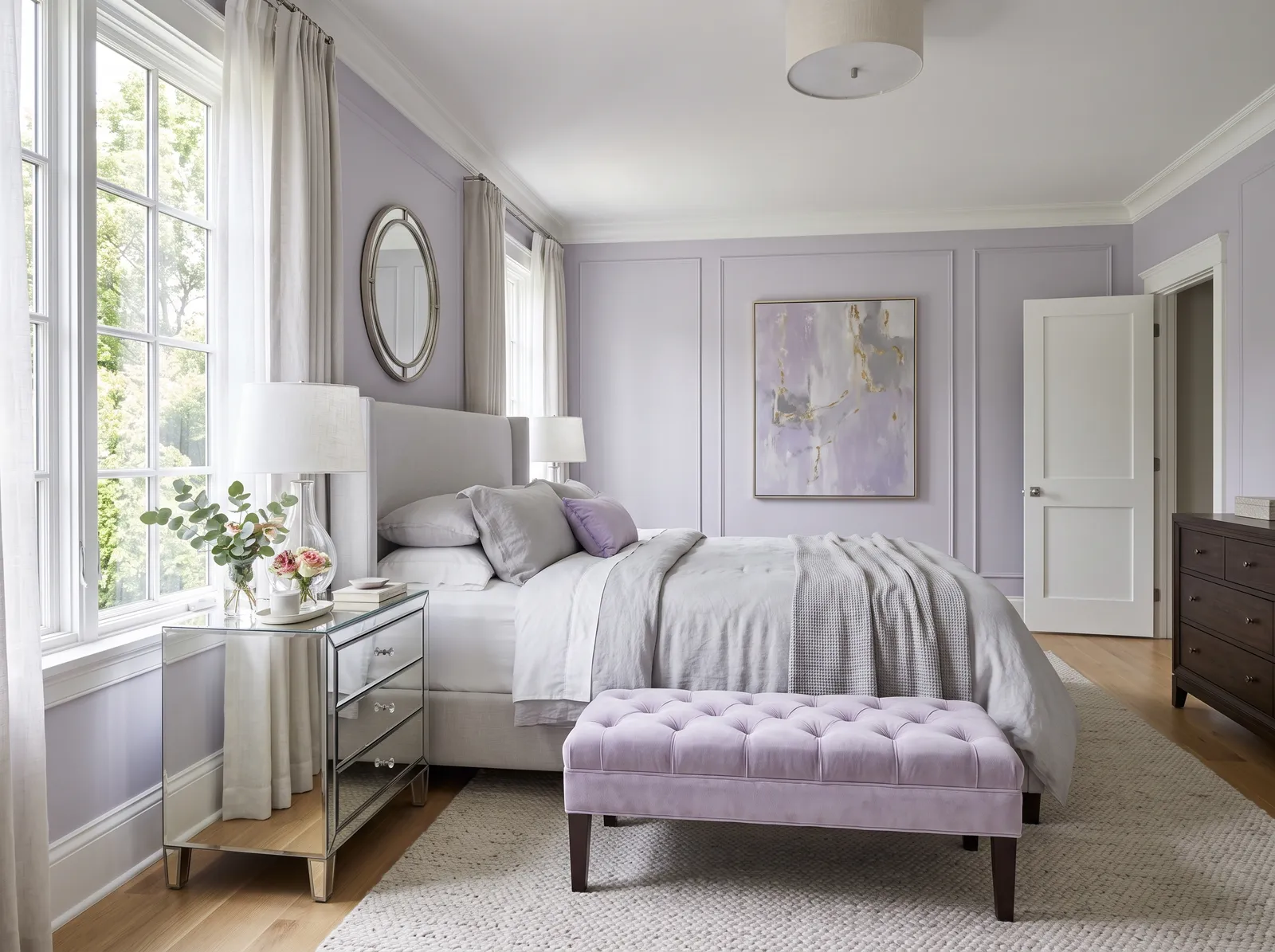
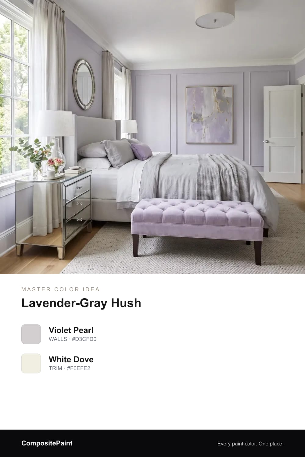
A barely-there lavender-gray that stays soft and grown-up, never sweet, and reads as the quietest kind of calm.
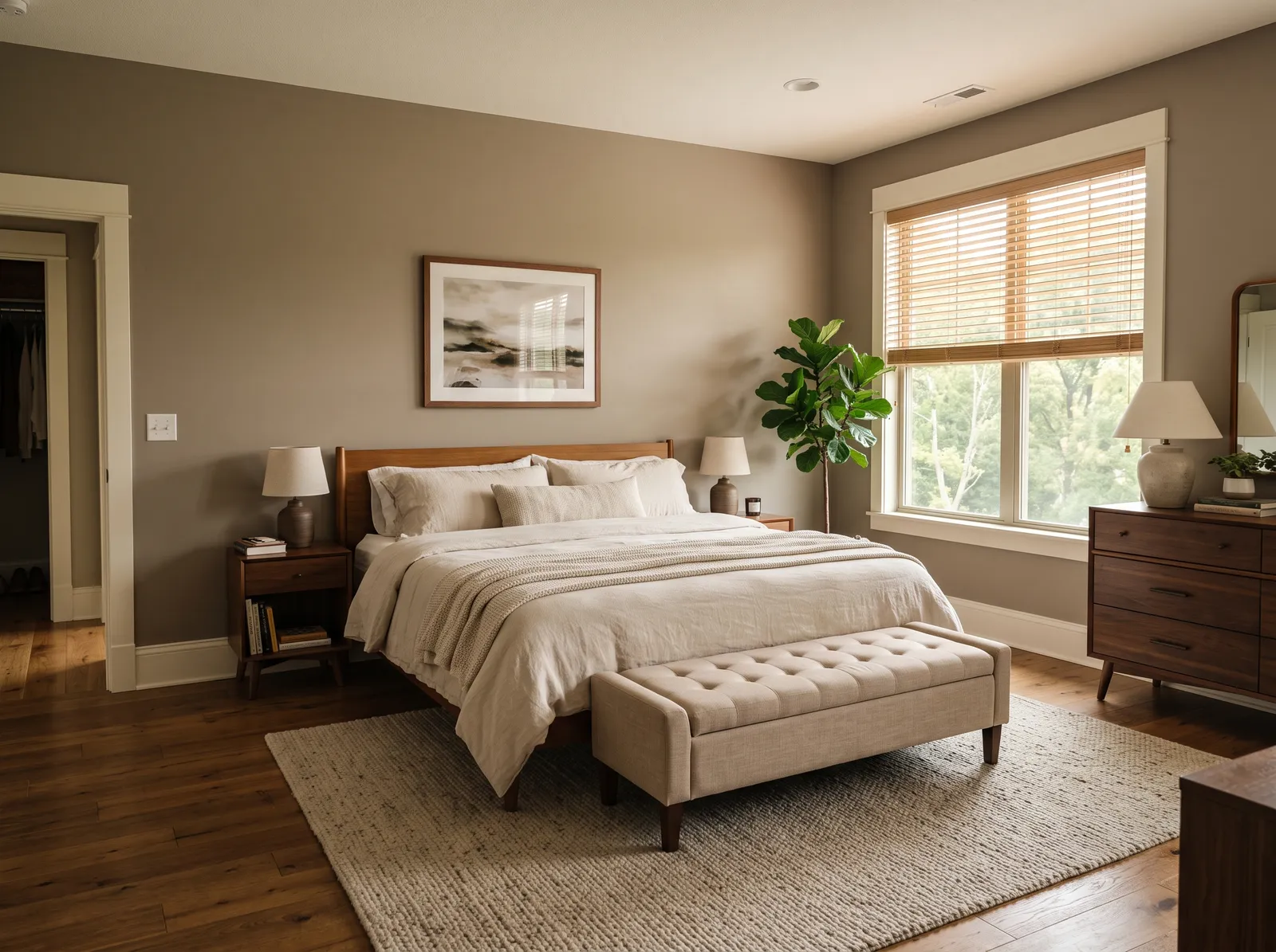
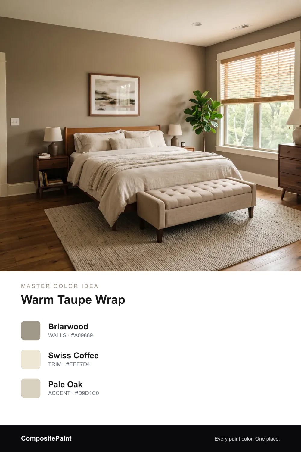
A deeper warm taupe that hugs the room like soft suede and makes the bed feel even more inviting.
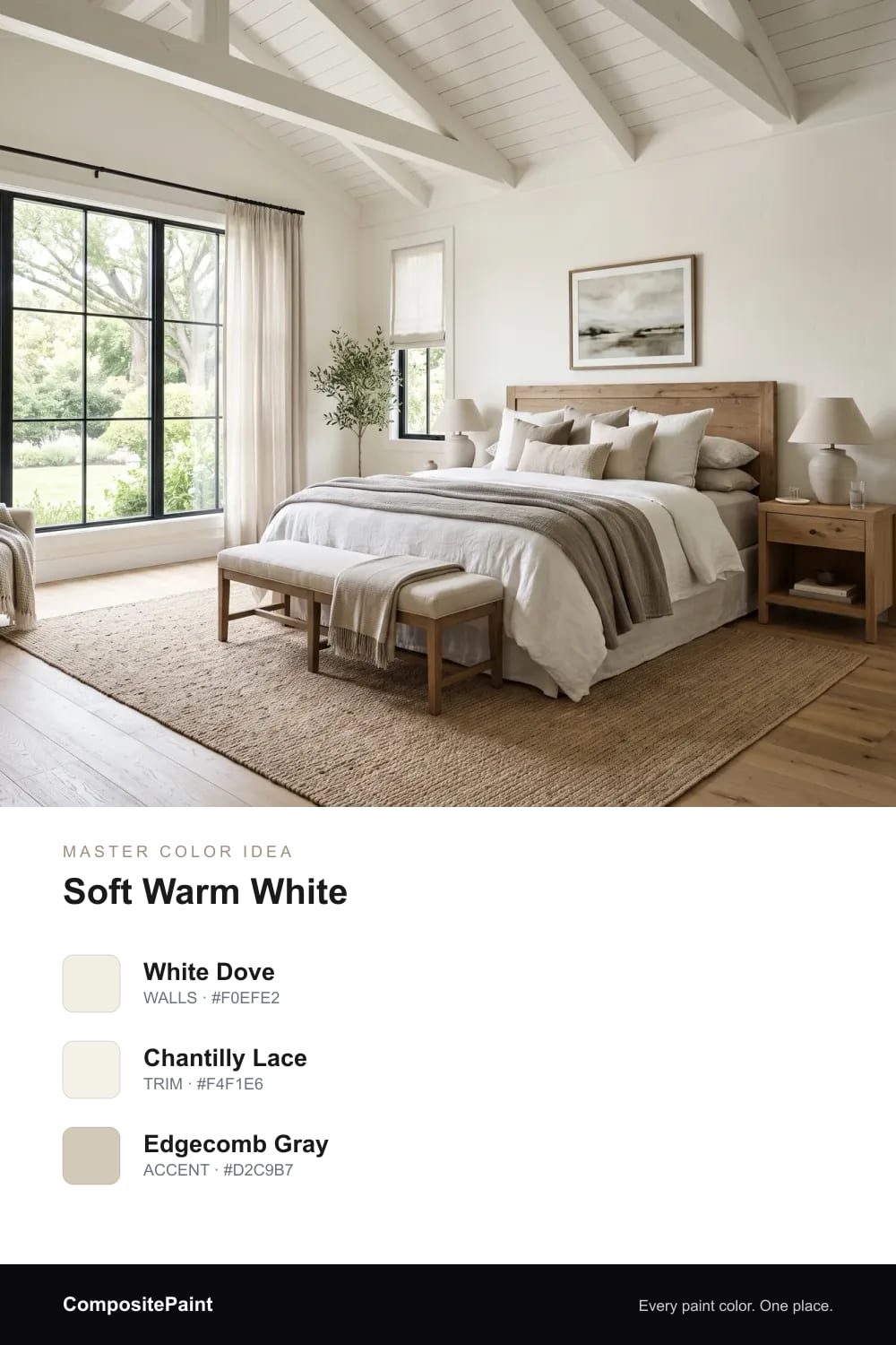
A creamy white with the smallest bit of warmth, light and airy yet still soft enough to feel restful.
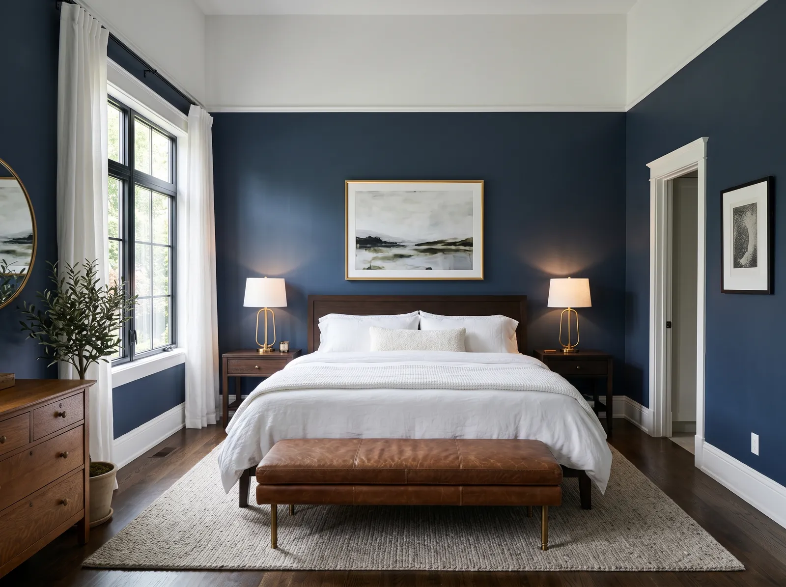
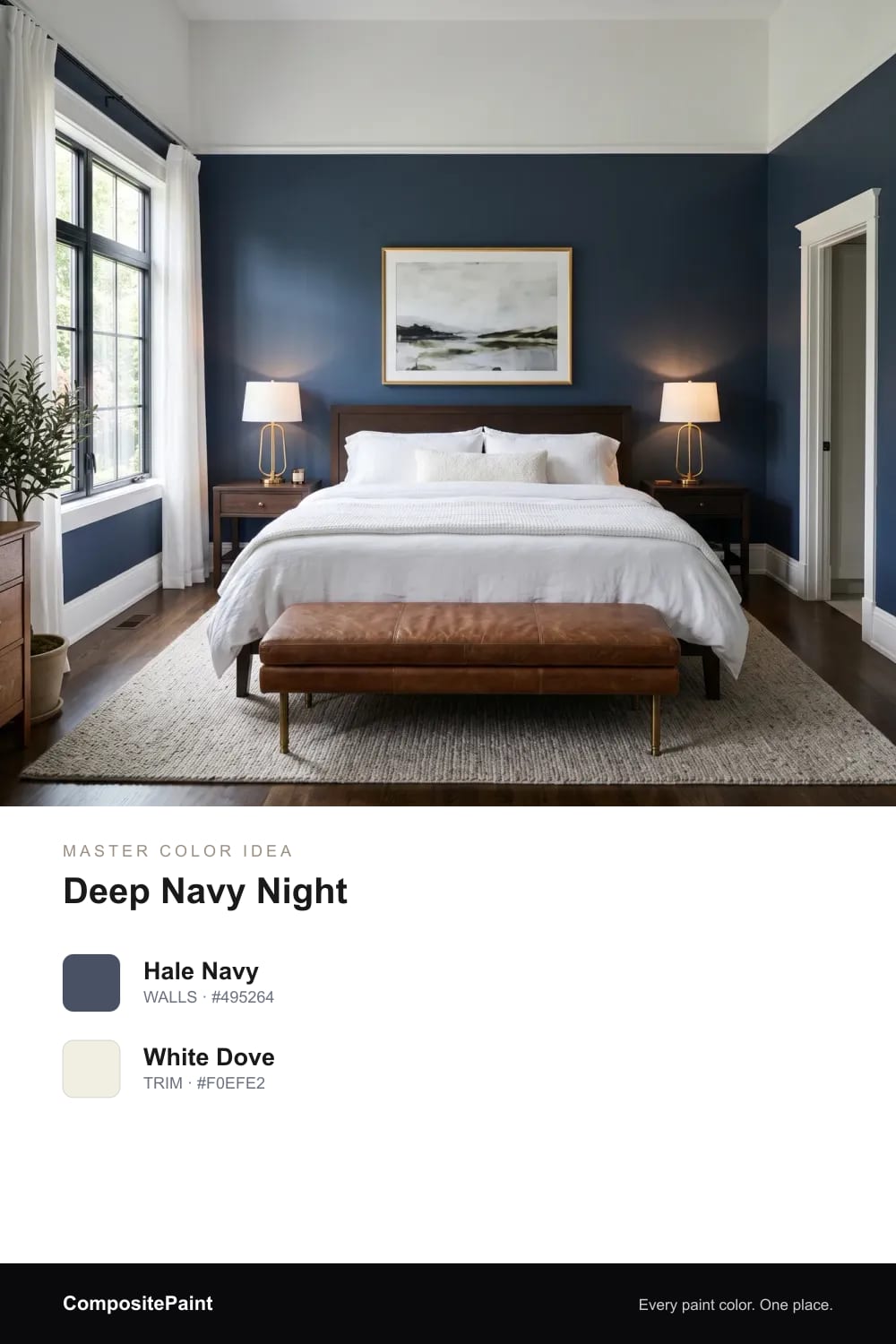
A rich, grown-up navy that turns the bedroom into a snug retreat and makes white bedding glow against it.
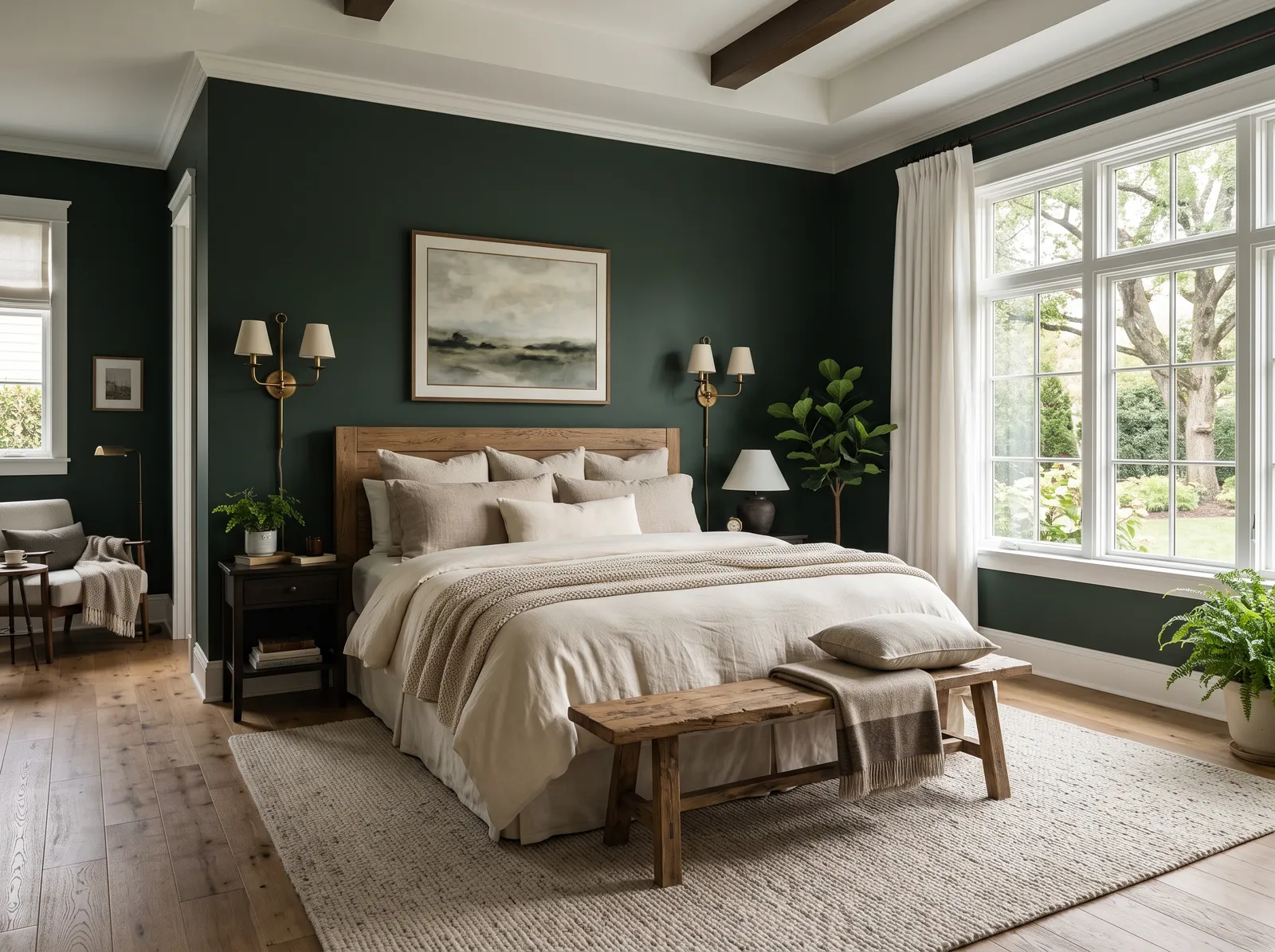
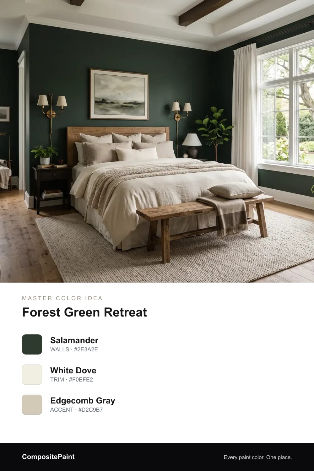
A deep forest green that feels like a quiet walk in the woods and wraps the bed in calm, cocooning color.
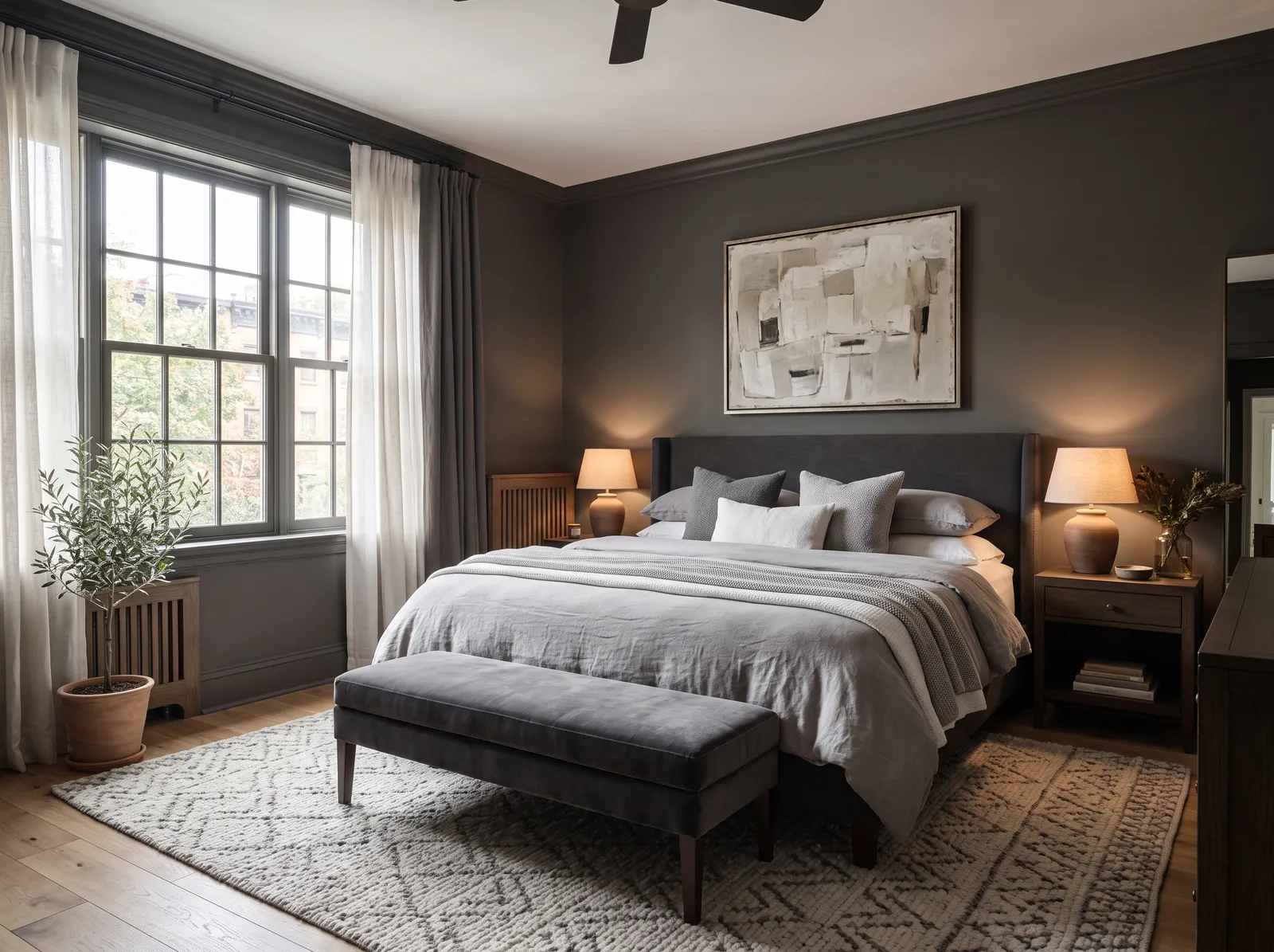
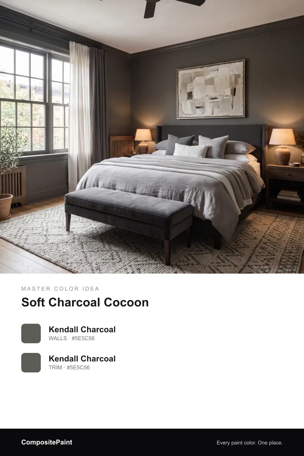
A soft warm charcoal taken over walls and trim alike, so the whole room feels wrapped, still and deeply restful.
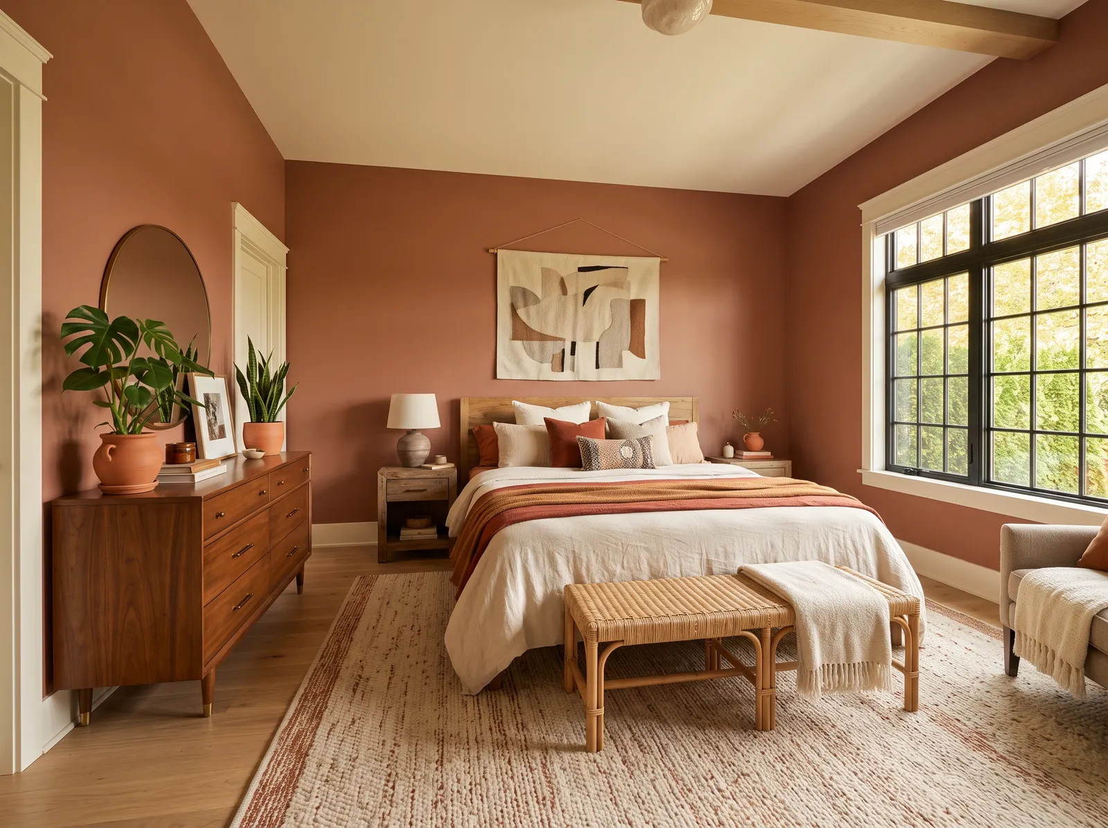
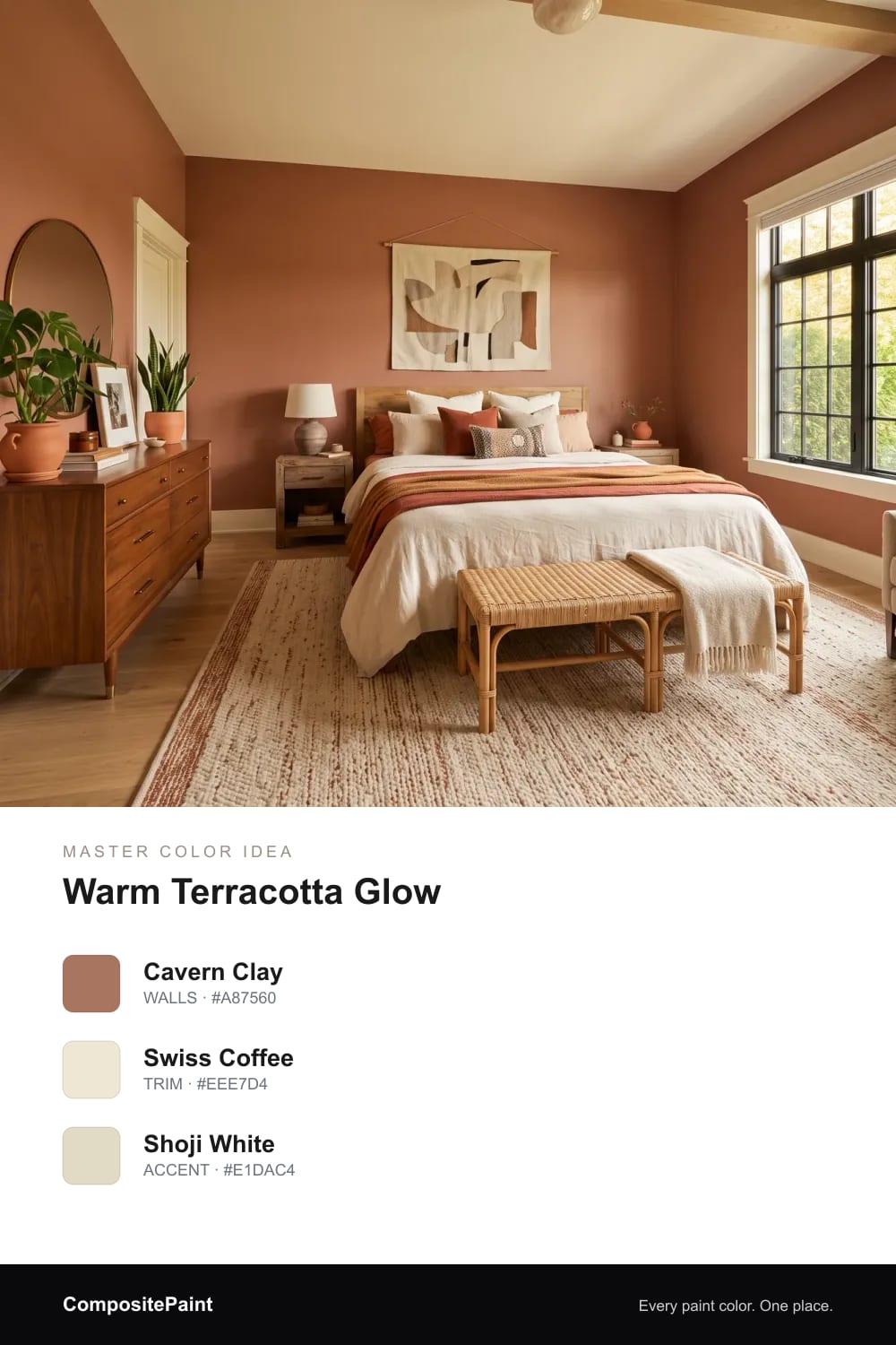
A clay-warm terracotta that glows in evening light and gives the bedroom a grounded, sun-baked sort of comfort.
A designer-loved gray-green taken right over the trim, soft and misty, for a calm room that feels finished and full.
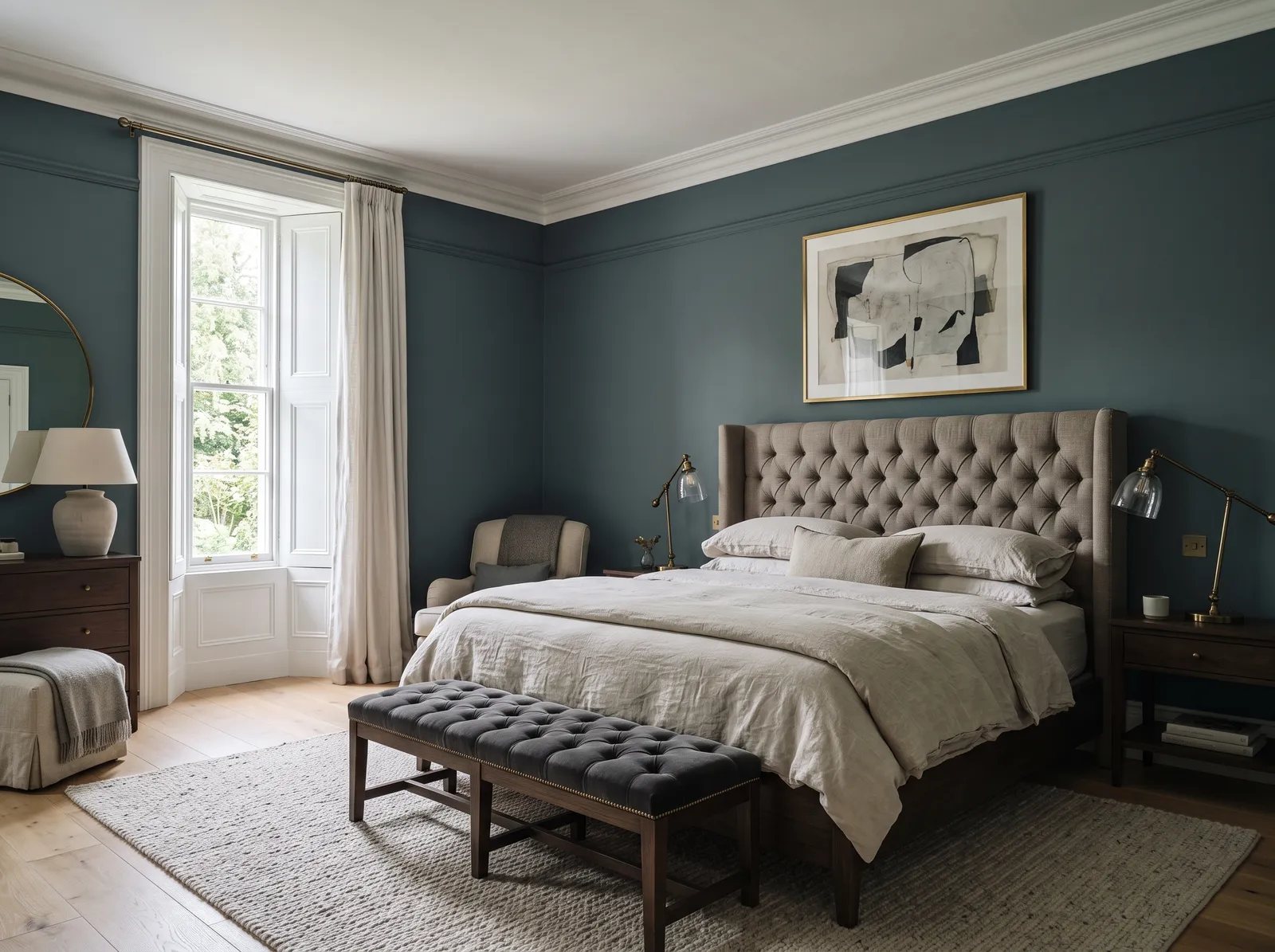
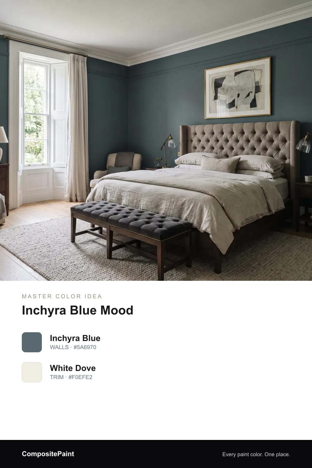
A deep, smoky blue-green that shifts through the day, a designer favorite that gives a big bedroom real character.
Upload a photo of your master and the visualizer paints your walls in any of these colors — in seconds.
UPLOAD YOUR PHOTO →Your master bedroom is the first thing you see in the morning and the last at night, so the color has a bigger job than in most rooms. It needs to help you wind down and feel calm, not wake your eyes up. That is why softer, deeper, and warmer shades tend to work better here than the bright, busy colors you might use in a kitchen or hallway.
A primary bedroom is also usually larger, which gives you more freedom. A bigger room with good light can carry a moodier color, like a deep green or navy, without feeling small or dark. So you can pick something grown-up and rich here that you might be nervous to try in a tiny guest room.
The calmest bedroom colors are the soft, muted ones. Think gentle greige, soft sage, watery blue-green, and quiet lavender-gray. These shades stay easy on the eyes in early morning light and never feel loud, which is exactly what you want when you are slowly waking up.
If you love color but still want rest, look for shades that have some gray mixed in. A grayed green or a dusty blue feels relaxed rather than bright. Bold, clean colors can be beautiful, but in a bedroom the softened version of almost any color will always feel more restful.
That serene hotel feeling usually comes from keeping things simple and tonal. Pick one soft, warm neutral for the walls and let the bedding, curtains, and rug stay close in tone. When everything is in the same gentle family, your eye relaxes and the room feels pulled together.
For an even more wrapped, luxurious look, you can paint the trim the same color as the walls instead of bright white. This tone-on-tone trick removes the hard lines around the room and makes it feel soft and seamless, like a quiet suite you never want to leave.
A larger master bedroom is the perfect place to be brave with deep color. Navy, forest green, charcoal, and smoky blue all turn a big room into a cozy retreat, and they make crisp white bedding look fresh and crisp against them. The extra space keeps a dark color from ever feeling closed in.
The key is to balance the depth with light. Keep your bedding, ceiling, and curtains light and soft so the room still breathes, and add warm lamps for the evening. A dark wall behind the bed, in particular, frames you beautifully and makes the whole room feel restful and intimate at night.
Before you choose a wall color, look at the things you are keeping. Warm wood furniture, like oak or walnut, loves warm colors next to it, such as greige, sage, taupe, and terracotta. These shades make wood look rich instead of orange. Cooler grays and blues can fight with warm wood and make it look out of place.
If your bed and dresser are dark or black, almost any soft neutral or deep color will frame them nicely. White or cream bedding is the easiest way to lighten a room with darker furniture, and a soft accent color on a bench or throw ties the whole look together without much effort.
The way your bedroom faces changes how a color looks. North-facing rooms get cooler, softer light, so warm shades like greige, taupe, cream, and sage help them feel cozy instead of gray. South-facing rooms get lots of warm sun, so they can handle cooler, calmer colors like blue-green and lavender-gray without feeling cold.
Light also changes through the day, so always test your color on the wall first. Paint a big patch, live with it for a day or two, and look at it in the morning, at midday, and at night with your lamps on. A color that feels right in all three is the one to choose.
For most bedroom walls, a matte or eggshell finish is the nicest choice. These low-shine finishes hide small bumps and roller marks, and they give walls a soft, velvety look that feels calm and restful. Matte is especially lovely for deep, moody colors because it lets the rich color speak without any glare.
Save the shinier finishes for the hard-working parts of the room. A satin or semi-gloss on the trim, doors, and baseboards makes them easy to wipe clean and gives a gentle bit of contrast against the softer walls. This simple mix of finishes is what makes a bedroom feel both cozy and well finished.
The best master bedroom colors are soft and restful, like warm greige, gentle sage, dusty blue-green, or a deep navy if your room is large. The right one for you depends on your light and your furniture, so pick the shade that feels calm to you and test it on the wall before deciding.
Soft, muted shades are the most relaxing for sleep, especially gentle greens, dusty blues, and warm neutrals. These colors keep the room quiet and easy on the eyes, which helps you wind down at night. Avoid bright, bold colors on the main walls, since they can feel a little too energetic in a bedroom.
For a spa-like feel, look at soft blue-greens and gray-greens like a sea-salt blue-green, a quiet sage, or a misty gray-green. Keep the bedding and curtains light and tonal so the whole room stays serene. These watery, muted colors feel clean and restful, just like a calm retreat.
Yes, and a larger master bedroom is a great place for it. Deep navy, forest green, charcoal, and smoky blue make a big room feel cozy and grown-up, and they make white bedding look crisp. Just keep your bedding and ceiling light, add warm lamps, and the room will feel restful rather than dark.
Warm, soft colors look best with dark wood, such as greige, sage, warm taupe, terracotta, and creamy white. These shades let the wood feel rich and grounded instead of heavy. A soft warm white or a gentle green is an easy, foolproof choice that lets dark wood furniture stand out.
Matte or eggshell is the best finish for bedroom walls because it has little shine, hides small flaws, and feels soft and calm. Use a satin or semi-gloss on the trim, doors, and baseboards so they are easy to wipe clean. This simple mix looks polished and works in any bedroom.
