CP

Winter Color Palette — Frosted Pine

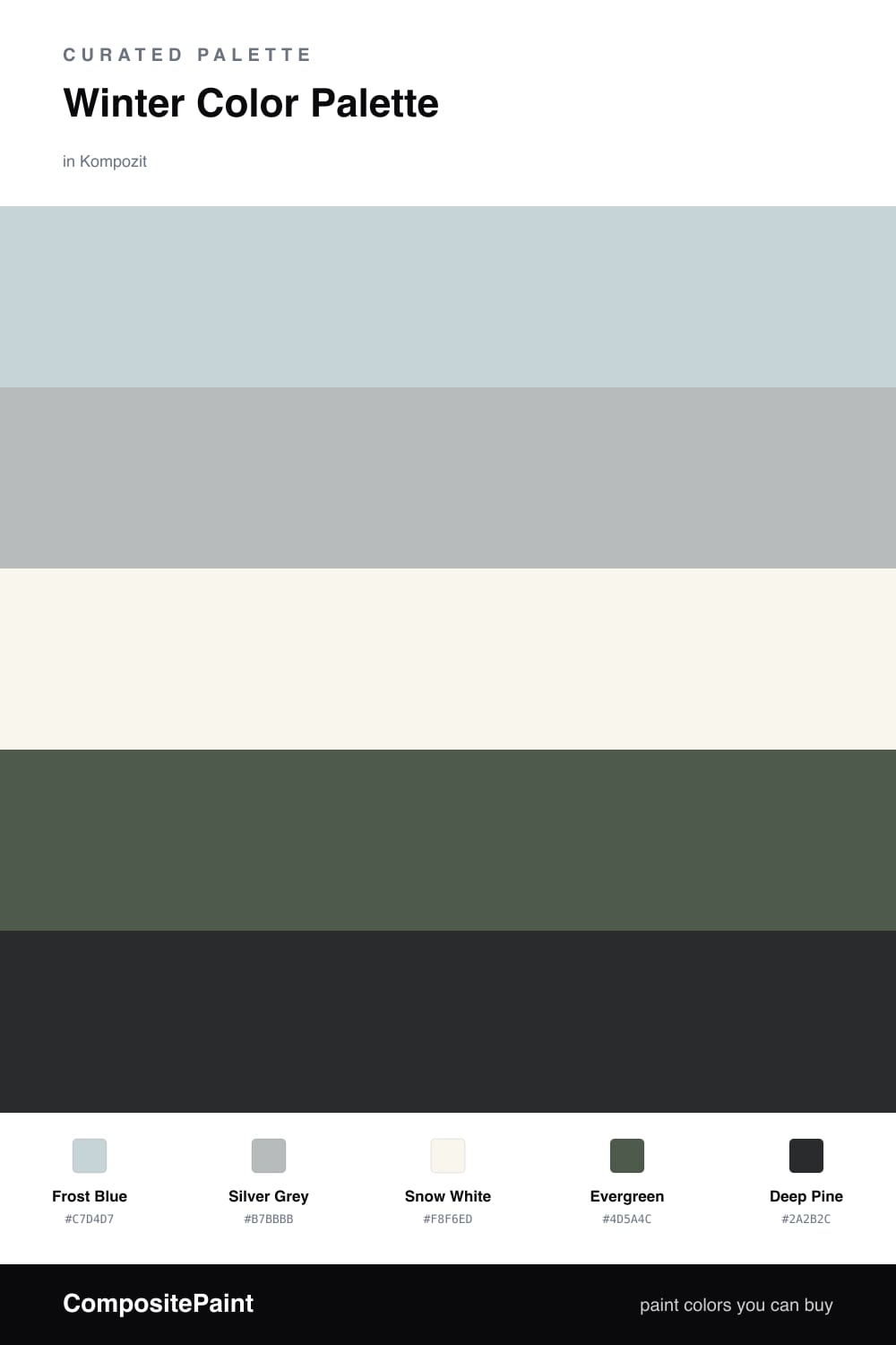
A quiet five-color winter scheme of frost blue, silver grey, snow white, evergreen and deep pine, with every color matched to real paint you can buy.

By Jessica Williams · Color Stylist & Interior Editor

Frost Blue
Dominant
Kompozit Polished Cotton · 0629
#C7D4D7
LRV 64
Silver Grey
Secondary
Kompozit Marseilles · 0525
#B7BBBB
LRV 49
Snow White
Base
Kompozit Sugar Dust · 0011
#F8F6ED
LRV 92
Evergreen
Support
Kompozit Pleasant Hill · 0459
#4D5A4C
LRV 9
Deep Pine
Accent
Kompozit Silent Sea · 0515
#2A2B2C
LRV 2
View palette in

There is a stillness to a winter morning before anyone is up, when the light comes through frosted glass and everything looks washed in cool, quiet grey. This palette is built around that feeling. Frost Blue leads, soft and barely there, with Silver Grey close behind so the whole scheme breathes like fog.

Snow White is your base, the clean breath of air that keeps the cooler tones from closing in. Let it cover most of your walls and trim so the room stays open and bright even on the shortest days.

Then the greens do the grounding. Evergreen brings a forest hush, and a touch of Deep Pine in a door, a cabinet or a single moody wall gives the palette weight. It is a restrained, modern take on winter, and it feels especially right in 2026, when the mood in interiors keeps drifting toward calm, natural and unhurried.

Buy These Colors

Each color matched to the closest real paint in every brand, by ΔE2000. Kompozit first; take any SKU to the store — these mix on demand.

Frost Blue
#C7D6DC · LRV 65 · Dominant
Kompozit Polished Cotton · 0629 ΔE 1.49
Backdrop Real Real · BD-RR ΔE 12.78
Behr Sky Light View · MQ3-53 ΔE 0.24
Benjamin Moore Heaven on Earth · 1661 ΔE 1.84
Clare Nairobi Blue · PNT100-LT-36 ΔE 3.96
Dunn-Edwards Snow Lodge · DE5799 ΔE 1.36
Farrow & Ball Skylight · No. 205 ΔE 5.7
Magnolia Home Dark Moon · JG-74 ΔE 5.36
PPG / Glidden Bit Of Heaven · 1156-2 ΔE 1.13
Sherwin-Williams Balmy · SW 6512 ΔE 1.51
Valspar Elevation · 8004-39B ΔE 1.51
Silver Grey
#B6BBBC · LRV 49 · Secondary
Kompozit Marseilles · 0525 ΔE 0.63
Backdrop Underdog · BD-UD ΔE 5.33
Behr French Silver · PPU18-05 ΔE 0.91
Benjamin Moore Blue Springs · 1592 ΔE 0.94
Clare Greige · PNT100-LT-13 ΔE 7.44
Dunn-Edwards Crestline · DE6325 ΔE 1.47
Farrow & Ball Light Blue · No. 22 ΔE 4.13
Magnolia Home Day-to-day · JG-123 ΔE 2.83
PPG / Glidden Gray Stone · 1009-4 ΔE 2.81
Sherwin-Williams Monorail Silver · SW 7663 ΔE 1.13
Valspar Voyage · 4006-1B ΔE 1.75
Snow White
#F4F5F2 · LRV 91 · Base
Kompozit Sugar Dust · 0011 ΔE 2.88
Backdrop Tabula Rasa · BD-TR ΔE 3.72
Behr Luster White · W-B-600 ΔE 0.84
Benjamin Moore Chantilly Lace · 2121-70 ΔE 1.2
Clare Timeless · PNT100-LT-04 ΔE 2.37
Dunn-Edwards Droplets · DEW381 ΔE 1.57
Farrow & Ball All White · No. 2005 ΔE 2.08
Magnolia Home True White · JG-21 ΔE 1
PPG / Glidden Delicate White · 1001-1 ΔE 0.81
Sherwin-Williams High Reflective White · SW 7757 ΔE 1.49
Valspar Cuddle Down · 8007-6F ΔE 1.44
Evergreen
#4A5F52 · LRV 10 · Support
Kompozit Pleasant Hill · 0459 ΔE 3.28
Backdrop North End · BD-NE ΔE 6.21
Behr Congo · PPU11-20 ΔE 0.87
Benjamin Moore Under the Sea · 693 ΔE 1.34
Clare Goodnight Moon · PNT100-DP-42 ΔE 13.28
Dunn-Edwards Pine Haven · DE5713 ΔE 2.38
Farrow & Ball Inchyra Blue · No. 289 ΔE 8.77
Magnolia Home Regal Leaf · JG-72 ΔE 3.06
PPG / Glidden Dark Green Velvet · 1136-7 ΔE 2.28
Sherwin-Williams Rookwood Dark Green · SW 2816 ΔE 6.37
Valspar Sherwood Forest · 8003-34G ΔE 3.85
Deep Pine
#26352D · LRV 3 · Accent
Kompozit Silent Sea · 0515 ΔE 10.15
Backdrop After Hours · BD-AH ΔE 7.56
Behr Black Suede · S-H-790 ΔE 4.46
Benjamin Moore Essex Green · HC-188 ΔE 0.32
Clare Blackish · PNT100-DP-54 ΔE 12.01
Dunn-Edwards Black · DEA187 ΔE 11.06
Farrow & Ball Pitch Black · No. 256 ΔE 11.22
Magnolia Home Blackboard · JG-05 ΔE 11.81
PPG / Glidden Black Magic · 1001-7 ΔE 11.69
Sherwin-Williams Tricorn Black · SW 6258 ΔE 10.45
Valspar Nocturnal Green · 5011-1 ΔE 7.29

Questions

Why do these winter colors work together?

They share one cool, low-saturation mood, so the soft frost blue, silver and white feel like the same chilly light, and the greens give that calm a place to land.

How do I keep this palette from feeling cold?

Lean on the warmer side of each color and let the soft white carry most of the room, so the deep pine reads as cozy and grounding rather than icy.

Similar Palettes

Closest schemes by color — not by label.