Winter Color Palette — Frost & Pine
A quiet five-color winter scheme built on frost blue, silver grey, evergreen, deep pine, and snow white — every color matched to real paint you can buy.
By Maya Patel · Reviews Editor & Product Tester
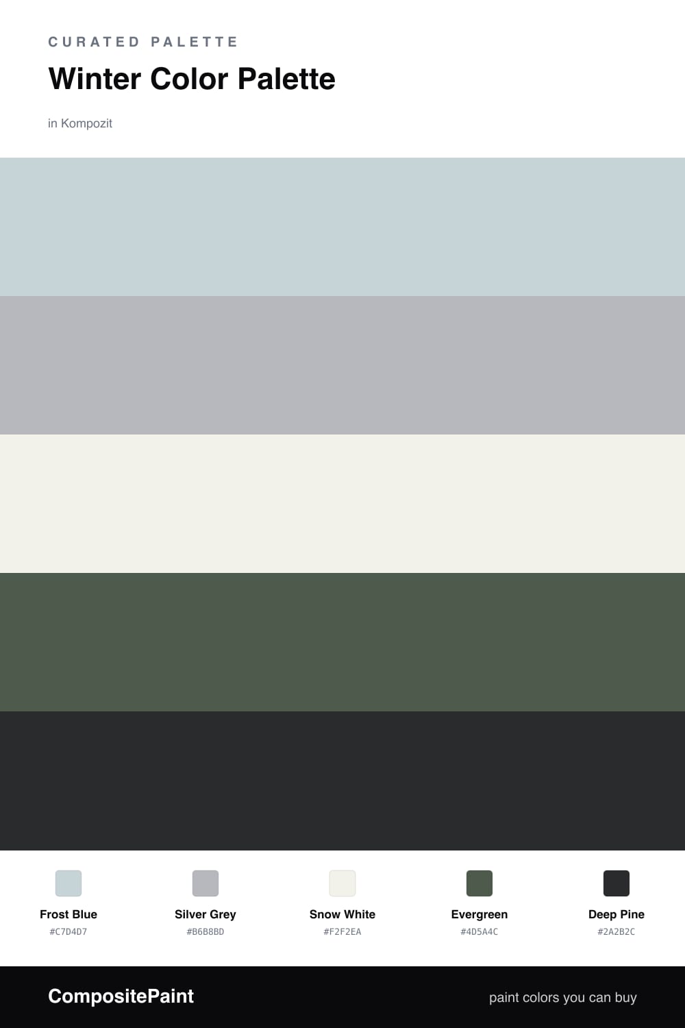
Winter is my favorite season to pull a palette from, because the colors do the hard work for you. This scheme leans on a pale Frost Blue as the dominant tone, the kind of cool, barely-there blue that feels like morning light on snow. Silver Grey backs it up and keeps things from tipping too sweet.
Snow White is the base that lets everything breathe — clean, soft, never stark. Then I bring in Evergreen and a darker Deep Pine for grounding. Used sparingly, those greens give the palette its backbone and a little of that fresh-cut tree feeling.
The trade-off to watch for is coldness. Lean too hard on the blues and greys and a room can go clinical. My fix for 2026 is simple — keep the lighter tones in charge, treat the pine as your one bold move, and let natural texture do the warming.
Buy These Colors
Each color matched to the closest real paint in every brand, by ΔE2000. Kompozit first; take any SKU to the store — these mix on demand.
Questions
They all share a cool, slightly grey undertone, so they read as one calm family rather than five separate picks. The two greens add depth without warmth, which keeps the whole thing feeling crisp and clean.
Let the soft frost blue and snow white carry most of the space, then use the deep pine in small doses on trim or a single piece. That contrast adds weight and stops the lighter tones from washing out.
Similar Palettes
Closest schemes by color — not by label.