Winter Color Palette — Winter Tide
A cool, quiet five-color scheme of frost blue, silver grey, evergreen and deep pine grounded by snow white — every color matched to real paint you can buy.
By Jessica Williams · Color Stylist & Interior Editor
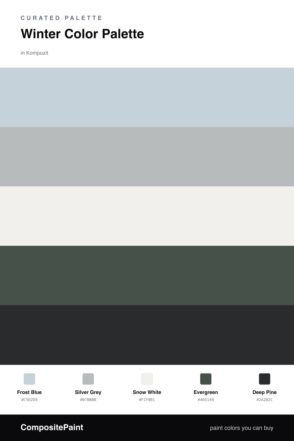
This is the feeling of a still winter morning, before anyone has walked across the snow. Frost Blue leads the way — a soft, dusty sky-blue that holds light beautifully — with Silver Grey beside it like breath on cold glass. Together they set a hushed, contemporary tone that feels fresh rather than chilly.
Snow White is the quiet base here, just warm enough to keep everything from tipping into sterile. Then the greens arrive — a grounded Evergreen and a near-black Deep Pine — bringing the forest at the edge of the snowfield indoors. They give the palette its weight and its calm.
Lean on the frost blue and snow white across your largest surfaces, then let the pines pool in the corners — a single deep wall, some trim, a low chair. The result feels serene and modern, the kind of cool quiet you want to come home to in winter.
Buy These Colors
Each color matched to the closest real paint in every brand, by ΔE2000. Kompozit first; take any SKU to the store — these mix on demand.
Questions
The frost blue and silver grey are soft and dusty rather than icy, and the warm snow white keeps the whole scheme breathable. The greens add depth so the palette reads quiet and restful, not clinical.
Keep evergreen and deep pine to smaller doses — one moody wall, cabinetry, or a few accents — and let the frost blue and snow white carry most of the space. That way the depth grounds the room rather than closing it in.
Similar Palettes
Closest schemes by color — not by label.