Winter Color Palette — Winter Quartz
A cool, quiet five-color winter scheme blending frosty blue, silver grey, and deep evergreen with crisp snow white, every color matched to real paint you can buy.
By Emily Roberts · DIY Editor & First-Timer's Guide
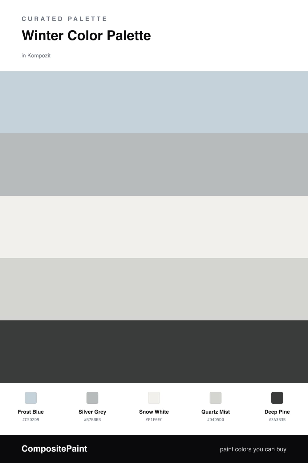
Winter has a hush to it, and this palette tries to bottle that feeling. Frost Blue leads the way with the soft look of breath on a cold window, while Silver Grey sits close behind it like a frozen sky just before snow.
Underneath, Snow White and Quartz Mist do the quiet work. They are not stark or icy, just gentle off-neutrals that keep everything calm and let the light bounce around the way it does on a bright winter morning.
Then there is Deep Pine, the one rich note in the whole group. A little goes a long way here, so use it in small doses to ground the cooler tones. It is the kind of restrained, nature-leaning depth that feels right for 2026, where soft and serene beats loud every time.
Buy These Colors
Each color matched to the closest real paint in every brand, by ΔE2000. Kompozit first; take any SKU to the store — these mix on demand.
Questions
They all share a soft, low-key undertone, so nothing fights for attention. The frosty blue and silver grey feel like the same chilly light, and the deep pine gives your eye one quiet place to land.
Lean on the warmer neutrals. Quartz Mist and Snow White have a gentle softness that takes the chill off, so let them cover the biggest areas and save the deep pine for small grounding moments.
Similar Palettes
Closest schemes by color — not by label.