Palette

Winter Color PaletteFrosted Reed

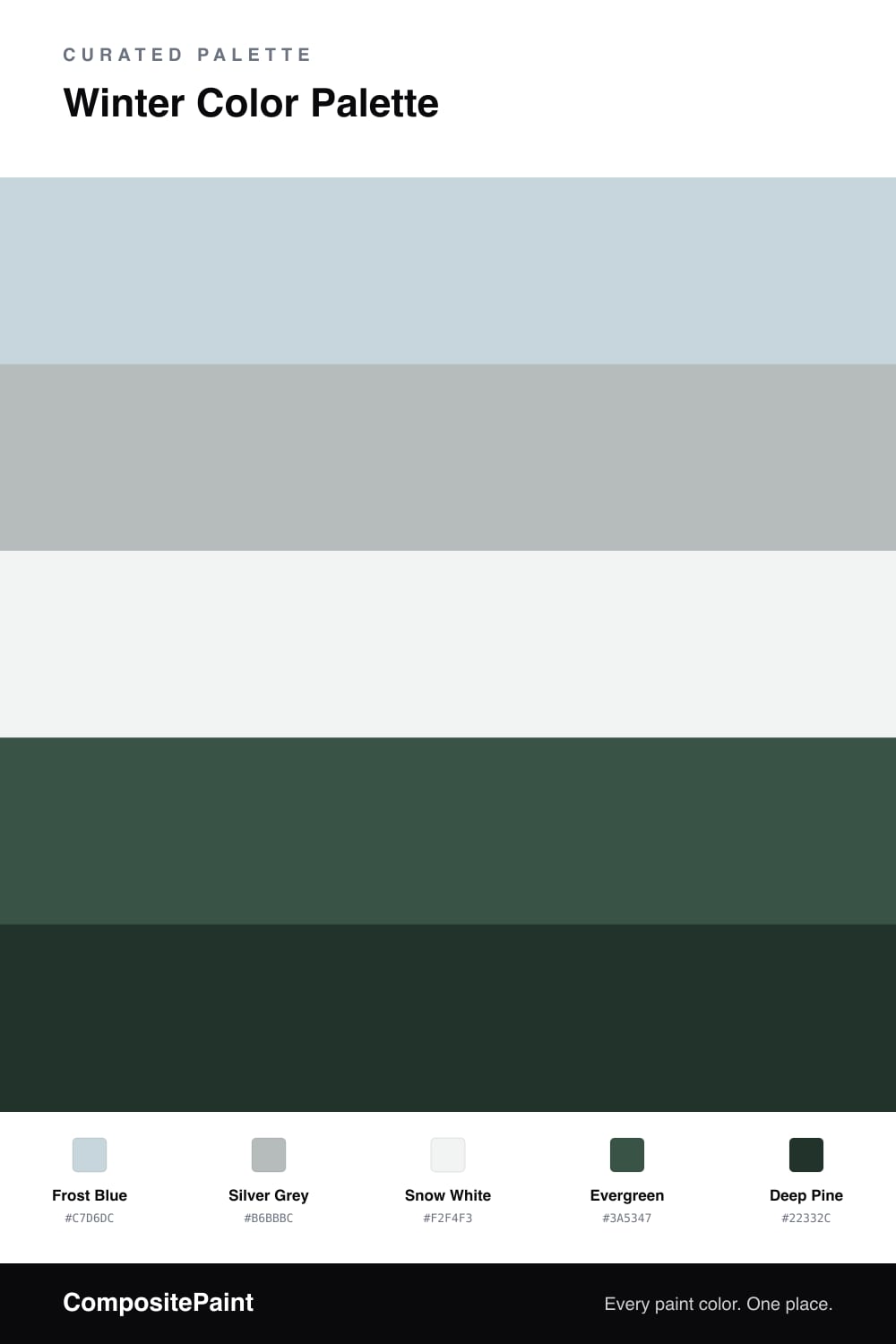
A quiet five-color winter scheme pairing frost blue and silver grey with deep evergreen, snow white, and a pine accent — every color matched to real paint you can buy.

By Maya Patel · Reviews Editor & Product Tester
View palette in

Winter palettes win when they stay quiet, and this one earns it. Frost Blue leads with a soft, glassy cool that reads almost grey in low light, and Silver Grey backs it up so the whole scheme settles instead of shimmering.

Snow White is the breathing room here — use it on ceilings and trim to keep everything crisp. Then Evergreen and Deep Pine do the heavy lifting, grounding the pale colors with the kind of forest depth that feels current in 2026 without chasing a trend.

My take — let the light trio cover most of the space and treat the greens as moments, not walls of color. A single pine cabinet or a deep green door against frost blue is the move. Add one warm material and this goes from cold to calm.

Buy these colors

Every Color, Matched to Real Paint

Each color matched to the closest paint in every brand we track, by ΔE2000. Tap a swatch for its full guide. Take any code to the store, they mix on demand.

Questions people actually ask

Questions

Why do these winter colors work together?

They share one cool undertone, so the pale blues and the deep greens feel like the same daylight. The snow white opens it up and the pine keeps it from going flat.

How do I keep the room from feeling cold?

Lean on the lighter trio for most surfaces and save the greens for one wall or the millwork. Warm wood, brass, or linen brings the temperature back up fast.