Winter Color Palette — Winter Snowfall
A quiet five-color winter scheme layering frost blue and silver grey over deep pine and snow white — every color matched to real paint you can buy.
By Emily Roberts · DIY Editor & First-Timer's Guide
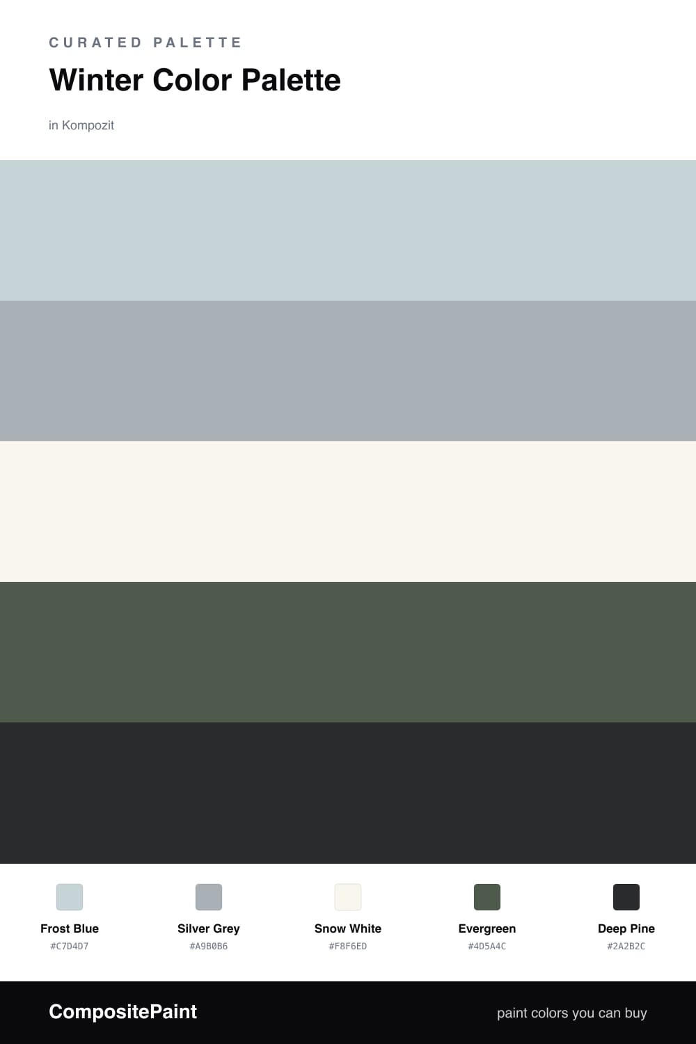
There is a special kind of quiet that comes with the first real snowfall, and this palette tries to bottle it. Frost Blue leads the way as a soft, barely-there wash that feels like cold morning light, while Silver Grey sits just behind it to add a little weight without ever turning gloomy.
Snow White is the breathing room here — keep most of your space in this clean, faintly cool white so the blues and greens have somewhere to land. Then bring in Evergreen as a grounding mid-tone, the way a tree line steadies a white field.
For 2026 the move is restraint, so save Deep Pine for one or two sharp moments and let it do the heavy lifting. Used sparingly, that deepest green turns the whole scheme from pretty to polished.
Buy These Colors
Each color matched to the closest real paint in every brand, by ΔE2000. Kompozit first; take any SKU to the store — these mix on demand.
Questions
Not if you let snow white carry most of the room. Frost blue and silver grey are soft, washed-out shades rather than icy brights, so they read calm instead of chilly. The two green tones add just enough warmth to keep the scheme from feeling clinical.
Use it in small, deliberate spots — a front door, a single piece of trim, or one painted cabinet. Deep pine is your darkest note here, so a little goes a long way and it makes the lighter frost blue look even cleaner next to it.
Similar Palettes
Closest schemes by color — not by label.