CP

Winter Color Palette — Winter Opal

A quiet five-color winter scheme of frost blue, silver grey, snow white, and deep evergreen, with every color matched to real paint you can buy.

By Emily Roberts · DIY Editor & First-Timer's Guide

Frost Blue
Dominant
Kompozit Serene Setting · 0622
#C5D2D9
LRV 63
Silver Grey
Secondary
Kompozit Marseilles · 0525
#B7BBBB
LRV 49
Snow White
Base
Kompozit Sugar Dust · 0011
#F8F6ED
LRV 92
Glacier Sage
Support
Kompozit Stormy Bay · 0484
#9AAFAF
LRV 41
Deep Pine
Accent
Kompozit Black Licorice · 0529
#3A3B3B
LRV 4
View palette in

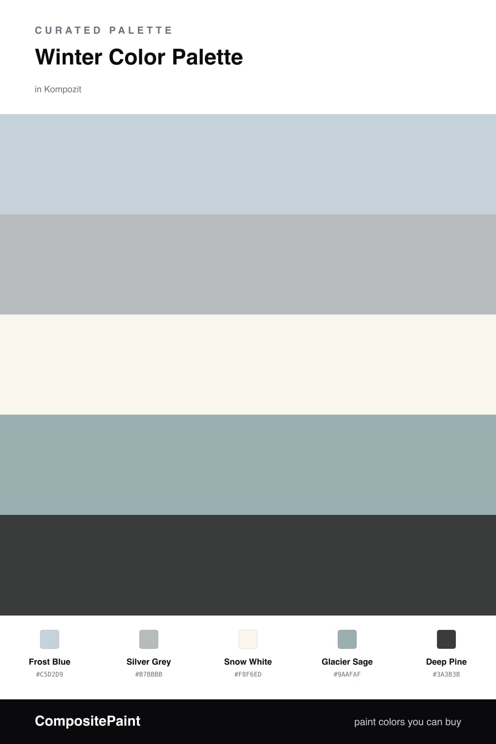
There is something about winter light that this palette tries to bottle — pale, clean, and a little hushed. Frost Blue leads the way as a soft, barely-there blue that feels like morning sky over snow, and Silver Grey backs it up so nothing ever turns icy or stark.

Snow White is your quiet base, the breathing room that keeps the cool colors from feeling cold. I like a white with the faintest warmth here, because it lets the blues and greys stay soft instead of clinical. Glacier Sage adds a whisper of green so the whole scheme feels alive rather than frozen.

Then comes the anchor — Deep Pine. Use it sparingly and it does all the heavy lifting, giving these gentle tones somewhere solid to land. This is a very 2026 way to do cool neutrals — quiet, layered, and easy to live with every day.

Buy These Colors

Each color matched to the closest real paint in every brand, by ΔE2000. Kompozit first; take any SKU to the store — these mix on demand.

Frost Blue
#C5D4DB · LRV 64 · Dominant
Kompozit Serene Setting · 0622 ΔE 0.87
Backdrop Real Real · BD-RR ΔE 13.11
Behr Polar Drift · PPU14-17 ΔE 2.48
Benjamin Moore Lake Placid · 827 ΔE 2.56
Clare Nairobi Blue · PNT100-LT-36 ΔE 4.38
Dunn-Edwards Polished Silver · DE5820 ΔE 1.89
Farrow & Ball Skylight · No. 205 ΔE 5.93
Magnolia Home Dark Moon · JG-74 ΔE 5.55
PPG / Glidden Sentimental Lady · 1159-2 ΔE 0.99
Sherwin-Williams Mild Blue · SW 6533 ΔE 1.95
Valspar Tinsel Beam · 4005-3A ΔE 1.09
Silver Grey
#B7BBBC · LRV 49 · Secondary
Kompozit Marseilles · 0525 ΔE 0.56
Backdrop Underdog · BD-UD ΔE 5.74
Behr French Silver · PPU18-05 ΔE 0.62
Benjamin Moore Blue Springs · 1592 ΔE 1.42
Clare Greige · PNT100-LT-13 ΔE 7
Dunn-Edwards Covered in Platinum · DE6367 ΔE 1.47
Farrow & Ball Light Blue · No. 22 ΔE 4.21
Magnolia Home Day-to-day · JG-123 ΔE 2.73
PPG / Glidden Gray Stone · 1009-4 ΔE 2.73
Sherwin-Williams Monorail Silver · SW 7663 ΔE 1.14
Valspar Voyage · 4006-1B ΔE 1.83
Snow White
#F4F5F3 · LRV 91 · Base
Kompozit Sugar Dust · 0011 ΔE 3.33
Backdrop Tabula Rasa · BD-TR ΔE 4.19
Behr Luster White · W-B-600 ΔE 0.56
Benjamin Moore Chantilly Lace · 2121-70 ΔE 1.68
Clare Timeless · PNT100-LT-04 ΔE 2.84
Dunn-Edwards Lighthouse · DEW385 ΔE 1.08
Farrow & Ball All White · No. 2005 ΔE 2.12
Magnolia Home True White · JG-21 ΔE 1.51
PPG / Glidden Delicate White · 1001-1 ΔE 1.21
Sherwin-Williams High Reflective White · SW 7757 ΔE 1.96
Valspar New Ream · V148 ΔE 1.48
Glacier Sage
#9FAFA6 · LRV 41 · Support
Kompozit Stormy Bay · 0484 ΔE 4.44
Backdrop Nuevo · BD-NU ΔE 5.17
Behr Aged Jade · HDC-CT-22 ΔE 0.84
Benjamin Moore Castle Walls · 1573 ΔE 2.06
Clare Make Waves · PNT100-MD-43 ΔE 2.65
Dunn-Edwards Pistachio Ice Cream · DE5717 ΔE 3.07
Farrow & Ball Dix Blue · No. 82 ΔE 2.89
Magnolia Home Weathered Windmill · JG-15 ΔE 6.4
PPG / Glidden Light Drizzle · 1033-4 ΔE 3.66
Sherwin-Williams Breezy · SW 7616 ΔE 5.15
Valspar Cambridge Lily · 8004-34D ΔE 2.1
Deep Pine
#2C3A33 · LRV 4 · Accent
Kompozit Black Licorice · 0529 ΔE 8.7
Backdrop After Hours · BD-AH ΔE 5.96
Behr Thorny Branch · S-H-780 ΔE 4.02
Benjamin Moore Waller Green · CW-510 ΔE 4.9
Clare Blackish · PNT100-DP-54 ΔE 10.48
Dunn-Edwards Black · DEA187 ΔE 10
Farrow & Ball Pitch Black · No. 256 ΔE 10.22
Magnolia Home Blackboard · JG-05 ΔE 11.02
PPG / Glidden Black Magic · 1001-7 ΔE 10.39
Sherwin-Williams Rookwood Shutter Green · SW 2809 ΔE 3.5
Valspar Forest Canopy · 5010-1 ΔE 4.58

Questions

Is this palette too cool for a cozy space?

Not at all. The trick is the warm-leaning Snow White base, which softens the cool tones so the room still feels calm rather than chilly. Add wood or linen and it reads cozy.

Where should the deep pine go?

Use Deep Pine in small doses for grounding — think a single accent wall, cabinets, or trim. A little of the darkest color makes the soft blues and greys feel intentional.

Similar Palettes

Closest schemes by color — not by label.