CP

Winter Color Palette — Winter Frost

A cool, quiet five-color winter scheme pairing frost blue and silver grey with deep pine and crisp snow white — every color matched to real paint you can buy.

By Emily Roberts · DIY Editor & First-Timer's Guide

Frost Blue
Dominant
Kompozit Polished Cotton · 0629
#C7D4D7
LRV 64
Silver Grey
Secondary
Kompozit Marseilles · 0525
#B7BBBB
LRV 49
Snow White
Base
Kompozit Cyprus Spring · 0411
#F2F2EA
LRV 88
Evergreen Sage
Support
Kompozit Dowager · 0442
#838C82
LRV 25
Deep Pine
Accent
Kompozit Black Licorice · 0529
#3A3B3B
LRV 4
View palette in

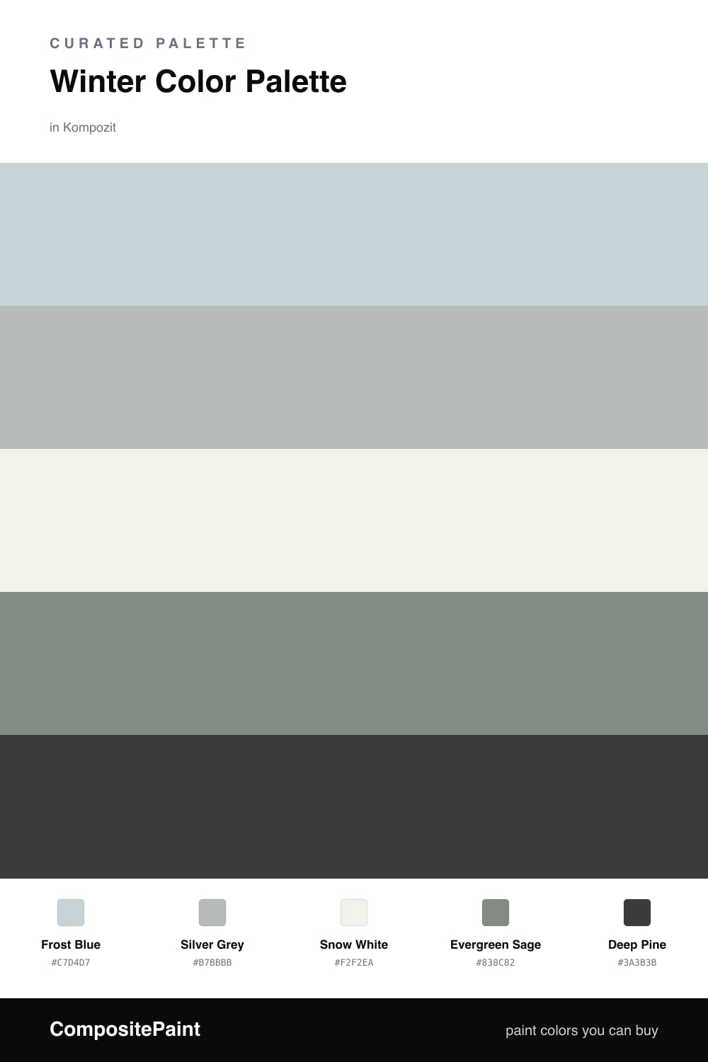
Winter has a quiet kind of beauty, and this palette tries to bottle it. A pale Frost Blue leads the way, the color of a clear sky just after a fresh snow, with a soft Silver Grey beside it for that hushed, frosted-window feeling.

Snow White is the base that keeps everything bright and clean, so the cooler tones never tip into gloomy. Then a little nature creeps in: Evergreen Sage is the muted green of a snow-dusted pine, and Deep Pine is the deep, almost-black version of it for contrast.

For a fresh 2026 take, let Frost Blue and Snow White do most of the work, and use Deep Pine in small, confident touches. The result feels serene and current, like a winter morning that is cold outside but completely calm inside.

Buy These Colors

Each color matched to the closest real paint in every brand, by ΔE2000. Kompozit first; take any SKU to the store — these mix on demand.

Frost Blue
#C7D6DD · LRV 65 · Dominant
Kompozit Polished Cotton · 0629 ΔE 1.91
Backdrop Real Real · BD-RR ΔE 13.13
Behr Sky Light View · MQ3-53 ΔE 0.54
Benjamin Moore Heaven on Earth · 1661 ΔE 2.08
Clare Nairobi Blue · PNT100-LT-36 ΔE 4.3
Dunn-Edwards Snow Lodge · DE5799 ΔE 0.9
Farrow & Ball Skylight · No. 205 ΔE 5.99
Magnolia Home Dark Moon · JG-74 ΔE 5.61
PPG / Glidden Bit Of Heaven · 1156-2 ΔE 0.86
Sherwin-Williams Balmy · SW 6512 ΔE 1.75
Valspar Elevation · 8004-39B ΔE 1.75
Silver Grey
#B4BBBE · LRV 49 · Secondary
Kompozit Marseilles · 0525 ΔE 1.83
Backdrop Underdog · BD-UD ΔE 4.43
Behr French Silver · PPU18-05 ΔE 1.41
Benjamin Moore Blue Springs · 1592 ΔE 1.09
Clare Cloud Watching · PNT100-MD-73 ΔE 5.05
Dunn-Edwards Crestline · DE6325 ΔE 0.5
Farrow & Ball Parma Gray · No. 27 ΔE 2.61
Magnolia Home Day-to-day · JG-123 ΔE 4.03
PPG / Glidden Stormy · 10-14 ΔE 2.4
Sherwin-Williams Colonial Revival Gray · SW 2832 ΔE 1.7
Valspar Voyage · 4006-1B ΔE 1.1
Snow White
#F3F4F2 · LRV 90 · Base
Kompozit Cyprus Spring · 0411 ΔE 2.88
Backdrop Tabula Rasa · BD-TR ΔE 4.16
Behr New House White · RD-W10 ΔE 1.01
Benjamin Moore Distant Gray · 2124-70 ΔE 0.79
Clare Timeless · PNT100-LT-04 ΔE 2.85
Dunn-Edwards Lighthouse · DEW385 ΔE 1.07
Farrow & Ball Wimborne White · No. 239 ΔE 4.32
Magnolia Home True White · JG-21 ΔE 1.54
PPG / Glidden Delicate White · 1001-1 ΔE 1.11
Sherwin-Williams High Reflective White · SW 7757 ΔE 2.01
Valspar Tell Me a Secret · 8007-2B ΔE 1.23
Evergreen Sage
#7E8C82 · LRV 25 · Support
Kompozit Dowager · 0442 ΔE 2.11
Backdrop Hartford · BD-HF ΔE 3.61
Behr Woodcraft · N200-5 ΔE 4.39
Benjamin Moore Garden Oasis · 699 ΔE 1.22
Clare Dirty Chai · PNT100-DP-52 ΔE 10.84
Dunn-Edwards Stone Craft · DE6292 ΔE 2.74
Farrow & Ball Card Room Green · No. 79 ΔE 3.91
Magnolia Home Eden · JG-60 ΔE 4.82
PPG / Glidden Thunderbolt · 10-06 ΔE 3.58
Sherwin-Williams Underseas · SW 6214 ΔE 2.03
Valspar Beguile · 5002-2A ΔE 3.13
Deep Pine
#2C3B34 · LRV 4 · Accent
Kompozit Black Licorice · 0529 ΔE 8.99
Backdrop After Hours · BD-AH ΔE 6.14
Behr Thorny Branch · S-H-780 ΔE 4.3
Benjamin Moore Waller Green · CW-510 ΔE 5.27
Clare Blackish · PNT100-DP-54 ΔE 10.66
Dunn-Edwards Black · DEA187 ΔE 10.32
Farrow & Ball Pitch Black · No. 256 ΔE 10.56
Magnolia Home Blackboard · JG-05 ΔE 11.29
PPG / Glidden Black Magic · 1001-7 ΔE 10.64
Sherwin-Williams Rookwood Shutter Green · SW 2809 ΔE 3.68
Valspar Aged Pine · 6011-5 ΔE 3.91

Questions

Will frost blue feel too cold to live with?

It can if it stands alone, so this scheme softens it. Snow White warms up the light and Evergreen Sage adds a touch of green, so Frost Blue reads calm and airy rather than icy. If you still want more warmth, swap in a creamier white as your base.

How do I keep the greys and blues from looking flat together?

Lean on Deep Pine for contrast. A small dose of that dark green on a door, a shelf, or trim gives your eye somewhere to land, so the soft Frost Blue and Silver Grey feel intentional instead of washed out.

Similar Palettes

Closest schemes by color — not by label.