CP

Winter Color Palette — Cedar Frost

A cool, quiet five-color winter scheme built from frost blue, silver grey, deep pine, and snow white, with each color matched to real paint you can buy.

By David Chen · Formulation Lead & Resident Chemist

Frost Blue
Dominant
Kompozit Polished Cotton · 0629
#C7D4D7
LRV 64
Silver Grey
Secondary
Kompozit Cystern · 0511
#A9B0B6
LRV 43
Snow White
Base
Kompozit Sugar Dust · 0011
#F8F6ED
LRV 92
Evergreen Mist
Support
Kompozit Mountain Meadow · 0703
#66887B
LRV 22
Deep Pine
Accent
Kompozit Atlantic Waves · 0473
#264243
LRV 5
View palette in

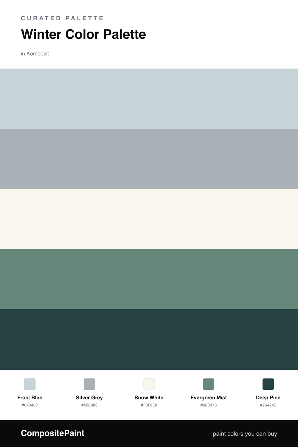
Winter has a very specific light. It is low, soft, and a little blue, and the best winter palettes try to bottle that exact feeling rather than chase it with bright color. This scheme starts with a pale Frost Blue as the dominant tone, the shade you see on a windowpane just before the first snow.

From there I let Silver Grey carry the middle and Snow White open everything up so the room can breathe. These three do most of the quiet work, and they read as one steady cool temperature instead of three separate colors.

The depth comes from green. Evergreen Mist is a soft, foggy support tone, and Deep Pine is the accent that grounds the whole thing, like a single cedar bough against fresh snow. Keep the pine to small doses in 2026 — a door, a built-in, a chair — and let the pale tones lead. That restraint is what makes the palette feel calm rather than cold.

Buy These Colors

Each color matched to the closest real paint in every brand, by ΔE2000. Kompozit first; take any SKU to the store — these mix on demand.

Frost Blue
#C7D6DD · LRV 65 · Dominant
Kompozit Polished Cotton · 0629 ΔE 1.91
Backdrop Real Real · BD-RR ΔE 13.13
Behr Sky Light View · MQ3-53 ΔE 0.54
Benjamin Moore Heaven on Earth · 1661 ΔE 2.08
Clare Nairobi Blue · PNT100-LT-36 ΔE 4.3
Dunn-Edwards Snow Lodge · DE5799 ΔE 0.9
Farrow & Ball Skylight · No. 205 ΔE 5.99
Magnolia Home Dark Moon · JG-74 ΔE 5.61
PPG / Glidden Bit Of Heaven · 1156-2 ΔE 0.86
Sherwin-Williams Balmy · SW 6512 ΔE 1.75
Valspar Elevation · 8004-39B ΔE 1.75
Silver Grey
#A9AFB0 · LRV 42 · Secondary
Kompozit Cystern · 0511 ΔE 2.6
Backdrop Underdog · BD-UD ΔE 4.59
Behr Soft Pebble · HDC-NT-27A ΔE 3.62
Benjamin Moore Subway Tile · CSP-585 ΔE 0.47
Clare Make Waves · PNT100-MD-43 ΔE 7.57
Dunn-Edwards Castlerock · DE6375 ΔE 2.74
Farrow & Ball Lamp Room Gray · No. 88 ΔE 5.24
Magnolia Home Tranquil Waters · JG-162 ΔE 2.21
PPG / Glidden Mirror Mirror · 1039-3 ΔE 0.93
Sherwin-Williams Uncertain Gray · SW 6234 ΔE 0.51
Valspar Metropolis · 4005-1C ΔE 1.61
Snow White
#F4F5F2 · LRV 91 · Base
Kompozit Sugar Dust · 0011 ΔE 2.88
Backdrop Tabula Rasa · BD-TR ΔE 3.72
Behr Luster White · W-B-600 ΔE 0.84
Benjamin Moore Chantilly Lace · 2121-70 ΔE 1.2
Clare Timeless · PNT100-LT-04 ΔE 2.37
Dunn-Edwards Droplets · DEW381 ΔE 1.57
Farrow & Ball All White · No. 2005 ΔE 2.08
Magnolia Home True White · JG-21 ΔE 1
PPG / Glidden Delicate White · 1001-1 ΔE 0.81
Sherwin-Williams High Reflective White · SW 7757 ΔE 1.49
Valspar Cuddle Down · 8007-6F ΔE 1.44
Evergreen Mist
#6E837C · LRV 21 · Support
Kompozit Mountain Meadow · 0703 ΔE 4.89
Backdrop Hartford · BD-HF ΔE 5.55
Behr Echo Park · MQ6-10 ΔE 2.64
Benjamin Moore Wetherburn's Blue · CW-580 ΔE 4.7
Clare Irony · PNT100-MD-16 ΔE 8.96
Dunn-Edwards Armor · DE6306 ΔE 1.91
Farrow & Ball Green Smoke · No. 47 ΔE 5.39
Magnolia Home Tranquility · JG-78 ΔE 2.38
PPG / Glidden Dwarf Spruce · 1136-6 ΔE 0.88
Sherwin-Williams Studio Blue Green · SW 47 ΔE 0.91
Valspar Blueridge Fir · 5004-4B ΔE 1.42
Deep Pine
#26392F · LRV 4 · Accent
Kompozit Atlantic Waves · 0473 ΔE 6.88
Backdrop After Hours · BD-AH ΔE 8.5
Behr Black Suede · S-H-790 ΔE 6.34
Benjamin Moore Essex Green · HC-188 ΔE 2.02
Clare Blackish · PNT100-DP-54 ΔE 12.97
Dunn-Edwards Black · DEA187 ΔE 12.63
Farrow & Ball Pitch Black · No. 256 ΔE 12.83
Magnolia Home Blackboard · JG-05 ΔE 13.51
PPG / Glidden Black Magic · 1001-7 ΔE 13.03
Sherwin-Williams Rookwood Shutter Green · SW 2809 ΔE 6.11
Valspar Aged Pine · 6011-5 ΔE 4.92

Questions

Why do these cool colors work together?

They all share a low, cool undertone, like light moving across snow at dusk. Because nothing fights for warmth, the eye reads the whole group as one calm, quiet temperature.

How do I keep a cool palette from feeling cold?

Lean on the soft frost blue and snow white for most surfaces, then use the deep pine in small, grounding doses. A little dark green warms the mood the way a cedar branch warms a white room.

Similar Palettes

Closest schemes by color — not by label.