Winter Color Palette — Winter Vale
A cool, quiet five-color winter scheme of frost blue, silver grey, deep pine, and snow white — every color matched to real paint you can buy.
By Emily Roberts · DIY Editor & First-Timer's Guide
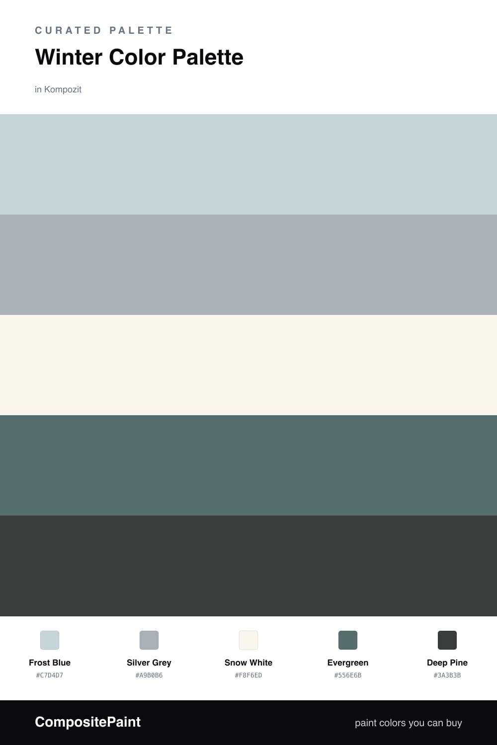
There is something about a still winter morning — the pale sky, the frost on the glass, the dark line of pines in the distance. This palette bottles that feeling. Frost Blue leads as a soft, cool wash that never feels cold or clinical, and Silver Grey sits just behind it to add a little quiet weight.
Snow White is your base here, and it is doing real work — it keeps everything bright and airy so the cooler tones feel calm rather than gloomy. If you only paint one large surface, make it this one.
For depth, lean on Evergreen as a support color and save Deep Pine for your smallest, most deliberate accents. A 2026 way to use these — a frost blue room, white trim, and a single pine-green built-in or door — feels modern and easy to live with, like winter light coming through a clean window.
Buy These Colors
Each color matched to the closest real paint in every brand, by ΔE2000. Kompozit first; take any SKU to the store — these mix on demand.
Questions
They all share a cool, slightly muted feeling, so they read as one calm family instead of clashing. The blue and the greens come from the same chilly side of the color wheel, and the white and grey give your eye a place to rest in between.
Let the soft frost blue lead and keep the snow white as your big quiet backdrop. Use silver grey to bridge them, then add evergreen and deep pine in small doses — think a door, some trim, or a few accents — so the dark greens feel like an accent, not the whole story.
Similar Palettes
Closest schemes by color — not by label.