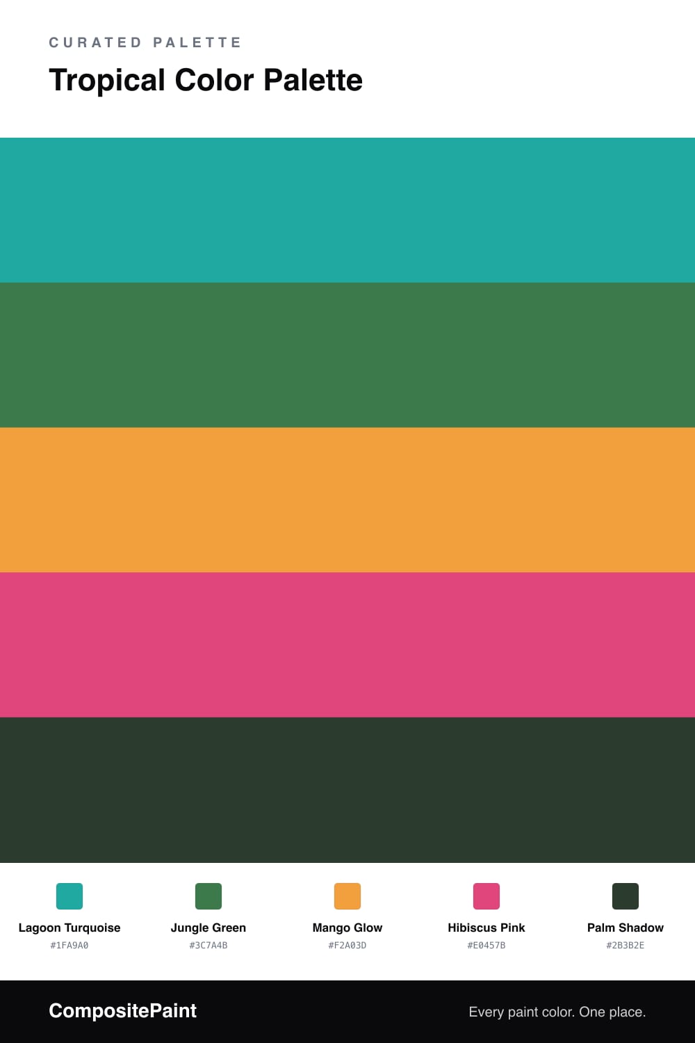
Tropical Color Palette — Hibiscus Coast
A vivid five-color tropical scheme pairing turquoise water and jungle green with mango, hibiscus pink, and a deep palm shadow — every color matched to real paint you can buy.
By Emily Roberts · DIY Editor & First-Timer's Guide
Tropical color is having a real moment in 2026, and this scheme leans all the way in without tipping into theme-park territory. Lagoon Turquoise is the heart of it, that clear blue-green you picture in shallow island water, and it does the heavy lifting as your dominant color.
Around it, Jungle Green brings the leafy, grounded feeling of palms and ferns, while Mango Glow warms everything up like late afternoon sun. These two are your steady middle players, the calm between the brights. Palm Shadow, a deep near-black green, is the quiet anchor that keeps the lighter shades from floating away.
Then there is Hibiscus Pink, the spark. A little goes a long way here, so use it where you want the eye to land. Keep the turquoise out front, let the green and mango do the easy work, and let that one hit of pink make the whole palette feel alive.
Buy These Colors
Each color matched to the closest real paint in every brand, by ΔE2000. Tap a swatch for its full guide or + to save it — take any SKU to the store, they mix on demand.
Questions
Pick one to lead and keep the rest in small doses. Let Lagoon Turquoise be your main color across the biggest surface, bring in Jungle Green and Mango Glow as gentle company, and save Hibiscus Pink for one or two spots like a door or a chair so it reads as a happy surprise instead of a shout.
Buy the most Lagoon Turquoise since it is the dominant shade, a smaller amount of Jungle Green and Mango Glow, and just a quart or two of Hibiscus Pink and Palm Shadow for accents and trim. A rough 60/25/15 split between leader, supports, and accents keeps the whole thing balanced.
Similar Palettes
Closest schemes by color — not by label.