Palette

Tropical Color PaletteTropical Loam

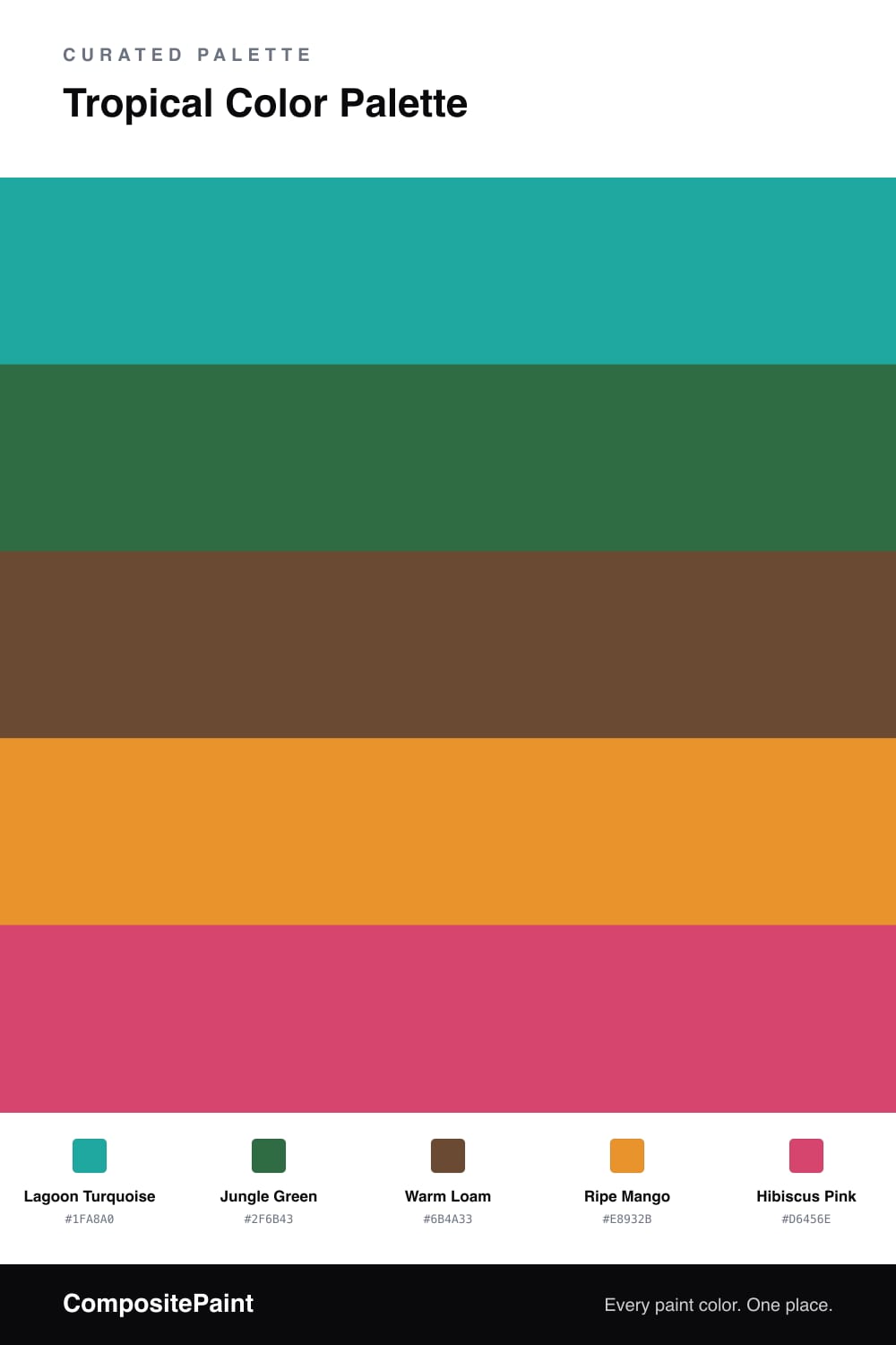
A vivid five-color tropical scheme that pairs turquoise and jungle green with mango, hibiscus pink, and a grounding loam brown — every color matched to real paint you can buy.

By Jessica Williams · Color Stylist & Interior Editor
View palette in

This is the tropics felt all at once. Lagoon Turquoise carries the palette like water under bright sky, and Jungle Green gives it depth, the kind of shade you only find under a thick canopy. Together they feel cool and alive, never cold.

The warmth comes from Ripe Mango, a soft glowing orange that lands like fruit catching the sun, and Hibiscus Pink, the loud little bloom you save for one chair or a single wall. A bit of each goes a long way.

Holding it all down is Warm Loam, a rich earth brown that keeps the brights honest. For 2026 I love this combination on cabinetry or a built-in, where the turquoise reads modern and the loam stops it from tipping into anything too playful.

Buy these colors

Every Color, Matched to Real Paint

Each color matched to the closest paint in every brand we track, by ΔE2000. Tap a swatch for its full guide. Take any code to the store, they mix on demand.

Questions people actually ask

Questions

Why do these tropical colors work together?

They borrow the logic of a real jungle, where bright blooms and fruit pop against deep green and damp earth. The turquoise and green give a calm canopy, while mango and hibiscus are the flashes of life that keep it from feeling flat.

How much of each color should I use?

Let the turquoise lead and the green back it up, roughly a 50/30 split. Then keep mango and hibiscus to small doses, with the loam brown grounding the whole thing underfoot.