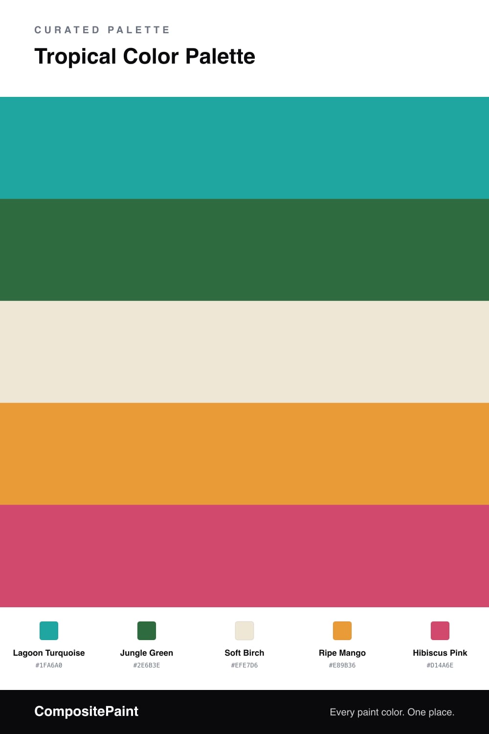
Tropical Color Palette — Birch & Hibiscus
A vivid five-color tropical scheme pairing turquoise and jungle green with mango, hibiscus pink, and a soft birch base — every color matched to real paint you can buy.
By Emily Roberts · DIY Editor & First-Timer's Guide
This is the palette for anyone who wants a little vacation feeling at home. Lagoon Turquoise leads the way with that clear, watery blue-green you see in tropical seas, and a deep Jungle Green stands behind it to keep things from feeling like a pool party.
The trick to making bright colors livable is a calm middle ground, so Soft Birch carries most of the room as a warm off-white. Then you get to have fun. Ripe Mango brings the sunny warmth, and a touch of Hibiscus Pink is the flower in the garden, best used in the smallest amount.
If you are nervous, start with the birch and turquoise alone, then add the mango and hibiscus in pillows, art, or a single painted piece. That way you can dial the energy up or down until it feels right for you.
Buy These Colors
Each color matched to the closest real paint in every brand, by ΔE2000. Tap a swatch for its full guide or + to save it — take any SKU to the store, they mix on demand.
Questions
Let the soft birch base cover most of the space and pick just one bold color to lead. Use the turquoise as your main color, then sprinkle mango and hibiscus in small doses so they read as fun pops, not noise.
Not the way they are balanced here. The turquoise and jungle green are grounded, slightly muted tones, so the palette feels fresh and current for 2026 without tipping into a costume that you will tire of in a year.
Similar Palettes
Closest schemes by color — not by label.