CP

Tropical Color Palette — Mango Marsh

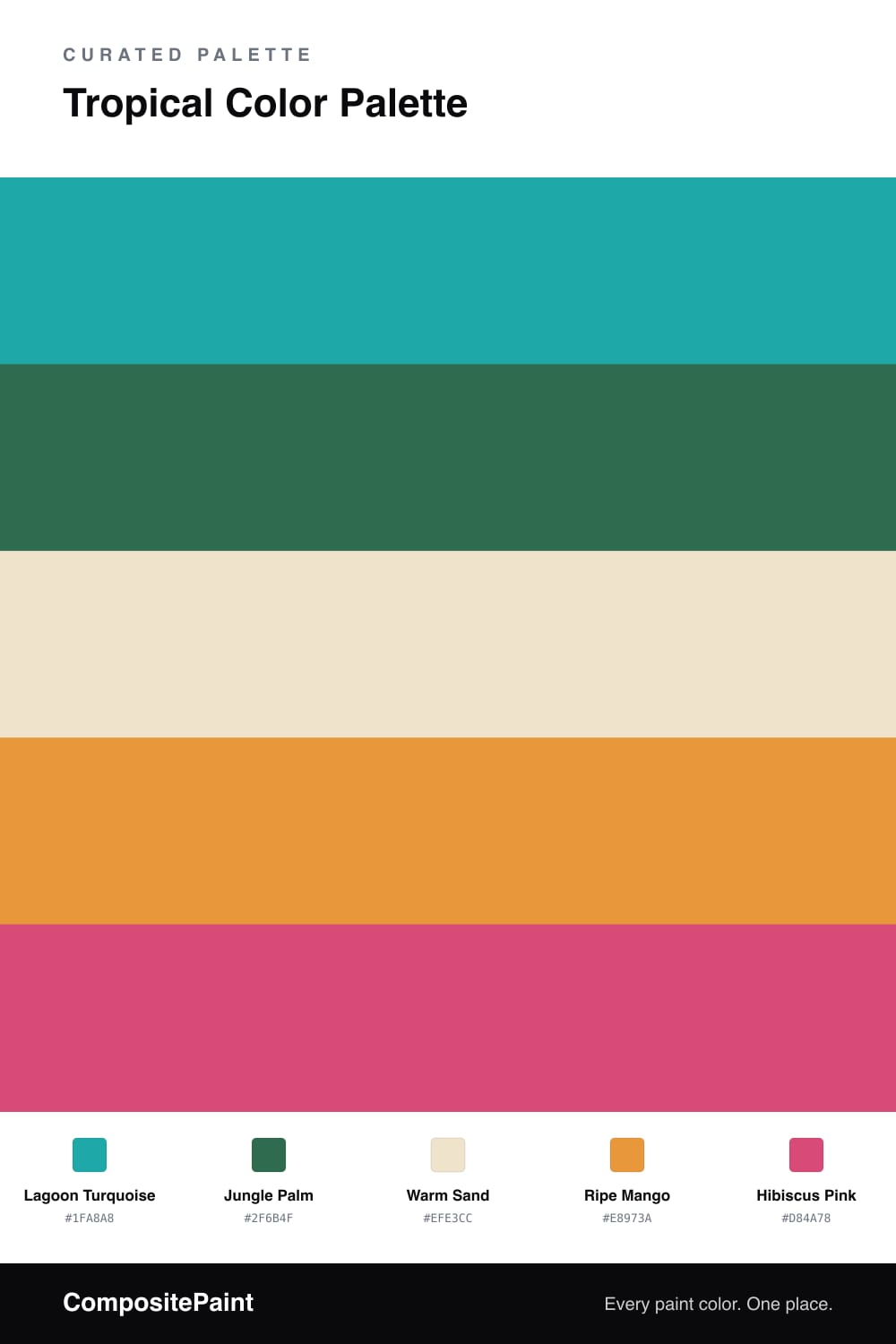
A vivid five-color tropical scheme pairing turquoise and jungle green with mango, hibiscus pink, and a palm accent — every color matched to real paint you can buy.

By Emily Roberts · DIY Editor & First-Timer's Guide

Tropical color is having a real moment in 2026, and this scheme leans all the way in without tipping into theme-park territory. A clear Lagoon Turquoise does the heavy lifting as your dominant shade, with a deep Jungle Palm green right behind it for that shady, leafy feeling.

Here is the trick that keeps it livable — Warm Sand is your true base. Think of it as the beach the whole scene sits on. It cools everything down and gives the brights room to breathe, so the room never feels like it is shouting at you.

Then come the fun parts. Ripe Mango brings a juicy, sunny warmth, and Hibiscus Pink is your accent — the one bold flower in the bunch. Use these last two sparingly, on a chair, a vase, or one painted nook, and let the turquoise and sand carry the rest.

View palette in
Lagoon Turquoise
Dominant
Sherwin-Williams Surfer · SW 6946
#01A4A5
LRV 29
Jungle Palm
Secondary
Dunn-Edwards Verdigris Green · DEFD36
#396D4F
LRV 12
Warm Sand
Base
Dutch Boy Intrigued Ivory · 214-1DB
#F1E4CD
LRV 79
Ripe Mango
Support
Valspar Sunflower Field · V013-3
#E8983D
LRV 40
Hibiscus Pink
Accent
Behr Coral Expression · 160B-6
#E0467C
LRV 22

Buy These Colors

Each color matched to the closest real paint in every brand, by ΔE2000. Tap a swatch for its full guide or + to save it — take any SKU to the store, they mix on demand.

Lagoon Turquoise
#1FA8A8 · LRV 31 · Dominant
Sherwin-Williams · SW 6946 · ΔE 1.44
Behr · M470-6 · ΔE 1.55
Benjamin Moore · 733 · ΔE 1.46
Valspar · 5006-10B · ΔE 2.78
PPG / Glidden · PPG1232-6 · ΔE 3.78
Glidden · 88GG 32/346 · ΔE 4.04
Dutch Boy · 133-6DB · ΔE 3.29
HGTV Home by Sherwin-Williams · HGSW 1323 · ΔE 2.73
Dunn-Edwards · DE5732 · ΔE 2.3
Magnolia Home · JG-02 · ΔE 15.51
Farrow & Ball · NO. CB7 · ΔE 9.36
Diamond Vogel · 0682 · ΔE 1.45
Hirshfield's · 0682 · ΔE 2.65
Rodda · R081 · ΔE 17.19
C2 Paint · C2-730 · ΔE 9.44
Clare · PNT100-MD-75 · ΔE 7.05
Portola Paints · BLUE HERON · ΔE 16.83
Annie Sloan · PROVENCE · ΔE 10.47
Backdrop · BD-PW · ΔE 18.36
Rust-Oleum · 371675 · ΔE 14.03
Kompozit · 0682 · ΔE 2.65
Jungle Palm
#2F6B4F · LRV 12 · Secondary
Sherwin-Williams · SW 6755 · ΔE 3.55
Behr · 460F-6 · ΔE 4.44
Benjamin Moore · 595 · ΔE 3.21
Valspar · 6001-8C · ΔE 2.3
PPG / Glidden · PPG1139-6 · ΔE 2.42
Glidden · PPG1139-6 · ΔE 2.55
Dutch Boy · 130-7DB · ΔE 3.55
HGTV Home by Sherwin-Williams · HGSW 1291 · ΔE 4.25
Dunn-Edwards · DEFD36 · ΔE 1.78
Magnolia Home · JG-71 · ΔE 4.94
Farrow & Ball · NO. 224 · ΔE 11.26
Diamond Vogel · 0697 · ΔE 7.51
Hirshfield's · 0739 · ΔE 5.96
Rodda · R060 · ΔE 11.35
C2 Paint · C2-661 · ΔE 10.76
Clare · PNT100-MD-40 · ΔE 17
Portola Paints · WONDERLAND · ΔE 15.7
Annie Sloan · OLIVE · ΔE 19.94
Backdrop · BD-NE · ΔE 13.5
Rust-Oleum · 391445 · ΔE 9.95
Kompozit · 0739 · ΔE 5.96
Warm Sand
#EFE3CC · LRV 78 · Base
Sherwin-Williams · SW 6371 · ΔE 1.27
Behr · 710C-2 · ΔE 1.4
Benjamin Moore · 1065 · ΔE 1.18
Valspar · 7002-21 · ΔE 2.32
PPG / Glidden · PPG1096-2 · ΔE 1.46
Glidden · 40YY 76/112 · ΔE 1.05
Dutch Boy · 214-1DB · ΔE 0.54
HGTV Home by Sherwin-Williams · HGSW 4038 · ΔE 1.27
Dunn-Edwards · DET669 · ΔE 0.73
Magnolia Home · JG-17 · ΔE 2.31
Farrow & Ball · NO. 2012 · ΔE 2.28
Diamond Vogel · 0300 · ΔE 0.71
Hirshfield's · 0300 · ΔE 0.74
Rodda · CA103 · ΔE 1.88
C2 Paint · C2-883 · ΔE 1.33
Clare · PNT100-LT-62 · ΔE 1.95
Portola Paints · MARIPOSA · ΔE 2.84
Annie Sloan · OLD OCHRE · ΔE 7.13
Backdrop · BD-DS · ΔE 2.43
Rust-Oleum · 398641 · ΔE 6.16
Kompozit · 0300 · ΔE 0.74
Ripe Mango
#E8973A · LRV 40 · Support
Sherwin-Williams · SW 6678 · ΔE 2.99
Behr · T18-05 · ΔE 2.49
Benjamin Moore · ES-40 · ΔE 1.8
Valspar · V013-3 · ΔE 0.35
PPG / Glidden · PPG1203-7 · ΔE 1.68
Glidden · PPG1203-7 · ΔE 1.61
Dutch Boy · 212-7DB · ΔE 2.99
HGTV Home by Sherwin-Williams · HGSW 1161 · ΔE 2.99
Dunn-Edwards · DE5293 · ΔE 2.85
Magnolia Home · JG-40 · ΔE 11.25
Farrow & Ball · NO. W76 · ΔE 2.9
Diamond Vogel · 0983 · ΔE 4.67
Hirshfield's · 0983 · ΔE 3.82
Rodda · CA120 · ΔE 10.81
C2 Paint · C2-618 · ΔE 7.59
Clare · PNT100-DP-59 · ΔE 11.33
Portola Paints · PIXIE · ΔE 12.05
Annie Sloan · ARLES · ΔE 5.31
Backdrop · BD-RO · ΔE 21.08
Rust-Oleum · 398640 · ΔE 9.47
Kompozit · 0983 · ΔE 3.82
Hibiscus Pink
#D84A78 · LRV 21 · Accent
Sherwin-Williams · SW 6860 · ΔE 4.84
Behr · 160B-6 · ΔE 1.53
Benjamin Moore · 1348 · ΔE 3.61
Valspar · 1004-1B · ΔE 5.49
PPG / Glidden · PPG1184-6 · ΔE 4.37
Glidden · 62RR 21/444 · ΔE 3.15
Dutch Boy · 103-6DB · ΔE 8.06
HGTV Home by Sherwin-Williams · HGSW 1054 · ΔE 9.28
Dunn-Edwards · DE5048 · ΔE 2.19
Magnolia Home · JG-25 · ΔE 13.17
Farrow & Ball · NO. W92 · ΔE 5.99
Diamond Vogel · 1100 · ΔE 9.12
Hirshfield's · 1100 · ΔE 9.09
Rodda · CA224 · ΔE 19.66
C2 Paint · BD58 · ΔE 8.53
Clare · PNT100-DP-29 · ΔE 13.87
Portola Paints · MESA · ΔE 22.64
Annie Sloan · CAPRI PINK · ΔE 9.28
Backdrop · BD-BH · ΔE 18.89
Rust-Oleum · 329211 · ΔE 18.82
Kompozit · 1100 · ΔE 9.09

Questions

Why do these tropical colors work together?

They borrow from the same beach scene — water, leaves, fruit, and flowers — so even the bright ones feel related. The warm sand sits in the middle and gives your eyes a place to rest.

How do I use this many bright colors without it feeling busy?

Let the turquoise lead and keep the sand as your main backdrop, then use mango and hibiscus in small doses like a throw pillow or a single door — roughly a 60/30/10 split.

KEEP EXPLORING

Similar Palettes

Closest schemes by color — not by label.