CP

Tropical Color Palette — Flax Lagoon

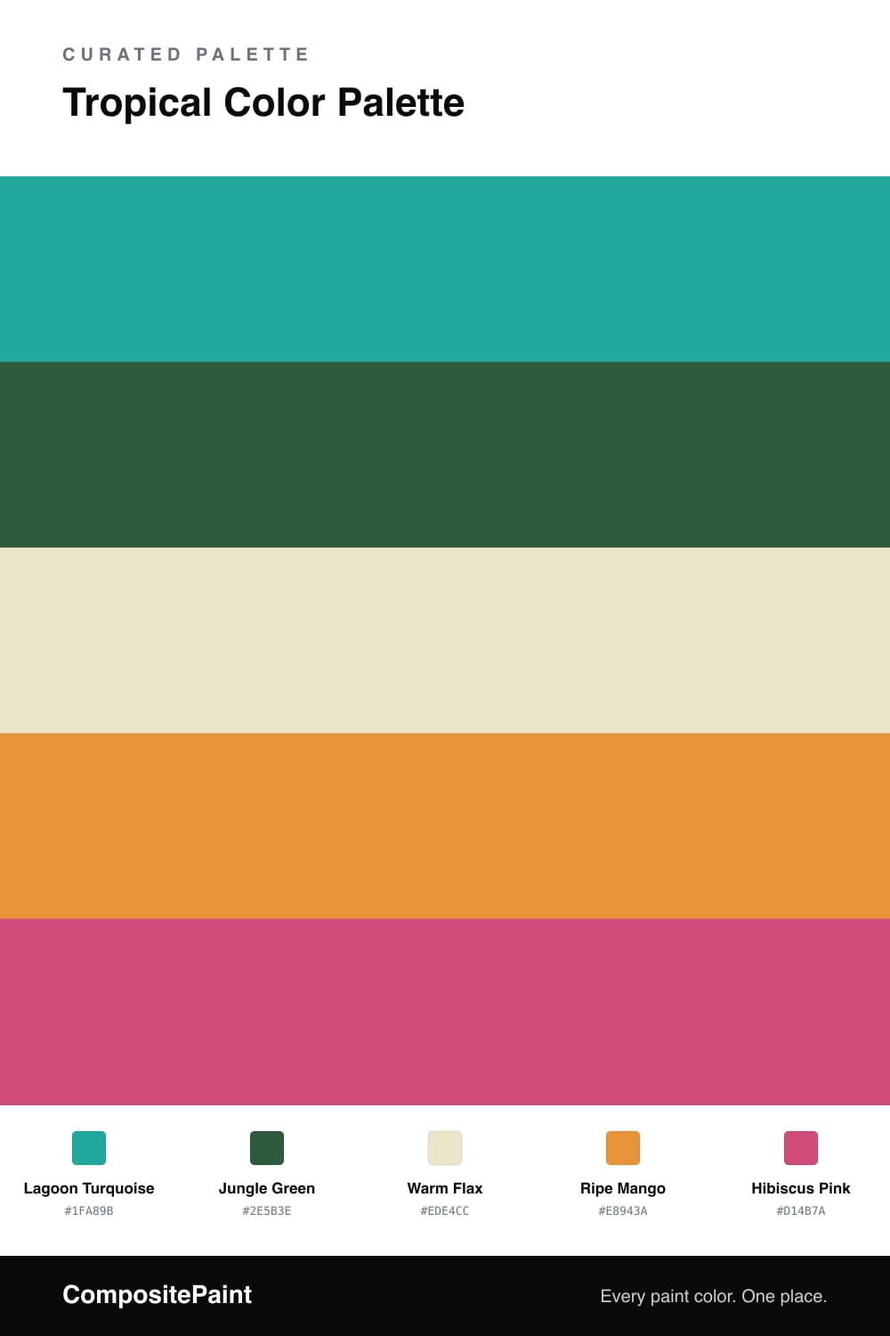
A vivid five-color tropical scheme pairing turquoise lagoon with jungle green, mango, and hibiscus pink over a soft flax base — every color matched to real paint you can buy.

By Jessica Williams · Color Stylist & Interior Editor

This is a palette that feels like stepping off a plane into warm, salt-soft air. A clear Lagoon Turquoise leads the way — bright, watery, and alive — while Jungle Green deepens it like the shade under heavy leaves. Together they hold the cool half of the room.

The warmth comes in through Ripe Mango, a sun-soaked orange that reads as fruit rather than flame, and a single hit of Hibiscus Pink for that flash of bloom you catch out of the corner of your eye. A little of each goes a long way.

Underneath it all sits Warm Flax, a soft oat-toned neutral that keeps the whole thing grounded and very 2026 — bright, but lived-in. Use it on the largest surfaces, let the turquoise carry the personality, and save the mango and pink for the moments you want a smile.

View palette in
Lagoon Turquoise
Dominant
Behr Tropical Sea · HDC-MD-22
#00A69A
LRV 30
Jungle Green
Secondary
Behr Jolly Green · BXC-33
#2E573C
LRV 8
Warm Flax
Base
Glidden Morocco Sand · PPG1096-2
#ECE3CC
LRV 77
Ripe Mango
Support
Valspar Sunflower Field · V013-3
#E8983D
LRV 40
Hibiscus Pink
Accent
Benjamin Moore Razzle Dazzle · 1348
#C9527F
LRV 20

Buy These Colors

Each color matched to the closest real paint in every brand, by ΔE2000. Tap a swatch for its full guide or + to save it — take any SKU to the store, they mix on demand.

Lagoon Turquoise
#1FA89B · LRV 31 · Dominant
Sherwin-Williams · SW 6946 · ΔE 5.32
Behr · HDC-MD-22 · ΔE 1
Benjamin Moore · 664 · ΔE 3.02
Valspar · 5007-10B · ΔE 2.21
PPG / Glidden · PPG1232-6 · ΔE 1.8
Glidden · PPG1232-6 · ΔE 1.96
Dutch Boy · 131-6DB · ΔE 2.84
HGTV Home by Sherwin-Williams · HGSW 1303 · ΔE 5.14
Dunn-Edwards · DEFD41 · ΔE 2.53
Magnolia Home · JG-02 · ΔE 16.34
Farrow & Ball · NO. CB7 · ΔE 13.77
Diamond Vogel · 0682 · ΔE 4.95
Hirshfield's · 0682 · ΔE 6.04
Rodda · R058 · ΔE 16.37
C2 Paint · C2-730 · ΔE 10.36
Clare · PNT100-MD-75 · ΔE 8.41
Portola Paints · BLUE HERON · ΔE 19.1
Annie Sloan · PROVENCE · ΔE 10.55
Backdrop · BD-PW · ΔE 20.16
Rust-Oleum · 371675 · ΔE 15.45
Kompozit · 0682 · ΔE 6.04
Jungle Green
#2E5B3E · LRV 8 · Secondary
Sherwin-Williams · SW 6734 · ΔE 2.66
Behr · BXC-33 · ΔE 1.46
Benjamin Moore · CW-535 · ΔE 1.79
Valspar · 8002-33G · ΔE 1.71
PPG / Glidden · PPG1139-7 · ΔE 4.84
Glidden · PPG1139-7 · ΔE 4.81
Dutch Boy · 229-7DB · ΔE 5.82
HGTV Home by Sherwin-Williams · HGSW 1261 · ΔE 2.66
Dunn-Edwards · DEA178 · ΔE 4.61
Magnolia Home · JG-160 · ΔE 14.47
Farrow & Ball · NO. W55 · ΔE 8.79
Diamond Vogel · 0711 · ΔE 5.87
Hirshfield's · H0094 · ΔE 5.04
Rodda · R048 · ΔE 16.67
C2 Paint · C2-693 · ΔE 12.47
Clare · PNT100-DP-55 · ΔE 21.49
Portola Paints · PONDEROSA · ΔE 17.1
Annie Sloan · AUBUSSON BLUE · ΔE 19.31
Backdrop · BD-NE · ΔE 9.64
Rust-Oleum · 391445 · ΔE 7.69
Kompozit · 0711 · ΔE 6.19
Warm Flax
#EDE4CC · LRV 78 · Base
Sherwin-Williams · SW 6371 · ΔE 2.67
Behr · 710C-2 · ΔE 0.52
Benjamin Moore · 225 · ΔE 0.52
Valspar · 8004-22A · ΔE 1.2
PPG / Glidden · PPG1104-2 · ΔE 1.49
Glidden · PPG1096-2 · ΔE 0.41
Dutch Boy · 121-1DB · ΔE 0.96
HGTV Home by Sherwin-Williams · HGSW 4038 · ΔE 2.67
Dunn-Edwards · DET669 · ΔE 1.77
Magnolia Home · JG-17 · ΔE 1.6
Farrow & Ball · NO. 2012 · ΔE 1.3
Diamond Vogel · 0300 · ΔE 0.95
Hirshfield's · 0384 · ΔE 0.97
Rodda · CA103 · ΔE 3.36
C2 Paint · C2-883 · ΔE 0.73
Clare · PNT100-LT-62 · ΔE 2.88
Portola Paints · MARIPOSA · ΔE 2.27
Annie Sloan · OLD OCHRE · ΔE 7.9
Backdrop · BD-DS · ΔE 1.34
Rust-Oleum · 398641 · ΔE 5.54
Kompozit · 0384 · ΔE 0.97
Ripe Mango
#E8943A · LRV 39 · Support
Sherwin-Williams · SW 6678 · ΔE 4.15
Behr · 290D-5 · ΔE 1.58
Benjamin Moore · ES-40 · ΔE 2.12
Valspar · V013-3 · ΔE 1.36
PPG / Glidden · PPG17-22 · ΔE 2.69
Glidden · PPG17-22 · ΔE 3.02
Dutch Boy · 110-6DB · ΔE 2.94
HGTV Home by Sherwin-Williams · HGSW 1161 · ΔE 4.15
Dunn-Edwards · DE5236 · ΔE 2.23
Magnolia Home · JG-40 · ΔE 12.01
Farrow & Ball · NO. W76 · ΔE 4.06
Diamond Vogel · 0983 · ΔE 4.39
Hirshfield's · 0983 · ΔE 3.27
Rodda · CA120 · ΔE 11.03
C2 Paint · C2-574 · ΔE 6.38
Clare · PNT100-DP-59 · ΔE 11.81
Portola Paints · PIXIE · ΔE 11.75
Annie Sloan · ARLES · ΔE 6.26
Backdrop · BD-RO · ΔE 20.64
Rust-Oleum · 398640 · ΔE 8.55
Kompozit · 0983 · ΔE 3.27
Hibiscus Pink
#D14B7A · LRV 20 · Accent
Sherwin-Williams · SW 6860 · ΔE 5.22
Behr · M160-6 · ΔE 3.36
Benjamin Moore · 1348 · ΔE 2.11
Valspar · 1002-1B · ΔE 6.15
PPG / Glidden · PPG1181-7 · ΔE 2.68
Glidden · 43RR 19/444 · ΔE 2.66
Dutch Boy · 103-6DB · ΔE 8.74
HGTV Home by Sherwin-Williams · HGSW 1054 · ΔE 10.35
Dunn-Edwards · DE5048 · ΔE 2.6
Magnolia Home · JG-25 · ΔE 13.42
Farrow & Ball · NO. W92 · ΔE 5.41
Diamond Vogel · 1100 · ΔE 10.24
Hirshfield's · 1100 · ΔE 10.31
Rodda · CA224 · ΔE 19.97
C2 Paint · BD58 · ΔE 9.18
Clare · PNT100-DP-29 · ΔE 14.51
Portola Paints · MESA · ΔE 23.38
Annie Sloan · CAPRI PINK · ΔE 9.33
Backdrop · BD-BH · ΔE 18.93
Rust-Oleum · 329211 · ΔE 19.31
Kompozit · 1100 · ΔE 10.31

Questions

Why do these tropical colors work together?

They borrow the logic of a real island scene — water, leaf, sand, fruit, and flower. The soft flax base cools everything down so the brights feel joyful instead of loud.

How do I keep a palette this bright from overwhelming a space?

Let the turquoise lead and hold the mango and hibiscus to small doses — think a roughly 60/30/10 split, with the flax and green carrying the calm.

KEEP EXPLORING

Similar Palettes

Closest schemes by color — not by label.