Tropical Color Palette — Tropical Jungle
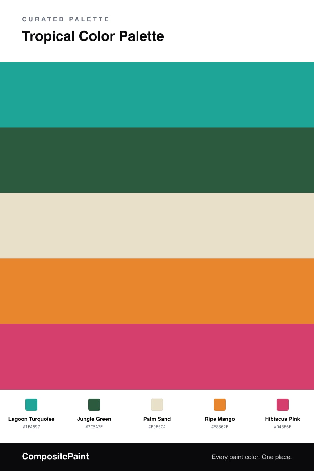
A lush five-color scheme layering turquoise lagoon and deep jungle green with mango, hibiscus pink, and a soft palm sand — every color matched to real paint you can buy.
By Jessica Williams · Color Stylist & Interior Editor
This is the palette I reach for when a space needs to feel like a deep breath of warm air. Lagoon Turquoise leads the whole scheme, that clear blue-green you see in shallow water, and Jungle Green sits beneath it like the shade under heavy leaves. Together they feel alive and a little wild, but never sweet.
Palm Sand is the quiet hero here. It is the soft, sun-bleached neutral that lets the brights sing, so the room never tips into a theme. Against it, Ripe Mango brings the heat of late afternoon and a single hit of Hibiscus Pink adds that flash of flower against green that you only really see in the tropics.
For 2026 I love keeping this combination grounded and grown-up. Pull the turquoise toward the deeper, slightly grayed side, lean on natural textures like rattan and linen, and let the pink show up just once or twice. The result feels less like a beach poster and more like a calm, confident room that happens to be in love with the jungle.
Buy These Colors
Each color matched to the closest real paint in every brand, by ΔE2000. Tap a swatch for its full guide or + to save it — take any SKU to the store, they mix on demand.
Questions
Let the soft Palm Sand carry most of the surface and keep the brights as moments. A turquoise wall, a mango chair, a few hibiscus cushions, and a deep green plant corner is plenty. The neutral base gives your eye somewhere to rest so the color reads joyful instead of chaotic.
Lead with Lagoon Turquoise and back it with Jungle Green for depth. Then use Ripe Mango in mid-size doses and save Hibiscus Pink for the smallest, sharpest accents, like trim, a vase, or a single piece of art.
Similar Palettes
Closest schemes by color — not by label.