CP

Tropical Color Palette — Tropical Fern

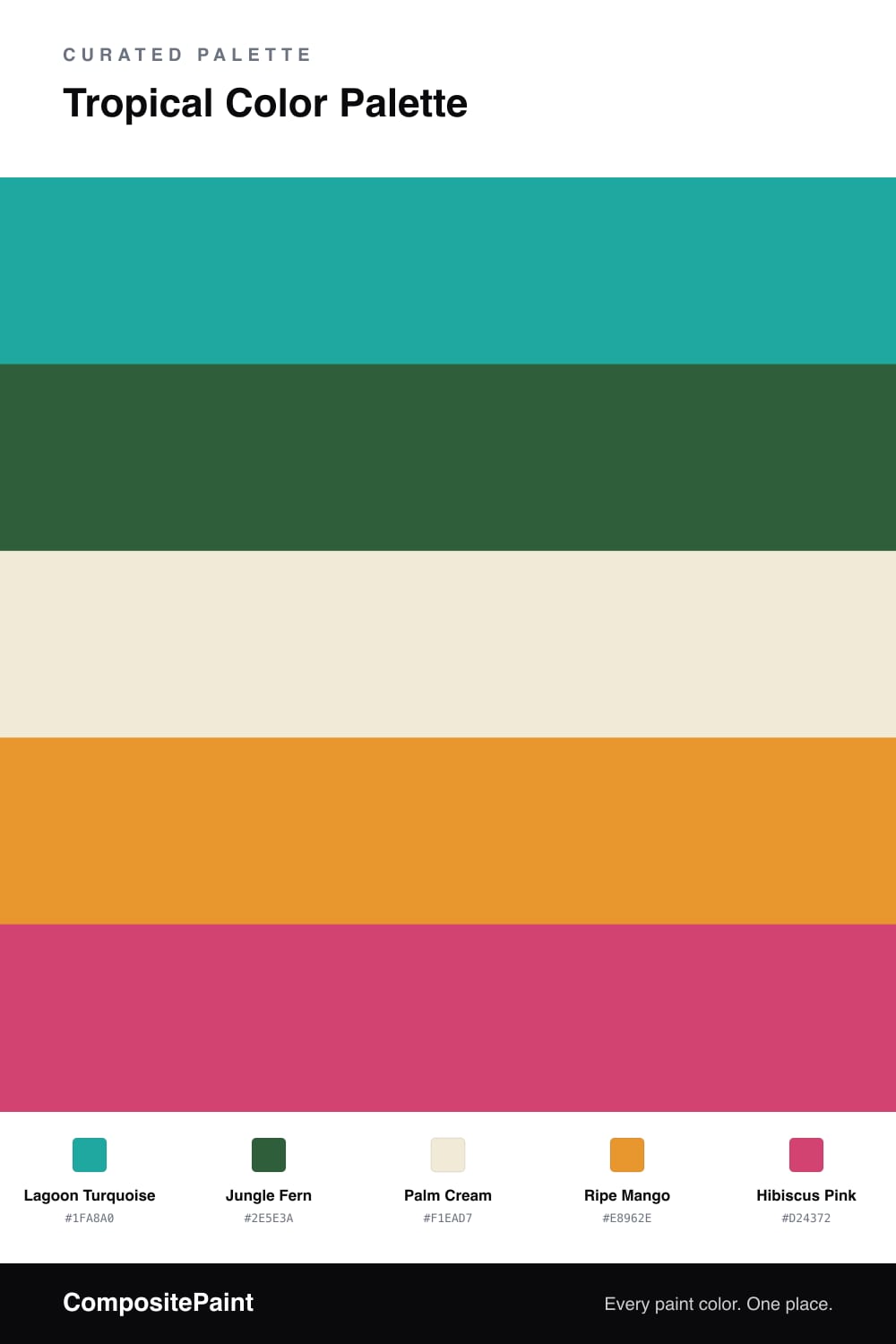
A vivid five-color tropical scheme pairing turquoise and deep jungle green with mango and hibiscus pink, grounded by a soft palm cream — every color matched to real paint you can buy.

By David Chen · Formulation Lead & Resident Chemist

Think of standing at the edge of a tropical lagoon. The water glows, the ferns crowd in behind it, and a single flower catches your eye. That is the whole idea here. Lagoon Turquoise does the heavy lifting as the dominant color, cool and clear, while Jungle Fern deepens the scene with a green that feels planted and real rather than minty.

Palm Cream is the quiet base that lets the rest of the palette breathe. Without it, the brights would fight each other. With it, they each get their own moment. I like to think of cream as the daylight in the photo, the thing that makes every other color legible.

The fun lives in the last two. Ripe Mango adds warmth and a 2026-friendly sun-washed glow, and Hibiscus Pink is the accent you use sparingly, a single bloom against all that green. Keep those two small and the palette stays vivid without tipping into loud.

View palette in
Lagoon Turquoise
Dominant
PPG / Glidden Grecian Isle · PPG1232-6
#00A59C
LRV 29
Jungle Fern
Secondary
Sherwin-Williams Espalier · SW 6734
#2F5F3A
LRV 9
Palm Cream
Base
Glidden Creamy White · PPG1105-1
#F0E9D6
LRV 82
Ripe Mango
Support
Valspar Roasted Chestnut · 3002-3A
#E89629
LRV 39
Hibiscus Pink
Accent
Dunn-Edwards Pink Punch · DE5048
#D04A70
LRV 18

Buy These Colors

Each color matched to the closest real paint in every brand, by ΔE2000. Tap a swatch for its full guide or + to save it — take any SKU to the store, they mix on demand.

Lagoon Turquoise
#1FA8A0 · LRV 31 · Dominant
Sherwin-Williams · SW 6946 · ΔE 3.55
Behr · M470-6 · ΔE 2.3
Benjamin Moore · 664 · ΔE 1.38
Valspar · 5007-10B · ΔE 2.23
PPG / Glidden · PPG1232-6 · ΔE 1.3
Glidden · PPG1232-6 · ΔE 1.55
Dutch Boy · 133-6DB · ΔE 6.36
HGTV Home by Sherwin-Williams · HGSW 1323 · ΔE 5.53
Dunn-Edwards · DE5732 · ΔE 1.68
Magnolia Home · JG-02 · ΔE 15.97
Farrow & Ball · NO. CB7 · ΔE 12.07
Diamond Vogel · 0682 · ΔE 3.21
Hirshfield's · 0682 · ΔE 4.43
Rodda · R058 · ΔE 17.29
C2 Paint · C2-730 · ΔE 9.83
Clare · PNT100-MD-75 · ΔE 7.64
Portola Paints · BLUE HERON · ΔE 18.21
Annie Sloan · PROVENCE · ΔE 10.35
Backdrop · BD-PW · ΔE 19.45
Rust-Oleum · 371675 · ΔE 14.84
Kompozit · 0682 · ΔE 4.43
Jungle Fern
#2E5E3A · LRV 9 · Secondary
Sherwin-Williams · SW 6734 · ΔE 0.43
Behr · 450F-7 · ΔE 2.14
Benjamin Moore · CW-535 · ΔE 3.03
Valspar · 8002-33G · ΔE 1.74
PPG / Glidden · PPG1132-7 · ΔE 4.65
Glidden · PPG1132-7 · ΔE 4.59
Dutch Boy · 227-6DB · ΔE 4.05
HGTV Home by Sherwin-Williams · HGSW 1261 · ΔE 0.43
Dunn-Edwards · DEA178 · ΔE 6.32
Magnolia Home · JG-72 · ΔE 12.68
Farrow & Ball · NO. 310 · ΔE 9.7
Diamond Vogel · 0711 · ΔE 7.9
Hirshfield's · H0094 · ΔE 6.83
Rodda · CA180 · ΔE 12.18
C2 Paint · C2-693 · ΔE 14.09
Clare · PNT100-DP-55 · ΔE 22.63
Portola Paints · WONDERLAND · ΔE 14.04
Annie Sloan · AUBUSSON BLUE · ΔE 21.45
Backdrop · BD-NE · ΔE 11.16
Rust-Oleum · 391445 · ΔE 9.41
Kompozit · 0711 · ΔE 8.3
Palm Cream
#F1EAD7 · LRV 82 · Base
Sherwin-Williams · SW 7558 · ΔE 1.64
Behr · YL-W08 · ΔE 0.75
Benjamin Moore · 942 · ΔE 1.13
Valspar · 8003-25A · ΔE 1.49
PPG / Glidden · PPG1100-2 · ΔE 0.51
Glidden · PPG1105-1 · ΔE 0.21
Dutch Boy · 116-1DB · ΔE 0.77
HGTV Home by Sherwin-Williams · HGSW 1187 · ΔE 0.39
Dunn-Edwards · DEW336 · ΔE 1.48
Magnolia Home · JG-33 · ΔE 1.56
Farrow & Ball · NO. 2002 · ΔE 0.8
Diamond Vogel · 0009 · ΔE 0.79
Hirshfield's · 0009 · ΔE 0.97
Rodda · CA006 · ΔE 1.45
C2 Paint · C2-563 · ΔE 1.22
Clare · PNT100-LT-62 · ΔE 2.22
Portola Paints · CASA FORMA · ΔE 1.46
Annie Sloan · OLD OCHRE · ΔE 9.67
Backdrop · BD-DS · ΔE 1.75
Rust-Oleum · 329598 · ΔE 2.88
Kompozit · 0009 · ΔE 0.97
Ripe Mango
#E8962E · LRV 39 · Support
Sherwin-Williams · SW 6678 · ΔE 2.24
Behr · T18-05 · ΔE 2.71
Benjamin Moore · ES-40 · ΔE 3.12
Valspar · 3002-3A · ΔE 0.6
PPG / Glidden · PPG17-22 · ΔE 4.89
Glidden · PPG1203-7 · ΔE 2.84
Dutch Boy · 212-7DB · ΔE 2.24
HGTV Home by Sherwin-Williams · HGSW 1161 · ΔE 2.24
Dunn-Edwards · DE5293 · ΔE 2.13
Magnolia Home · JG-45 · ΔE 14.32
Farrow & Ball · NO. W76 · ΔE 2.98
Diamond Vogel · 0983 · ΔE 6.06
Hirshfield's · 0983 · ΔE 5.25
Rodda · CA120 · ΔE 11.82
C2 Paint · C2-618 · ΔE 7.13
Clare · PNT100-DP-59 · ΔE 11.81
Portola Paints · PIXIE · ΔE 13.27
Annie Sloan · ARLES · ΔE 5.72
Backdrop · BD-RO · ΔE 22.35
Rust-Oleum · 398640 · ΔE 10.42
Kompozit · 0983 · ΔE 5.25
Hibiscus Pink
#D24372 · LRV 19 · Accent
Sherwin-Williams · SW 6860 · ΔE 4.24
Behr · P160-5 · ΔE 3.1
Benjamin Moore · 2079-30 · ΔE 1.98
Valspar · 8001-5G · ΔE 4.61
PPG / Glidden · PPG1184-7 · ΔE 4.33
Glidden · PPG1184-7 · ΔE 4.36
Dutch Boy · 103-6DB · ΔE 8.12
HGTV Home by Sherwin-Williams · HGSW 1053 · ΔE 10.36
Dunn-Edwards · DE5048 · ΔE 1.64
Magnolia Home · JG-25 · ΔE 12.06
Farrow & Ball · NO. W92 · ΔE 4.51
Diamond Vogel · 1101 · ΔE 12.7
Hirshfield's · 1100 · ΔE 9.66
Rodda · CA224 · ΔE 19.51
C2 Paint · BD58 · ΔE 8.86
Clare · PNT100-DP-29 · ΔE 13.76
Portola Paints · MESA · ΔE 23.14
Annie Sloan · CAPRI PINK · ΔE 7.36
Backdrop · BD-BH · ΔE 17.27
Rust-Oleum · 329211 · ΔE 17.61
Kompozit · 1100 · ΔE 9.66

Questions

Why do these tropical colors work together?

They borrow the logic of a real jungle scene, where bright water and warm fruit always sit against many shades of green. The cream acts as breathing room so the bold colors read as lively rather than chaotic.

How do I keep the bright colors from feeling overwhelming?

Let the turquoise lead and the green back it up, then use mango and hibiscus only as small sparks. A rough 60/25/15 split keeps the energy while the cream calms everything down.

KEEP EXPLORING

Similar Palettes

Closest schemes by color — not by label.