CP

Tropical Color Palette — Tropical Cove

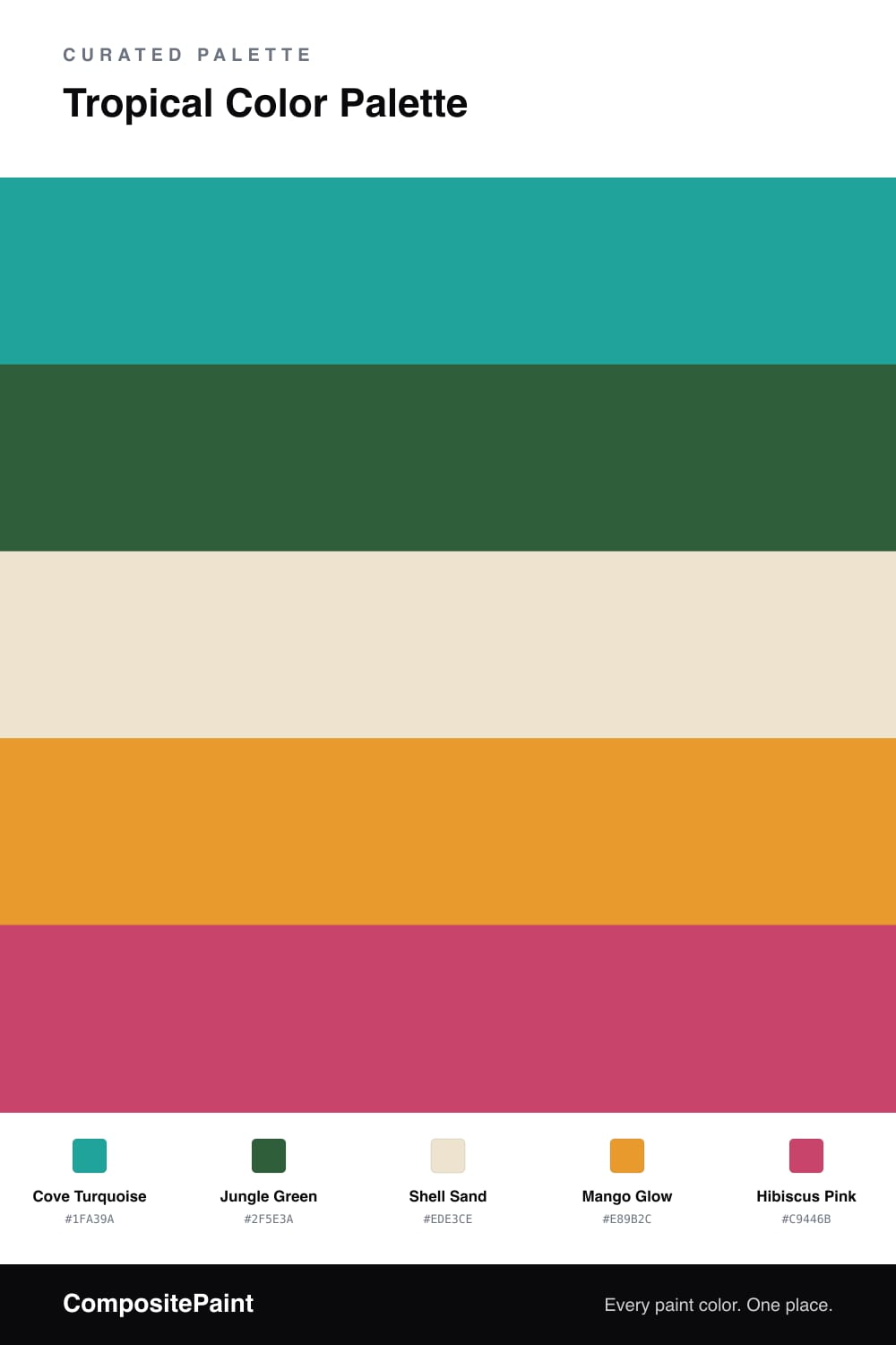
A vivid five-color tropical scheme pairing turquoise and jungle green with mango and hibiscus pink over a sandy base — every color matched to real paint you can buy.

By Maya Patel · Reviews Editor & Product Tester

This is the tropical look I keep coming back to in 2026 — fresh, a little playful, and grounded enough to live with. Cove Turquoise does the heavy lifting, that clean lagoon blue-green you want on a big wall, while Jungle Green adds the deep palm shadow that makes the turquoise feel like real water and not a pool float.

Shell Sand is the quiet hero. It is the warm, barely-there neutral that gives your eyes a place to rest, and it is what lets the loud colors stay friends. Without it, this palette would shout.

Then the fun part. Mango Glow brings the warm citrus hit, and Hibiscus Pink is the flower against the leaves — bold, modern, and best in small doses. Keep these two as accents on smaller pieces and trim, and the room stays vivid without tipping into theme-park territory.

View palette in
Cove Turquoise
Dominant
Glidden Grecian Isle · PPG1232-6
#00A49B
LRV 29
Jungle Green
Secondary
Sherwin-Williams Espalier · SW 6734
#2F5F3A
LRV 9
Shell Sand
Base
C2 Paint Horseradish · C2-883
#EDE4CE
LRV 78
Mango Glow
Support
Dunn-Edwards Persimmon · DE5293
#E59B34
LRV 38
Hibiscus Pink
Accent
Benjamin Moore Peony · 2079-30
#C84470
LRV 18

Buy These Colors

Each color matched to the closest real paint in every brand, by ΔE2000. Tap a swatch for its full guide or + to save it — take any SKU to the store, they mix on demand.

Cove Turquoise
#1FA39A · LRV 29 · Dominant
Sherwin-Williams · SW 6939 · ΔE 2.52
Behr · HDC-MD-22 · ΔE 1.55
Benjamin Moore · 664 · ΔE 1.85
Valspar · 5007-10B · ΔE 0.93
PPG / Glidden · PPG1232-6 · ΔE 0.9
Glidden · PPG1232-6 · ΔE 0.76
Dutch Boy · 131-6DB · ΔE 3.43
HGTV Home by Sherwin-Williams · HGSW 1303 · ΔE 5.81
Dunn-Edwards · DEFD41 · ΔE 3.69
Magnolia Home · JG-70 · ΔE 13.7
Farrow & Ball · NO. CB7 · ΔE 12.58
Diamond Vogel · 0682 · ΔE 3.43
Hirshfield's · 0682 · ΔE 4.25
Rodda · R058 · ΔE 16.48
C2 Paint · C2-730 · ΔE 9.22
Clare · PNT100-MD-75 · ΔE 7.04
Portola Paints · BLUE HERON · ΔE 17.96
Annie Sloan · PROVENCE · ΔE 10.33
Backdrop · BD-PW · ΔE 19.19
Rust-Oleum · 285141 · ΔE 20.04
Kompozit · 0682 · ΔE 4.25
Jungle Green
#2F5E3A · LRV 9 · Secondary
Sherwin-Williams · SW 6734 · ΔE 0.41
Behr · 450F-7 · ΔE 1.99
Benjamin Moore · CW-535 · ΔE 3.13
Valspar · 8002-33G · ΔE 1.62
PPG / Glidden · PPG1132-7 · ΔE 4.75
Glidden · PPG1132-7 · ΔE 4.7
Dutch Boy · 227-6DB · ΔE 3.89
HGTV Home by Sherwin-Williams · HGSW 1261 · ΔE 0.41
Dunn-Edwards · DEA178 · ΔE 6.43
Magnolia Home · JG-72 · ΔE 12.57
Farrow & Ball · NO. 310 · ΔE 9.57
Diamond Vogel · 0711 · ΔE 7.93
Hirshfield's · H0094 · ΔE 6.79
Rodda · CA180 · ΔE 12.07
C2 Paint · C2-693 · ΔE 14.02
Clare · PNT100-DP-55 · ΔE 22.53
Portola Paints · WONDERLAND · ΔE 13.9
Annie Sloan · AUBUSSON BLUE · ΔE 21.43
Backdrop · BD-NE · ΔE 11.07
Rust-Oleum · 391445 · ΔE 9.33
Kompozit · 0739 · ΔE 5.51
Shell Sand
#EDE3CE · LRV 77 · Base
Sherwin-Williams · SW 7571 · ΔE 1.5
Behr · 23 · ΔE 1.35
Benjamin Moore · 232 · ΔE 0.9
Valspar · 8004-22A · ΔE 1.47
PPG / Glidden · PPG1104-2 · ΔE 1.91
Glidden · 40YY 76/112 · ΔE 0.73
Dutch Boy · 214-1DB · ΔE 1.35
HGTV Home by Sherwin-Williams · HGSW 4042 · ΔE 1.5
Dunn-Edwards · DET676 · ΔE 0.77
Magnolia Home · JG-17 · ΔE 1.46
Farrow & Ball · NO. 59 · ΔE 1.17
Diamond Vogel · 0300 · ΔE 1.04
Hirshfield's · 0327 · ΔE 0.82
Rodda · CA010 · ΔE 1.7
C2 Paint · C2-883 · ΔE 0.73
Clare · PNT100-LT-62 · ΔE 1.64
Portola Paints · MARIPOSA · ΔE 1.9
Annie Sloan · OLD OCHRE · ΔE 7.7
Backdrop · BD-DS · ΔE 2.17
Rust-Oleum · 398641 · ΔE 6.5
Kompozit · 0327 · ΔE 0.82
Mango Glow
#E89B2C · LRV 41 · Support
Sherwin-Williams · SW 6678 · ΔE 1.13
Behr · HDC-FL14-5 · ΔE 1.9
Benjamin Moore · 308 · ΔE 2.17
Valspar · 3002-3A · ΔE 1.79
PPG / Glidden · PPG1203-7 · ΔE 4.02
Glidden · PPG1203-7 · ΔE 4.17
Dutch Boy · 212-7DB · ΔE 1.13
HGTV Home by Sherwin-Williams · HGSW 1161 · ΔE 1.13
Dunn-Edwards · DE5293 · ΔE 0.91
Magnolia Home · JG-45 · ΔE 12.99
Farrow & Ball · NO. W76 · ΔE 2.35
Diamond Vogel · 0942 · ΔE 4.61
Hirshfield's · 0942 · ΔE 4.44
Rodda · CA126 · ΔE 10.9
C2 Paint · C2-618 · ΔE 5.25
Clare · PNT100-DP-59 · ΔE 11.42
Portola Paints · PIXIE · ΔE 14.11
Annie Sloan · ARLES · ΔE 4.93
Backdrop · BD-EA · ΔE 14.43
Rust-Oleum · 398640 · ΔE 12.18
Kompozit · 0942 · ΔE 4.44
Hibiscus Pink
#C9446B · LRV 18 · Accent
Sherwin-Williams · SW 6860 · ΔE 3.2
Behr · P160-5 · ΔE 2.21
Benjamin Moore · 2079-30 · ΔE 1.53
Valspar · 8001-5G · ΔE 2.57
PPG / Glidden · PPG1184-7 · ΔE 3.08
Glidden · PPG1184-7 · ΔE 3.2
Dutch Boy · 101-6DB · ΔE 4.12
HGTV Home by Sherwin-Williams · HGSW 1053 · ΔE 8.63
Dunn-Edwards · DE5048 · ΔE 2.22
Magnolia Home · JG-25 · ΔE 10.22
Farrow & Ball · NO. W92 · ΔE 2.62
Diamond Vogel · 1102 · ΔE 9.04
Hirshfield's · 1129 · ΔE 5.63
Rodda · CA224 · ΔE 18.15
C2 Paint · BD58 · ΔE 8.19
Clare · PNT100-DP-29 · ΔE 12.56
Portola Paints · MESA · ΔE 22.31
Annie Sloan · CAPRI PINK · ΔE 6.31
Backdrop · BD-BH · ΔE 15.28
Rust-Oleum · 329211 · ΔE 15.95
Kompozit · 1129 · ΔE 5.63

Questions

Why do these tropical colors work together?

They borrow the logic of a real shoreline — cool turquoise water, deep palm greens, warm sand, and bright fruit and flower colors. The neutral sand keeps the brights from fighting each other, so the whole thing reads lively instead of chaotic.

How do I use them without overdoing it?

Let Cove Turquoise lead and keep the hot colors small. Roughly two-thirds cool tones and sand, then mango and hibiscus as quick sparks on a door, a chair, or art.

KEEP EXPLORING

Similar Palettes

Closest schemes by color — not by label.