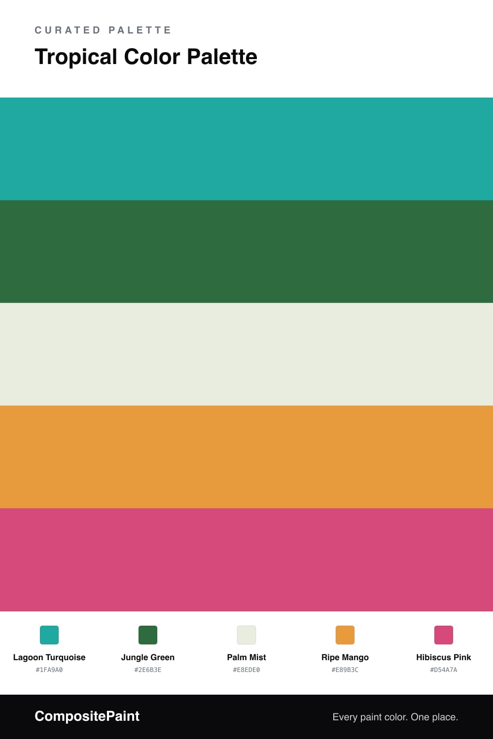
Tropical Color Palette — Tropical Vale
A vivid five-color tropical scheme layering turquoise, jungle green, and mango with a soft palm base and a hibiscus pink accent — every color matched to real paint you can buy.
By Jessica Williams · Color Stylist & Interior Editor
There is a kind of color that feels like warm air on your skin, and this palette is built entirely from it. Lagoon Turquoise sets the tone, that clear blue-green you find in shallow water, and Jungle Green sits underneath it like dense leaves catching shade.
To keep all that vividness from tipping into noise, I leaned on Palm Mist, a soft, almost-white green that lets everything else breathe. Ripe Mango brings the late-afternoon warmth, and a touch of Hibiscus Pink is the flower in the hedge — used sparingly, it makes the whole scheme feel alive.
This is a confident, slightly playful palette that suits where 2026 is heading, color used with joy rather than caution. Anchor a space in the turquoise and palm, fold in the green and mango, and let the pink show up only where you want a little heat.
Buy These Colors
Each color matched to the closest real paint in every brand, by ΔE2000. Tap a swatch for its full guide or + to save it — take any SKU to the store, they mix on demand.
Questions
They share the same sun-soaked energy, so they read as one mood instead of a clash. The turquoise leads, the deep green steadies it, and the pale palm base gives your eye a place to rest between the brighter notes.
Let the turquoise carry most of the space and keep the jungle green close behind. Treat mango as a warm supporting layer and save the hibiscus pink for the smallest, boldest moments — a door, a chair, or a single shelf.
Similar Palettes
Closest schemes by color — not by label.