Tropical Color Palette — Tropical Opal
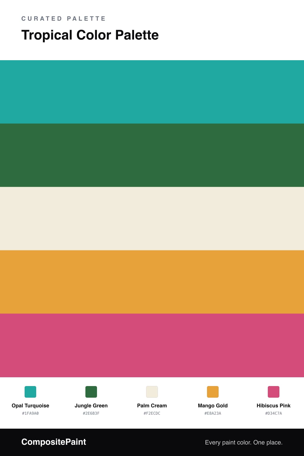
A vivid five-color tropical scheme pairing opal turquoise with jungle green, mango, and hibiscus pink, grounded by a soft palm cream — every color matched to real paint you can buy.
By David Chen · Formulation Lead & Resident Chemist
Tropical color is really a balancing act between cool and warm, and this scheme leans on Opal Turquoise as the anchor. It reads like shallow water over white sand, which is exactly why it can carry so much of a wall without tiring the eye.
From there I bring in Jungle Green for depth and a warm pair of Mango Gold and Hibiscus Pink for the spark. Think of the warm tones as fruit against foliage — a little goes a long way, so keep them to trim, a door, or one piece of furniture.
Palm Cream is the quiet hero here. It gives the bright colors somewhere to rest, which is what makes this feel fresh and current rather than like a theme park. For a 2026 take, lean into matte finishes so the turquoise and green look soft and chalky rather than glossy.
Buy These Colors
Each color matched to the closest real paint in every brand, by ΔE2000. Tap a swatch for its full guide or + to save it — take any SKU to the store, they mix on demand.
Questions
They share the same high energy but sit at different points on the wheel, so the cool turquoise and green cool things down while the mango and hibiscus warm them back up. The cream base keeps all that brightness from competing at once.
Let the turquoise lead and treat mango and hibiscus as small sparks, roughly a 70/30 split. Think of the cream as the breathing room between the louder notes.
Similar Palettes
Closest schemes by color — not by label.