Palette

Tropical Color PaletteCedar Lagoon

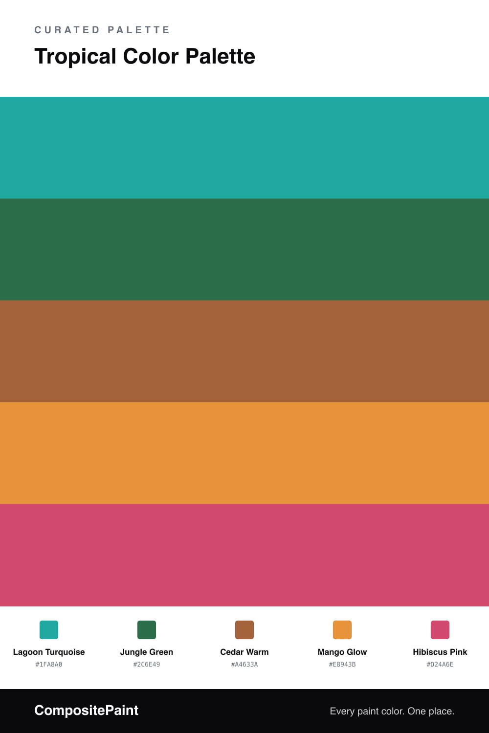
A vivid five-color tropical scheme pairing turquoise lagoon and jungle green with mango and hibiscus, grounded by warm cedar — every color matched to real paint you can buy.

By Maya Patel · Reviews Editor & Product Tester
View palette in

Tropical palettes usually go wrong by trying to use every loud color at full volume. This one fixes that with a clear hierarchy. Lagoon Turquoise leads as the dominant, Jungle Green backs it up, and a grounded Cedar Warm keeps the whole thing from floating away into pure vacation kitsch.

The two warm players, Mango Glow and Cedar Warm, are what make this feel current rather than retro. They bridge the cool turquoise and the hot pink so nothing clashes, and they nod to the earthy, clay-forward look that is everywhere in 2026.

Save Hibiscus Pink for the smallest moments — a single piece of furniture, a door, a pillow. In tiny doses it is the spark that tells you the rest of the palette is intentional. Push the turquoise and green wide, keep the cedar and mango steady, and let the pink do its one loud job.

Buy these colors

Every Color, Matched to Real Paint

Each color matched to the closest paint in every brand we track, by ΔE2000. Tap a swatch for its full guide. Take any code to the store, they mix on demand.

Questions people actually ask

Questions

Why do these tropical colors work together?

They share the same high-energy, sun-soaked mood, so even though they are bright they read as one family. The cedar base does the heavy lifting, giving your eye a warm resting spot between the louder shades.

How do I keep a palette this bold from feeling busy?

Let the turquoise lead and treat hibiscus as a tiny spark, roughly a one-fifth dose. Use cedar and mango as the connective tissue so the green and pink never fight for attention.