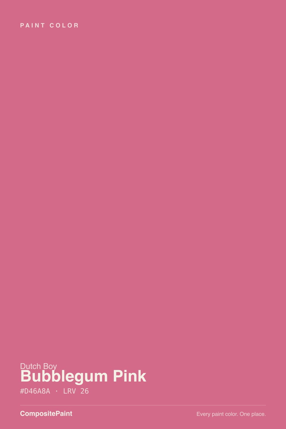
Bubblegum Pink
The candy pink in the Dutch Boy deck, reviewed honestly: where it pops on one wall or a dresser, and where four walls of it still reads like a joke.

Jessica has spec'd whites and neutrals for more than 300 rooms and keeps a sample wall of painted drawdowns in her studio. Every color review is checked against real reader rooms in the comments and re-tested when a formula changes. About the testing process →
- 1Berry Bush14
- 2Razzle Dazzle20
- 3Bubblegum Pink26
- 4Vintage Tea Rose47
- 5Pink Quartz53
The Fast Verdict
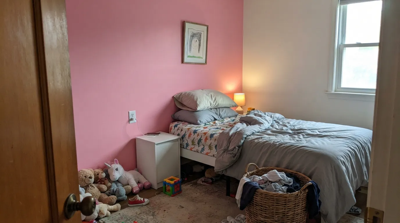
Bubblegum Pink is exactly what the name promises: a saturated medium pink with a warm rose-to-coral bias, not a dusty blush and not millennial beige-pink. At LRV 26 it has real depth, so it stays candy in daylight instead of washing out to baby-girl pastel — which is the whole point, and also the trap. Paint a dresser, a powder room, or one kids-room wall and it feels joyful and deliberate. Paint a living room and you have committed to bubblegum.
One accent wall · painted dressers, vanities, and kids furniture · nurseries, playrooms, and teen rooms · a powder-room drench if you actually want candy
You wanted dusty rose or millennial blush · the plan is four living-room walls · cool white LEDs and a dim north room · you repaint rarely and hate trend risk
- Unapologetic candy pink — nobody will ask if it was supposed to be beige
- LRV 26 holds the chroma in daylight instead of washing to baby-pastel
- High payoff on one wall, a dresser, or a vanity without a whole-house bet
- Warm rose-coral undertone stays pretty under 2700K lamps
- Kids rooms and powder rooms feel finished and fun in one decision
- Four walls read juvenile — this is not a whole-house pink
- Not the dusty rose or millennial blush most pink-curious buyers actually want
- Cool LEDs and dim north light push it fuchsia-magenta
- Dates faster than a muted pink if you commit architecture to it
What Color Is Bubblegum Pink, Really?
Dutch Boy parks Bubblegum Pink in the red family, and that filing is the right tell. This is not a cool magenta and not a grayed millennial pink. It is a clear, fairly saturated medium pink with a warm rose-to-coral bias — the color of actual bubble gum, not the color of a 2016 Instagram apartment. The 101 strip around it (the pale Sweet Tart and Be Mine on one side, deeper Neon Hippie on the other) is a warm red-pink family sold exclusively at Menards, so you are not accidentally buying a dusty mauve with a cute name. The name is the warning.
At LRV 26 it sits in the same mid-depth band as a lot of moody grays, except the chroma is fully on. That combination is why the chip looks cheerful and the wall looks loud: depth multiplies saturation. A pale blush at LRV 70-plus can hide on four walls; this one cannot. In bright daylight it stays a clean candy pink. After dark, and especially under warm lamps, the rose-coral comes forward and it reads a step deeper and more red. Plan for the wall to be pinker than the chip — every saturated mid-tone does this, and candy pink is not subtle about it.
Undertone in one line: warm rose first, coral second, never blue. If a sample goes fuchsia or electric, your light is cool; if it goes watermelon-coral, that is west sun or 2700K bulbs doing it. Both versions are the same paint being honest about the room. Sample a poster-size swatch on the actual wall and look at it morning, noon, and lamp-on night before you buy a gallon — at this chroma, the shift is the whole review.
Where It Shines
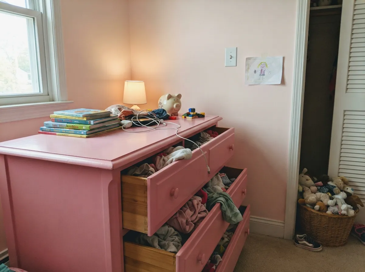
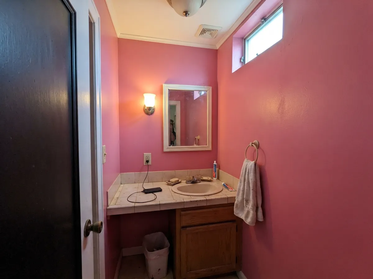
This color is built for a dose, not a drench of the whole house. On one wall behind a bed, on a dresser, a vanity, or kids closet doors, the saturation reads custom and fun instead of themed. Its second home is the small room you can afford to make a joke in a good way: a powder room, a playroom, a teen bedroom, where candy pink is the point. Give it crisp white trim, navy or near-black contrast, and brass or chrome hardware, and it looks like you meant it. Hide it in a pale blush and you bought the wrong pink.
Where It Fails
Almost every regret story about a color this saturated follows one of three scripts, and all three are visible on the chip if you are honest. None of them are the paint's fault — but if your room matches one, this is not your color, and a bigger sample will only confirm it.
On a one-inch chip it can look like a cheerful mid pink. On a wall it is candy. If what you actually wanted is millennial pink, a dusty rose, or a pink you can pretend is beige, this is the wrong strip — look at First Light or Pale Cherry Blossom and let the pink stay a whisper. Bubblegum Pink will not whisper.
LRV 26 plus full chroma is a lot of pink bouncing around a room. In a kids room or a powder room the bounce is the charm. In a living room, open kitchen, or master bedroom it reads juvenile fast — guests will call it bubblegum whether you wanted them to or not. Keep it to one surface unless the brief is literally candy.
Cold 4000K LEDs and gray north daylight strip the rose-coral and leave a harsher fuchsia-magenta that photographs cheap. The fix is part of the paint job: 2700K lamps, and enough of them. If the room is dim and you refuse lamps, pick a muted pink that does not depend on warmth to stay pretty.
Room by Room
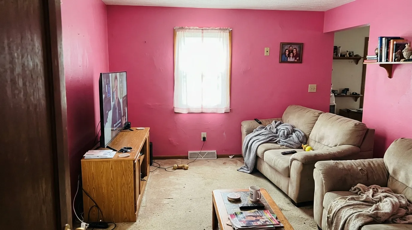
One wall, eggshell, White Dove trim. That is the use case the chroma was built for: a headboard wall, the wall you see from the hallway, the playroom wall behind the toy shelves. The rest of the room stays pale so the candy has somewhere to sit. Four matching walls is how this color becomes a punchline.
This is the honest kids-room pink: not dusty, not 'grown-up mauve,' just cheerful. It works best as furniture, closet doors, or one wall under First Light or White Dove on the other three. Full-room pink in a nursery can feel sweet at six months and loud at six years — the dresser is the version that can move to a teen room later.
A satin Bubblegum Pink dresser, nightstand, or bath vanity against cream or white walls is the high-reward, low-regret version of this color. You get the candy without betting the architecture on it, and you can recast the piece when the trend moves. Urethane-fortified enamel, not wall paint, on anything that gets hands.
Small rooms take saturated color well, and a powder room is the one interior where four walls of Bubblegum Pink can look like a decision instead of an accident. Pair with White Dove trim, a near-black door or mirror, and warm bulbs. Skip it if the powder room shares a vista with a beige hallway — the handoff will look like two different houses.
A headboard wall is charming; a pink cube is a lot to wake up in. Keep the other three walls a warm white or a pale blush, 2700K lamps on the nightstands, and cream or white bedding rather than beige, which goes peachy against this rose-coral. Master bedrooms should treat it as furniture or a single wall unless candy is the brief.
Open living rooms and kitchens are the wrong scale for this chroma, and full sun on an exterior wall will punch it toward loud coral-pink from the street. A shaded front door on a white house is the only outdoor maybe, and even that is a personality door, not a resale door. Cabinets in a kitchen only work as a single island or a hutch, never the whole run.
Your Light Is the Risk
South or strong east light keeps it a clean candy pink — rose, not magenta, and cheerful instead of loud. This is the light the color was named for.
Cool gray daylight strips the coral and leaves a harsher fuchsia. Fine if electric pink was the brief; disappointing if you wanted sweet.
Low warm sun flushes it distinctly coral-watermelon for an hour. Most people who bought candy pink love the shift; test at 6pm if coral is a dealbreaker.
2700K bulbs pull the rose-coral forward and keep it pretty after dark. Cool 4000K LEDs push magenta and make the walls look cheaper than the paint. Warm bulbs are part of this job.
Most complaints about Bubblegum Pink are a light mismatch. Upload a photo of your actual room and see it on your walls — then ask for the same wall in north light or evening lamps before you buy a single sample.
Need It From Another Brand?
Any paint counter can custom-tint Dutch Boy 101-5DB directly. If you would rather stay in one brand's own deck, these are the closest stock matches, measured as ΔE2000. Under 2 is a difference you will not see on the wall.
| Brand | Closest color | ΔE | LRV | |
|---|---|---|---|---|
| Sherwin-Williams | HibiscusSW 6851 · Sherwin-Williams | 2.5 | 26 | Color page → |
| Behr | Pink DamaskM160-5 · Behr | 3.3 | 29 | Color page → |
| Valspar | Frosty Berry1003-1B · Valspar | 2.3 | 28.9 | Color page → |
| PPG / Glidden | Paris PinkPPG1181-6 · PPG / Glidden | 1.8 | 28 | Color page → |
| Glidden | Fiesta Pink53RR 27/417 · Glidden | 0.6 | 27 | Color page → |
| Dunn-Edwards | First LoveDE5053 · Dunn-Edwards | 3.3 | 26 | Color page → |
Similar Dutch Boy Colors
The nearest shades to Bubblegum Pink within Dutch Boy's own range, ranked by perceptual color distance — useful when you want the same look a touch lighter, darker, or warmer.
WCAG 2.1: AA is 4.5 : 1 for normal text, 3 : 1 for large text, AAA is 7 : 1.
Bubblegum Pink vs the Colors You're Also Considering
Every Bubblegum Pink sample board has the same rivals on it. The numbers show the real lightness gap — then it comes down to which risk you would rather live with.
Pick this when the pink is the point and a whisper will not do.
Benjamin Moore 2102-70 · LRV 76First LightPick this if you want a pale pink that behaves like a warm off-white — the blush you can live with on four walls.
Pick this when pretending is the problem and you want candy, not camouflage.
Benjamin Moore 2101-60 · LRV 61Pale Cherry BlossomPick this if you want the pink you can pretend isn't pink — quieter, dustier, easier to sell later.
Bubblegum Pink Coordinating Colors
The rule for coordinating with Bubblegum Pink: warm whites, one navy or near-black, and pale blushes if you need a quieter pink in the next room. Keep yellow-beige and honey oak at arm's length — they push this rose-coral toward cheap watermelon. These are the partners that keep a candy pink looking decided:
Candy vs Dusty: Why This Pink Is a Dose Color
The last decade trained everyone to say they like pink and then buy a greige with a blush cast. Millennial pink faded; dusty rose and taupe-pink took its place because they behave on main walls. Bubblegum Pink never got that memo. It is a Menards-exclusive Dutch Boy red-family pink with the chroma still turned up, which is why it barely shows up in designer roundups and why that is not a defect. It is a furniture-and-accent color that kept its name.
Use it like you would a clear yellow or a true red: on purpose, in a bounded dose, next to a white that can take the bounce. If the current mood is 'pink but make it taupe,' Vintage Tea Rose and Pale Cherry Blossom will make you happier. If the mood is actually bubble gum, stop shopping the dusty strip — you already found the color.
Bubblegum Pink With Wood Tones and Floors
White oak, painted white floors, and gray-washed wood are the easy yes — they stay out of the way and let the candy read clean. Walnut and espresso are surprisingly good too: the dark red-brown grounds the rose so the pink looks chosen, not childish. Cream carpet is fine; true gray carpet is fine.
The honest no is golden honey oak and orange builder stain. This pink already leans coral; yellow-orange wood pushes it into watermelon and makes the floor look cheaper at the same time. A large rug can referee, but if the honey floor is staying in a main room, put this color on a dresser, not the walls.
Metals are easy: unlacquered brass and chrome both work — brass warms it, chrome keeps it candy. Matte black hardware is the grown-up move on a vanity. Skip anything with a strong gold-orange PVD finish if the floors are already golden.
Three Ready Palettes Built on Bubblegum Pink
A color is never alone on the wall. These are complete combinations in the 60-30-10 pattern, with the reason each one holds together. Every one opens in the visualizer.
Candy pink needs a pale landing pad and one dark note so it reads intentional. White Dove is the safest warm white against this rose-coral; Hale Navy is the navy that still reads navy, and it stops the scheme from looking like a kids catalog. Keep the pink on a single wall.
Try this palette in your roomFirst Light gives you a pale pink that still behaves like a warm off-white on the architecture, so the room can age out of toddler. Bubblegum Pink stays on the furniture you can recast. White Dove trim keeps both pinks from going dusty against a stark edge.
Try this palette in your roomA tiny room is the one place a full drench of this chroma looks expensive instead of themed. White Dove keeps the edges soft; Wrought Iron — the softest near-black in the BM deck — gives one grounded note so the pink does not float. Warm 2700K bulbs are non-negotiable in here.
Try this palette in your roomBubblegum Pink FAQ
Is Bubblegum Pink too pink for a whole room?
For a living room, kitchen, or master bedroom, yes. At LRV 26 with full chroma it is a mid-tone candy pink, not a blush, and four walls of it bounce. A powder room, playroom, or kids room can take the drench; everywhere else, keep it to one wall or a piece of furniture.
What trim white goes with Bubblegum Pink?
A warm, soft white — White Dove is the default. Swiss Coffee if you want a creamier vintage pairing, knowing it can go warmer when the light does. A brilliant cool white makes the pink look harsher and more costume. Semi-gloss on the trim, eggshell on the walls.
Is it only for kids rooms?
No, but it is honest kids-room energy, and that is not an insult. A satin dresser in a guest room, a powder-room drench, or one bedroom accent wall on a white house can look deliberate and adult. Four walls in an open main floor will not. If you want grown-up pink that does not announce itself, this is the wrong color.
Does Bubblegum Pink work on furniture and cabinets?
That is its best use. A vanity, dresser, island, or set of closet doors gives you the candy without locking the architecture to 2026 Pinterest. Use satin enamel made for cabinets, not wall paint. A whole kitchen of bubblegum cabinets is a much louder bet than one piece.
How does it look in north light?
Cooler and more fuchsia. North rooms strip the rose-coral and can leave a magenta that feels electric instead of sweet. If the room is north-facing, add 2700K lamps and sample on that wall, or pick a dustier pink that does not need warmth to stay pretty.
Should I pick Bubblegum Pink or a dusty rose?
If you are even asking, you probably want the dusty rose. Vintage Tea Rose and Pale Cherry Blossom are the 'is this even pink' camp; Romance is the blush that still commits; Bubblegum Pink is candy. Buy this one only when the name still sounds like a compliment after you say it out loud.
Have you painted with Bubblegum Pink?
Rate it — one tap helps the next reader decide.
Ask a Question