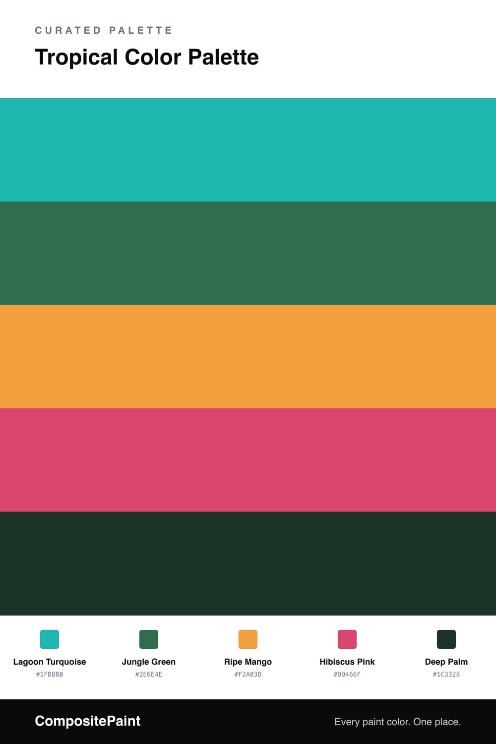
Tropical Color Palette — Palm Breeze
A vivid five-color tropical scheme pairing turquoise and jungle green with mango and hibiscus pink, grounded by deep palm — every color matched to real paint you can buy.
By David Chen · Formulation Lead & Resident Chemist
Think of this palette as a walk from the water into the leaves. Lagoon Turquoise is that first clear, shallow water you see in a postcard, and it leads the whole scheme. Jungle Green picks up right behind it, the way the tree line meets the shore, giving the brightness somewhere solid to stand.
Then come the flowers and the fruit. Ripe Mango adds a warm glow, and Hibiscus Pink is the single hot petal that wakes everything up. A little of each goes a long way, so keep them as small sparks rather than big fields of color. The contrast is the point.
Holding it all together is Deep Palm, a near-black green that reads as shadow under the canopy. It is the easiest way to make a bright tropical mix feel modern instead of cartoonish, so lean on it for the edges and the grounding pieces while the turquoise does the talking.
Buy These Colors
Each color matched to the closest real paint in every brand, by ΔE2000. Tap a swatch for its full guide or + to save it — take any SKU to the store, they mix on demand.
Questions
Let one color lead and treat the rest as guests. Here Lagoon Turquoise carries most of the space, Jungle Green backs it up, and the mango and hibiscus show up only in small doses. Deep Palm acts like a frame, giving your eye a quiet place to rest.
Lagoon Turquoise or Jungle Green. Both read as cooler, calmer greens at scale, so they hold up well across a big wall. Save Ripe Mango and Hibiscus Pink for smaller moments, since those warm brights get intense fast when spread wide.
Similar Palettes
Closest schemes by color — not by label.