Tropical Color Palette — Tropical Lagoon
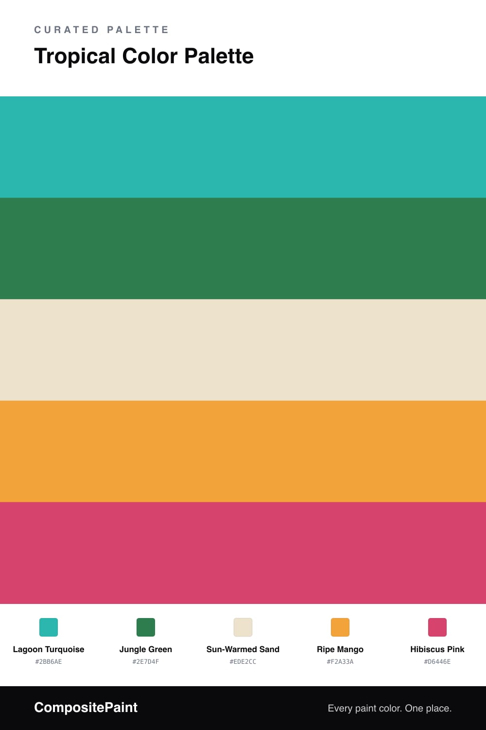
A vivid five-color tropical scheme pairing lagoon turquoise and jungle green with mango and hibiscus pink, grounded by a warm sand base — every color matched to real paint you can buy.
By Emily Roberts · DIY Editor & First-Timer's Guide
This is the palette I reach for when someone says they want their space to feel like a vacation but they are nervous about going too bold. The trick is that not every color has to shout. Lagoon Turquoise carries most of the room, that clear blue-green you see in shallow tropical water, and it is surprisingly easy to live with on a big wall.
From there, Jungle Green deepens things and keeps the look grounded rather than candy-bright, while Sun-Warmed Sand is your breathing room, the neutral that lets the brights feel intentional instead of busy. Think of it as the beach the lagoon sits on.
Then come the fun parts. Ripe Mango is the warm glow, lovely on a door, a cabinet, or a piece of furniture, and Hibiscus Pink is your one-and-done accent, the flower tucked behind the ear. Use it in small doses and this whole scheme reads fresh and modern, exactly the kind of easy, sun-soaked color story people are leaning into for 2026.
Buy These Colors
Each color matched to the closest real paint in every brand, by ΔE2000. Tap a swatch for its full guide or + to save it — take any SKU to the store, they mix on demand.
Questions
Not if you let one lead and keep the rest small. Lagoon Turquoise is the star here, with the warm sand calming everything down, so the mango and hibiscus pink land as pops rather than a wall of color. A good rule is roughly two-thirds calm, one-third bright.
Hibiscus Pink. It is the loudest note in the group, so treat it as your accent. A throw pillow, a single piece of art, or one painted shelf is plenty to make the whole palette feel alive without tipping into chaos.
Similar Palettes
Closest schemes by color — not by label.