Amber
A soft golden amber from Rodda's Cascadia deck, reviewed honestly: the rooms where it glows like honey, the light that turns it pumpkin, and what to pick instead.

Jessica has spec'd whites and neutrals for more than 300 rooms and keeps a sample wall of painted drawdowns in her studio. Every color review is checked against real reader rooms in the comments and re-tested when a formula changes. About the testing process →

- 1Caramelized35
- 2Venetian Plaster42
- 3Amber53
- 4Colonial Yellow59
- 5Belvedere Cream65
The Fast Verdict
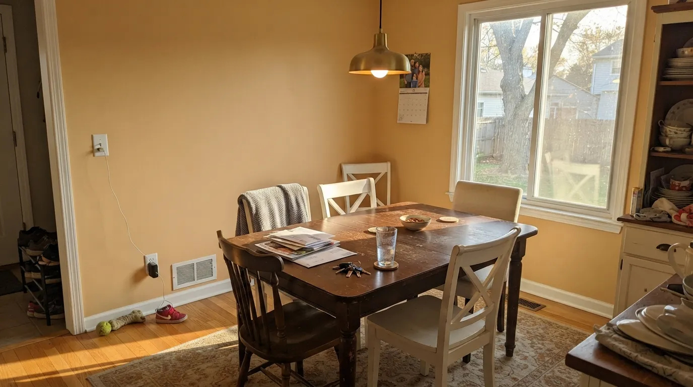
Amber is the light orange people type into a search bar when they mean honey, not pumpkin — a golden yellow-orange at LRV 53 that still reads as a real color on four walls. In west sun it glows like resin; in cool north light it slumps into dingy apricot. It is not beige, not a Color of the Year, and not a whole-house color. If you want a dining room or a west-facing living room to feel like late afternoon all day, this is the one — sample it big, because the chip is a liar.
Dining rooms and west-facing living rooms · kitchen islands and pantry cabinets · a honey-gold accent wall · anyone who typed amber and meant it
You actually wanted beige · honey-oak floors on every wall already · the room runs on cool LEDs or faces north · you want one color for the whole house
- The actual honey-gold people search for — not beige, not pumpkin on the chip
- Glows in west and south light; dining rooms look finished at 4pm
- LRV 53 holds color without going pale or cave-dark
- Excellent in doses: island, pantry, powder, one accent wall
- Pairs cleanly with brass, walnut, navy, and a quiet warm white
- The wall is more orange than the chip — four walls surprise people
- Gold-on-gold with honey oak turns the room into a pumpkin cave
- Cool LEDs and north light leave dingy apricot
- Too chromatic for a whole-house color; more repaint risk than a greige
What Color Is Amber, Really?
A golden yellow-orange — honey first, peach second — from Rodda's Cascadia collection, the 288-color deck the Pacific Northwest brand built around regional light and landscape. CA132 is not a muted greige pretending to be warm. It is the color of amber resin: yellow-gold with enough orange in it that nobody will call it cream. Rodda has made paint in the Northwest since 1932; this chip has sat in Cascadia without a national moment, which is why you find it by searching the word amber rather than by a magazine spread.
At LRV 53 it sits in the same lightness band as a mid greige, but chroma does the work greige refuses. That number means it will brighten a room without reading pale — and it also means four walls will look a full step deeper and more orange than the fan deck. The chip is polite honey. The room is amber. Plan for that gap; it is the number-one surprise with every light orange this saturated.
Undertone in one line: yellow-gold first, orange second, a whisper of peach — never pink, never brown until bad light dirties it. If your sample reads pumpkin, you are seeing west sun or 2700K bulbs doing their job. If it reads tired apricot, the light is cool and the color is telling you this is the wrong room.
Where It Shines
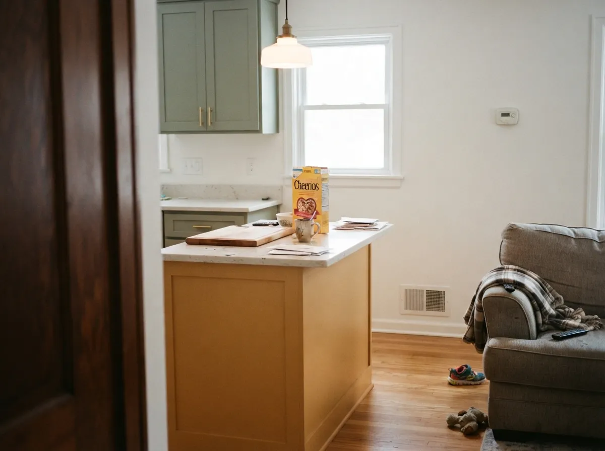
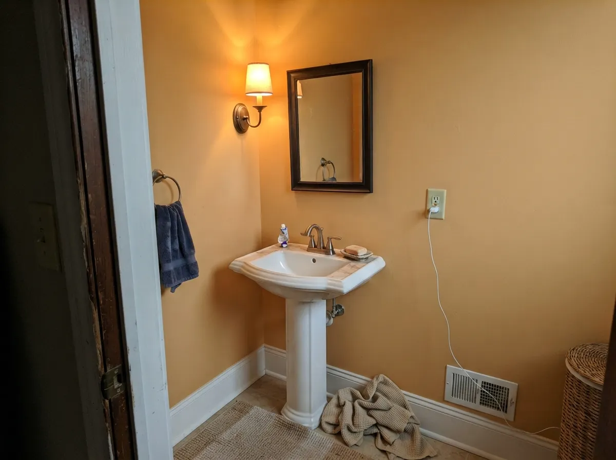
Give it real warm daylight and it earns the name. A west-facing dining room at 4pm is the poster room: the gold comes forward, brass looks intentional, and cream linen stops fighting the walls. Its second home is the contained dose — an island, a pantry, a powder room — where the color reads custom without betting the whole floor plan on orange. Pair it with a quiet warm white, walnut or pale oak, unlacquered brass, and one dark navy note, and it looks like it was always there.
Where It Fails
Almost every regret story about a honey-gold this chromatic follows one of three scripts, and all three are visible before the first coat. None of them are the paint's fault — but if your room matches one, this is not your color, and a bigger sample will only confirm it.
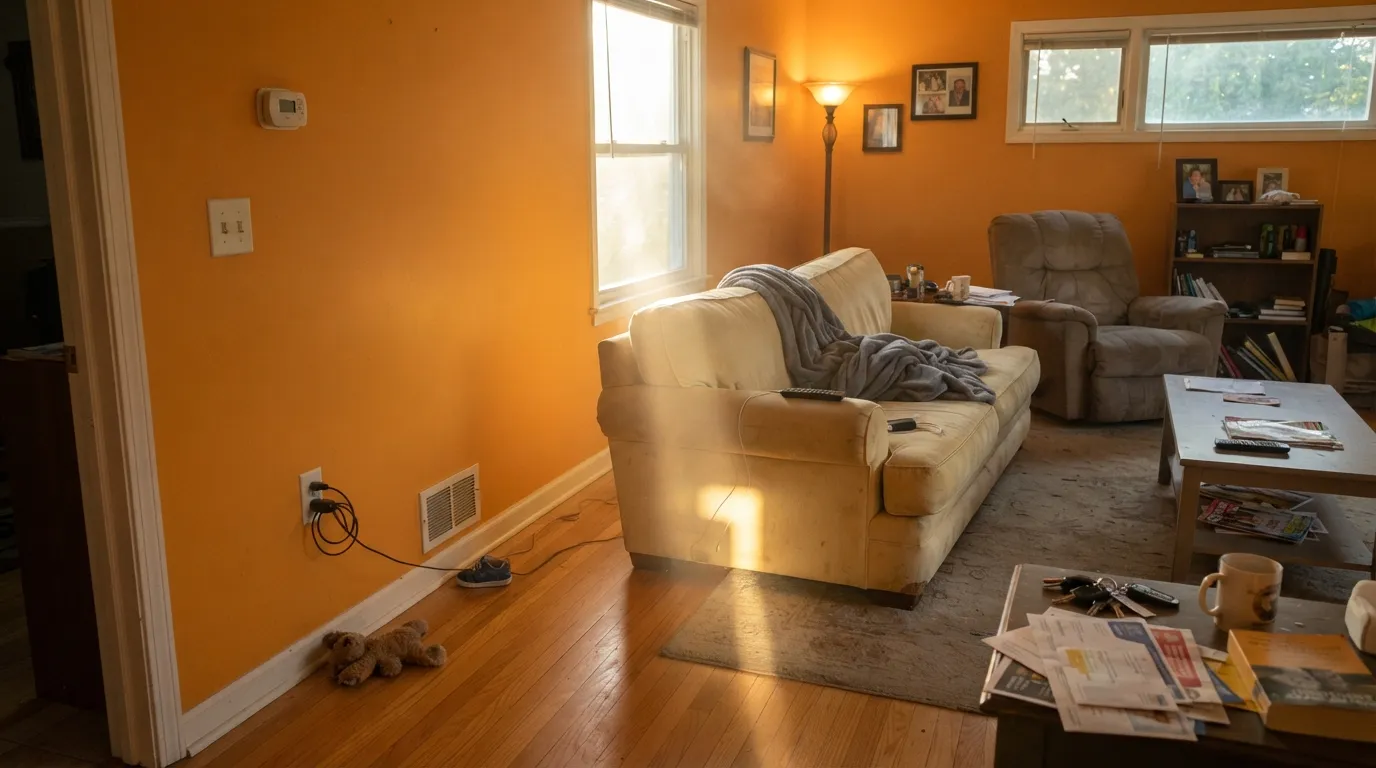
On the fan deck Amber looks like a soft gold. On four walls the orange wakes up — chroma multiplies with square footage, and west sun pushes it toward pumpkin. If you wanted a warm beige or a quiet honey-wheat, this is too much color; look at Golden Straw instead and let the gold stay in the background.
Matching gold undertones can calm a floor in a small dose. On four Amber walls plus orange-stained oak, the room becomes a pumpkin cave — no contrast, no rest, just yellow-orange from floor to ceiling. Walnut, espresso, or pale white oak give the gold somewhere to sit. If the honey oak is staying and covering the whole floor, keep Amber on one wall or skip it.
Cold light kills the yellow and leaves a dingy apricot that readers will call peachy and dirty. Cool gray marble and gray LVP do the same trick from the other direction — they shove the warmth into relief until the wall looks orange-stained. Warm 2700K bulbs are part of this paint job. If the room is north-facing and you refuse lamps, pick a color that does not depend on gold.
Room by Room
This is the room the color was built for. West or south light, a walnut or oak table, brass, cream linen — Amber holds the gold through dinner and then goes honey under lamps. Eggshell on the walls, White Dove trim in semi-gloss. Do not drench a north-facing dining room in it.
Beautiful in a closed, sunlit living room with cream upholstery and one dark navy or charcoal note. Riskier in an open plan, where it has to negotiate with kitchen wood and whatever the adjacent rooms wear. Pale Oak next door is the safe handoff — it shares the warmth without competing in gold.
Satin Amber on an island or a pantry under Alabaster or White Dove walls is genuinely charming — honey without going harvest-gold on every cabinet. A full kitchen of Amber cabinets is a bold bet, and a losing one over wall-to-wall honey oak. Satin urethane-fortified enamel either way.
A west-facing bedroom with 2700K lamps will feel like late afternoon at night, which some people love and some people cannot sleep in. Matte finish, cream bedding, no beige (beige goes yellow against it). If you want restful and quiet, this is the wrong family.
Small rooms take chromatic color well. Drench all four walls, keep the trim a warm white, add brass and a dark mirror frame, and the little room reads finished instead of peach. Satin on a vanity under a warm stone top works the same way.
Full sun punches the chroma up and the gold can read traffic-cone from the street. A shaded or north-facing front door on a cream or warm-white house is the exception — the honey reads intentional. Leave siding and shutters to something quieter.
Your Light Is the Risk
Warm sun wakes the gold and the walls go honey-resin. This is the light the color was named for — the reason to buy it.
Cool gray daylight strips the yellow and leaves a dingy apricot. Fine if you half-wanted peach; disappointing if you wanted gold.
Morning east light keeps it paler and more yellow; late-day west sun saturates it toward pumpkin-honey. Sample the same wall at 9am and 5pm before committing.
2700K bulbs push it peach-honey and cozy. Cool 4000K LEDs muddy it toward dirty apricot — swap the bulbs, not the paint.
Most complaints about Amber are a light mismatch. Upload a photo of your actual room and see it on your walls — then ask for the same wall in north light or evening lamps before you buy a single sample.
Need It From Another Brand?
Any paint counter can custom-tint Rodda CA132 directly. If you would rather stay in one brand's own deck, these are the closest stock matches, measured as ΔE2000. Under 2 is a difference you will not see on the wall.
| Brand | Closest color | ΔE | LRV | |
|---|---|---|---|---|
| Sherwin-Williams | Polvo de OroSW 9012 · Sherwin-Williams | 1.0 | 53 | Color page → |
| Behr | Eastern AmberICC-100 · Behr | 1.6 | 53 | Color page → |
| Benjamin Moore | Golden Mist2158-40 · Benjamin Moore | 1.3 | 53 | Color page → |
| Valspar | Old PlasterP013 · Valspar | 1.7 | 51.8 | Color page → |
| PPG / Glidden | Bold ButterscotchPPG12-08 · PPG / Glidden | 2.2 | 51 | Color page → |
| Glidden | Bold ButterscotchPPG12-08 · Glidden | 2.2 | 51 | Color page → |
Similar Rodda Colors
The nearest shades to Amber within Rodda's own range, ranked by perceptual color distance — useful when you want the same look a touch lighter, darker, or warmer.
WCAG 2.1: AA is 4.5 : 1 for normal text, 3 : 1 for large text, AAA is 7 : 1.
Amber vs the Colors You're Also Considering
Every Amber sample board has the same rivals on it. The numbers show the real lightness gap — then it comes down to which risk you would rather live with.
Pick this when you want the gold to stay clearly amber, not slip into colonial butter.
Sherwin-Williams SW 30 · LRV 59Colonial YellowPick this if you want the historic yellow built for whole walls — lighter, more yellow, less peach.
Pick this for the lighter, more golden, less pumpkin version of the same warmth.
Benjamin Moore 2166-40 · LRV 42Soft PumpkinPick this if you want it peachier and a step deeper — friendly orange for a kids' room in doses.
Amber Coordinating Colors
The rule for coordinating with Amber: quiet warm whites, one dark navy or near-black, and sage or walnut — and keep extra yellow at arm's length. Cream-on-gold in west sun is how a dining room goes harvest. These are the partners that keep the gold looking deliberate:
A Pacific Northwest Gold, Not a Color of the Year
Rodda is a Portland-born brand, painting the Northwest since 1932. Amber lives in the Cascadia collection — 288 colors built for regional light — and it has never been a Color of the Year. Rodda's 2026 pick is Day Spa, a deep blue. That obscurity is useful: you are not buying last year's trend chip, and you are not buying a color with a thousand identical Instagram dining rooms attached.
What you are buying is the search term. People type amber when they want a light orange they can live with — not rust, not tangerine, not beige. CA132 is that chip. It will not make you famous. In the right west light, with the right white and one navy note, it will make a dining room look like it has a point of view.
Amber With Wood Tones and Floors
This decision gets made at the floor. Walnut and espresso are the color's best friends — the dark red-brown depth makes the gold read like honey in a bottle, not like a 1970s kitchen. Pale white oak is safe and keeps the room from going cave. Cream carpet is fine.
The honest caution is golden oak. A little matching undertone can calm orange floors. Four Amber walls plus honey oak is gold-on-gold: the floor goes more orange, the walls go more pumpkin, and no amount of coats fixes the missing contrast. If the golden floor is staying, put a large rug between it and this paint, or keep Amber on an island and let Pale Oak take the walls.
Metals are easy: unlacquered brass and antique bronze love it; matte black is the cool counterweight. Polished chrome is the one that leans cold against the gold.
Three Ready Palettes Built on Amber
A color is never alone on the wall. These are complete combinations in the 60-30-10 pattern, with the reason each one holds together. Every one opens in the visualizer.
Navy is amber's complement, so one dark Hale Navy note keeps the gold from floating. White Dove is the quiet warm white that will not double-yellow the room the way a cream can in west sun — sheen change is enough to separate trim from walls.
Try this palette in your roomSage and honey is the pairing that keeps Amber from reading themed. Alabaster on the walls is a superb cabinet-adjacent white; Evergreen Fog on the perimeters grounds the gold so the island can carry the color without a full harvest-gold kitchen.
Try this palette in your roomPale Oak is the rare light neutral that stays warm in good light without going gold, so an Amber dining room off a Pale Oak living room reads like the same house getting richer, not a color change. White Dove trim ties both back together.
Try this palette in your roomAmber FAQ
Is Rodda Amber orange or gold?
Both — gold on the chip, orange on the wall. Yellow-gold is the first read; orange and a whisper of peach come forward with square footage and warm sun. Nobody will call it beige. If you wanted honey-wheat that behaves like a neutral, Golden Straw is the safer color.
What trim white goes with Amber?
A quiet warm white — White Dove is the default, Alabaster if the rest of the house is Sherwin-Williams. Skip a cream in a west-facing room (it double-yellows next to this gold) and skip a crisp bright white like Chantilly Lace, which makes the walls look dingy-orange by comparison. Semi-gloss on the trim, eggshell on the walls.
Does Amber work with honey oak floors?
In a dose, yes — matching gold undertones can calm the floor. On four walls plus wall-to-wall orange oak, the room goes pumpkin with nowhere for the eye to rest. Walnut, espresso, and pale white oak are the better partners. If the honey oak stays, keep Amber on one wall or an island and put a large rug between the floor and the gold.
Is it good for a whole living room?
Only a west- or south-facing one you are willing to commit to color. At LRV 53 it will not cave the room, but it will not recede either — guests will name it. Open plans are harder because the gold has to hand off to the kitchen. North-facing living rooms should skip it.
Can I use it on kitchen cabinets?
Yes, in doses: an island, a pantry, a hutch, under a quiet warm-white wall. A whole kitchen of Amber cabinets is a strong commitment and a losing one over honey-oak floors. Use a satin urethane-fortified cabinet enamel.
Will a honey-gold wall date the house?
Saturated harvest-golds already did, in the 1970s. Amber is lighter and more yellow than those, but it is still a real orange, not a greige. It carries more repaint risk than Pale Oak and less than a true pumpkin. Keep it in the dining room or on an island if resale is on a short clock.
Have you painted with Amber?
Rate it — one tap helps the next reader decide.
Ask a Question