Terracotta Study Palette — Dawn Terracotta & Clay Earth
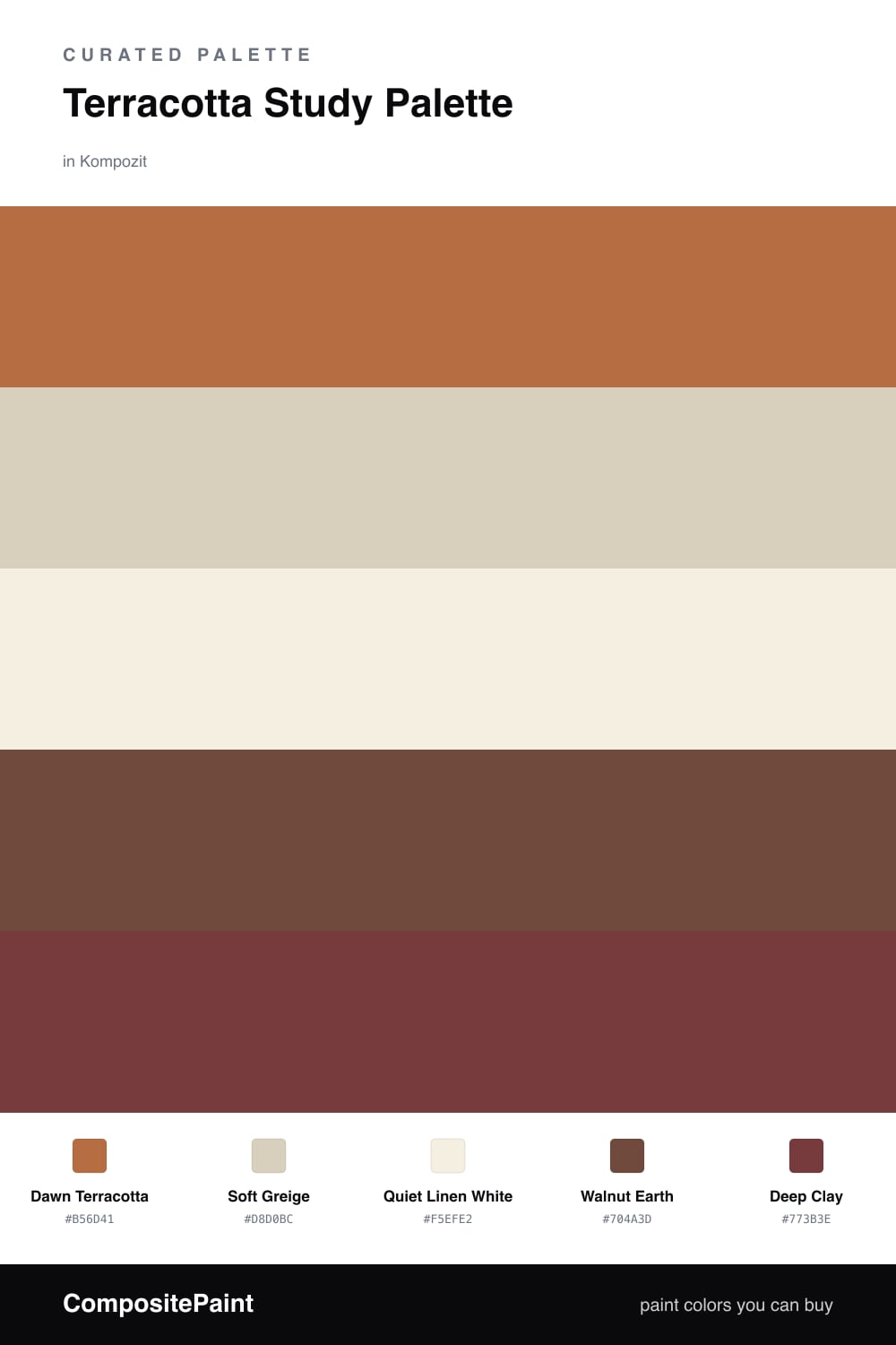
A warm five-color study scheme led by dawn terracotta, layered with a soft greige backdrop, crisp white trim, an earthy wood tone, and a deep clay accent — every color matched to real paint you can buy.
By Emily Roberts · DIY Editor & First-Timer's Guide
Terracotta is having a real moment right now, and a study is the perfect place to use it. Dawn Terracotta on the walls feels warm and a little earthy without going loud, the kind of color that makes you want to sit down and stay a while.
To keep it from feeling heavy, I paired it with a Soft Greige for the trim and ceiling and a clean Quiet Linen White for any cabinets or built-ins. Those two lighten the whole room and let the terracotta breathe. Walnut Earth is your wood tone, so think floors, a desk, or open shelving that ties back to the warmth on the walls.
The one I would use sparingly is Deep Clay. It is the richest color here, so a little goes a long way. Try it on the back of a bookshelf or a single piece of furniture, and let it add depth without taking over.
Buy These Colors
Each color matched to the closest real paint in every brand, by ΔE2000. Kompozit first; take any SKU to the store — these mix on demand.
Questions
Terracotta is a warm, grounded color, so it makes a room feel calm and focused instead of busy. That is exactly what you want in a space for reading or working.
Let the terracotta lead on the walls, then pull it back everywhere else. Keep the greige and white doing most of the quiet work and save the deep clay for small touches like a shelf or a chair.
Similar Palettes
Closest schemes by color — not by label.