CP

Terracotta Dining Room Palette — Burnt Terracotta & Warm Linen

A warm five-color dining room scheme led by burnt terracotta walls, balanced with soft linen, crisp white trim, walnut wood, and a deep clay accent — every color matched to real paint you can buy.

By Emily Roberts · DIY Editor & First-Timer's Guide

Burnt Terracotta
Walls
Kompozit Angelic Choir · 0058
#B8665C
LRV 20
Warm Linen
Trim & Ceiling
Kompozit White Lightning · 0187
#EEE2D3
LRV 77
Crisp White
Cabinets or Vanity
Kompozit Sugar Dust · 0011
#F8F6ED
LRV 92
Walnut Brown
Wood & Floors
Kompozit Evolution · 0130
#704A3D
LRV 9
Deep Clay
Accent
Kompozit Monterey Chestnut · 0123
#7D4235
LRV 9
View palette in

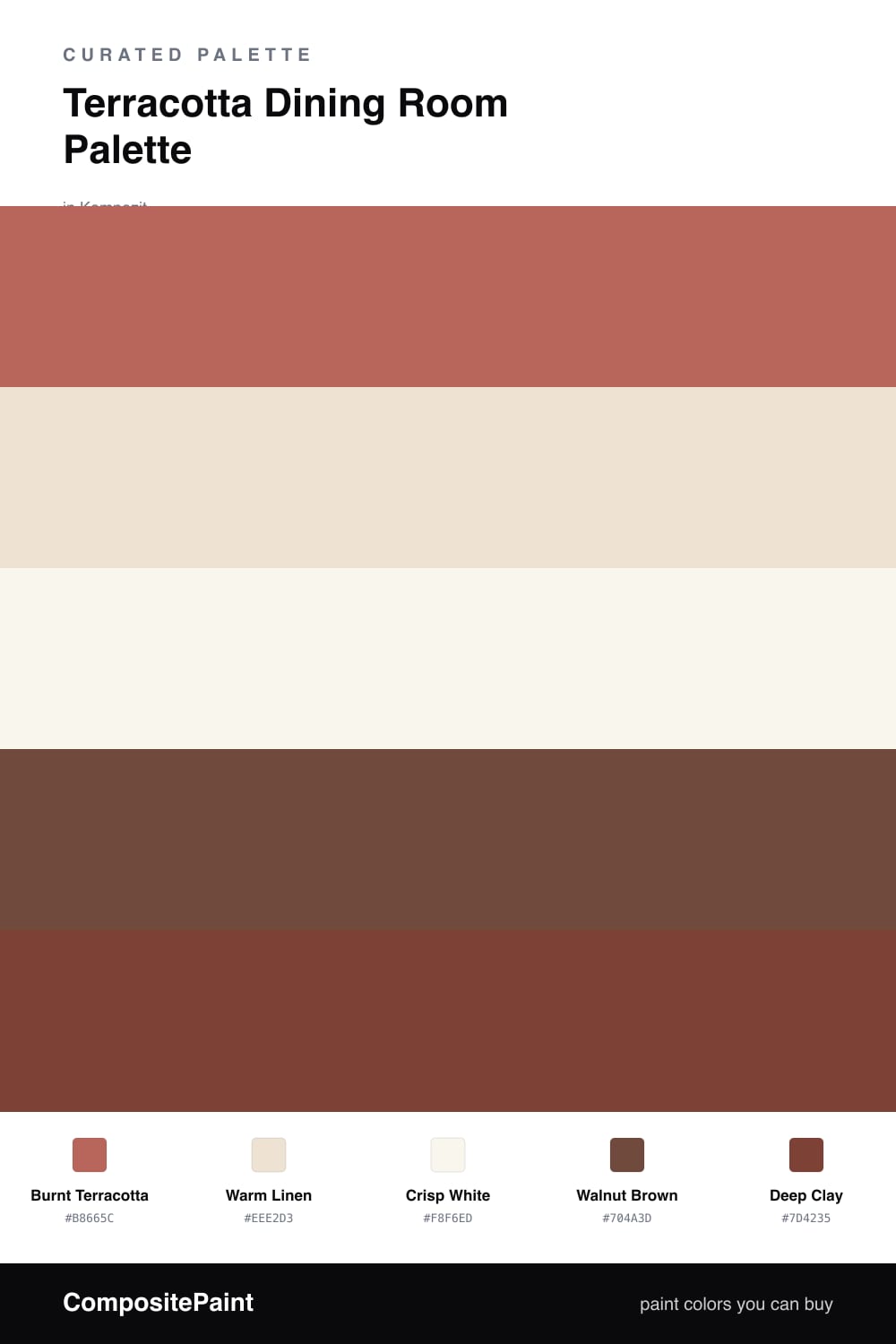
Terracotta is having a real moment, and a dining room is the perfect place for it. The walls here wear a rich Burnt Terracotta that glows under warm light, the kind of color that makes a shared meal feel a little more special.

To keep it from feeling too much, the trim and ceiling get a soft Warm Linen, and cabinets or built-ins stay clean with a Crisp White. Those two lighter tones give your eye somewhere to rest, so the terracotta feels cozy rather than overwhelming.

For grounding, Walnut Brown brings in that natural wood-floor or table warmth, and a small dose of Deep Clay on chairs or a sideboard adds depth. Keep the terracotta in charge and use the clay sparingly, and the whole room lands warm, current, and easy to live with.

Buy These Colors

Each color matched to the closest real paint in every brand, by ΔE2000. Kompozit first; take any SKU to the store — these mix on demand.

Burnt Terracotta
#B5654A · LRV 20 · Walls
Kompozit Angelic Choir · 0058 ΔE 6.16
Backdrop Old Soul · BD-OS ΔE 25.31
Behr Chimayo Red · QE-04 ΔE 5.72
Benjamin Moore Rust · 2175-30 ΔE 2.52
Clare Sriracha · PNT100-DP-29 ΔE 7.08
Dunn-Edwards Georgia Clay · DE5181 ΔE 1.84
Farrow & Ball Picture Gallery Red · No. 42 ΔE 7.07
Magnolia Home Work Worn Wood · JG-35 ΔE 3.01
PPG / Glidden Cinnabar · 1065-6 ΔE 4.68
Sherwin-Williams Reynard · SW 6348 ΔE 2.04
Valspar Autumn Ivy · 8002-12E ΔE 1.86
Warm Linen
#EDE3D3 · LRV 78 · Trim & Ceiling
Kompozit White Lightning · 0187 ΔE 1.22
Backdrop Don't Eat the Yellow Snow · BD-DS ΔE 3.78
Behr Artist's Canvas · UL150-8 ΔE 0.77
Benjamin Moore Puppy Paws · 1156 ΔE 1.9
Clare Like Buttah · PNT100-LT-62 ΔE 1.01
Dunn-Edwards Siamese Kitten · DE6121 ΔE 1.94
Farrow & Ball Dimity · No. 2008 ΔE 0.48
Magnolia Home Carter Crème · JG-16 ΔE 2.05
PPG / Glidden Glazed Pears · 1095-2 ΔE 0.87
Sherwin-Williams Alluring White · SW 6343 ΔE 2.14
Valspar Honey Moon · 8003-22A ΔE 0.97
Crisp White
#F7F4EE · LRV 91 · Cabinets or Vanity
Kompozit Sugar Dust · 0011 ΔE 1.65
Backdrop Tabula Rasa · BD-TR ΔE 2.55
Behr Whisper White · HDC-MD-08 ΔE 0.56
Benjamin Moore Mountain Peak White · 2148-70 ΔE 2.06
Clare Timeless · PNT100-LT-04 ΔE 1.56
Dunn-Edwards Droplets · DEW381 ΔE 0.58
Farrow & Ball Wimborne White · No. 239 ΔE 2.22
Magnolia Home True White · JG-21 ΔE 1.93
PPG / Glidden Delicate White · 1001-1 ΔE 2.05
Sherwin-Williams High Reflective White · SW 7757 ΔE 1.57
Valspar Cuddle Down · 8007-6F ΔE 1.5
Walnut Brown
#6E4A33 · LRV 8 · Wood & Floors
Kompozit Evolution · 0130 ΔE 4.68
Backdrop It's a Date · BD-IT ΔE 5.49
Behr Bricktone · BXC-42 ΔE 3.23
Benjamin Moore Mocha Madness · 2100-10 ΔE 3.16
Clare Vintage · PNT100-DP-67 ΔE 11.31
Dunn-Edwards Chaps · DE6049 ΔE 6.07
Farrow & Ball Preference Red · No. 297 ΔE 13.43
Magnolia Home Mountain Currant · JG-171 ΔE 6.68
PPG / Glidden Bird House Brown · 1072-7 ΔE 3.99
Sherwin-Williams Sturdy Brown · SW 6097 ΔE 2.75
Valspar Cowboy Hat · 3010-8 ΔE 0.88
Deep Clay
#7E3B2C · LRV 8 · Accent
Kompozit Monterey Chestnut · 0123 ΔE 2.44
Backdrop Stage Beauty · BD-SB ΔE 4.38
Behr True Copper · S180-7 ΔE 2.67
Benjamin Moore Rustique · AF-275 ΔE 1.18
Clare Vintage · PNT100-DP-67 ΔE 9.06
Dunn-Edwards Spiced Berry · DEA149 ΔE 5.23
Farrow & Ball Preference Red · No. 297 ΔE 11.03
Magnolia Home Create · JG-28 ΔE 8.63
PPG / Glidden Sweet Spiceberry · 1059-7 ΔE 5.05
Sherwin-Williams Fired Brick · SW 6335 ΔE 1.57
Valspar Smoked Paprika · 8002-12G ΔE 1.9

Questions

Is terracotta too dark for a dining room?

Not at all. Terracotta reads warm and cozy rather than gloomy, which is exactly the mood you want around a dinner table. Pairing it with linen trim and a crisp white keeps the room feeling open instead of heavy.

How much terracotta should I actually use?

Let it lead on the walls and keep everything else calmer. A good rule is roughly two-thirds terracotta and one-third everything else, so the deep clay accent stays a small spark on chairs, art, or a sideboard.

Similar Palettes

Closest schemes by color — not by label.