CP

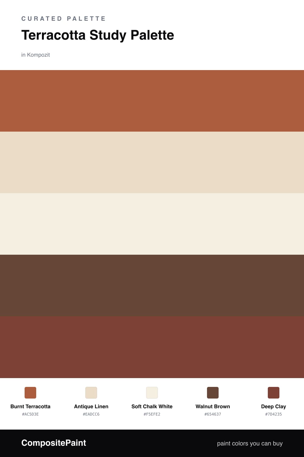
Terracotta Study Palette — Burnt Terracotta & Antique Linen

A grounded five-color study scheme led by warm burnt terracotta, balanced with antique linen, soft white, walnut brown and a deep clay accent — every color matched to real paint you can buy.

By Jessica Williams · Color Stylist & Interior Editor

Burnt Terracotta
Walls
Kompozit Pretty Parasol · 1039
#AC5D3E
LRV 17
Antique Linen
Trim & Ceiling
Kompozit Yellow Page · 0286
#EADCC6
LRV 73
Soft Chalk White
Cabinets or Vanity
Kompozit Bunny Cake · 0012
#F5EFE2
LRV 87
Walnut Brown
Wood & Floors
Kompozit Hideaway · 0137
#654637
LRV 7
Deep Clay
Accent
Kompozit Monterey Chestnut · 0123
#7D4235
LRV 9
View palette in

A study should feel like a place you actually want to sit for hours, and warm earth tones do that quietly. This scheme leans on a soft Burnt Terracotta for the walls — a baked, sun-warmed clay that glows in lamplight and feels modern instead of rustic.

Around it, Antique Linen on the trim and ceiling keeps the room from closing in, while Soft Chalk White on built-ins or a vanity adds a crisp, contemporary lift. Walnut Brown in the floor and desk grounds everything with real depth.

For the spark, reach for Deep Clay — a richer, smokier cousin of the wall color. Use it on shelving, a feature wall, or chair backs, and let it stay small so the whole room feels collected and calm.

Buy These Colors

Each color matched to the closest real paint in every brand, by ΔE2000. Kompozit first; take any SKU to the store — these mix on demand.

Burnt Terracotta
#B05E3E · LRV 18 · Walls
Kompozit Pretty Parasol · 1039 ΔE 0.94
Backdrop Buenos Aires · BD-BA ΔE 14.03
Behr Thanksgiving · M210-7 ΔE 2.01
Benjamin Moore Pilgrimage Foliage · 2175-20 ΔE 2.06
Clare Sriracha · PNT100-DP-29 ΔE 8.88
Dunn-Edwards Georgia Clay · DE5181 ΔE 1.29
Farrow & Ball Picture Gallery Red · No. 42 ΔE 7.07
Magnolia Home On Bosque · JG-36 ΔE 3.96
PPG / Glidden Fragrant Cloves · 1199-7 ΔE 1.73
Sherwin-Williams Earthen Jug · SW 7703 ΔE 2.75
Valspar Bear Claw · 2004-5A ΔE 1.51
Antique Linen
#E7DCC8 · LRV 72 · Trim & Ceiling
Kompozit Yellow Page · 0286 ΔE 1.31
Backdrop Cookies & Cream · BD-CC ΔE 2.08
Behr Ivory Paper · MQ3-12 ΔE 0.89
Benjamin Moore Lambskin · 1051 ΔE 0.48
Clare Greenish · PNT100-LT-68 ΔE 4.17
Dunn-Edwards Cream Wave · DE6198 ΔE 0.97
Farrow & Ball Lime White · No. 1 ΔE 0.82
Magnolia Home Castle Cream · JG-153 ΔE 1.75
PPG / Glidden Navajo White · 1101-2 ΔE 1.63
Sherwin-Williams Antique White · SW 6119 ΔE 0.73
Valspar Natural Soap · T559 ΔE 0.52
Soft Chalk White
#F4EFE6 · LRV 87 · Cabinets or Vanity
Kompozit Bunny Cake · 0012 ΔE 1.68
Backdrop Tabula Rasa · BD-TR ΔE 2.01
Behr Nude W-f-210 · W-F-210 ΔE 1.69
Benjamin Moore Alabaster · 876 ΔE 1.13
Clare Wing It · PNT100-LT-24 ΔE 2.07
Dunn-Edwards Antique Paper · DE6218 ΔE 0.59
Farrow & Ball Pointing · No. 2003 ΔE 2.12
Magnolia Home Silos White · JG-107 ΔE 1.5
PPG / Glidden Crumb Cookie · 18-01 ΔE 1.69
Sherwin-Williams White Flour · SW 7102 ΔE 0.46
Valspar Crisp Cotton · 7007-4 ΔE 0.47
Walnut Brown
#5A4332 · LRV 6 · Wood & Floors
Kompozit Hideaway · 0137 ΔE 4.18
Backdrop It's a Date · BD-IT ΔE 1.31
Behr Breakfast Blend · 280F-7 ΔE 1.66
Benjamin Moore Deep Taupe · 2111-10 ΔE 0.9
Clare Blackish · PNT100-DP-54 ΔE 11.94
Dunn-Edwards Northern Territory · DEA158 ΔE 3.95
Farrow & Ball Mahogany · No. 36 ΔE 8.1
Magnolia Home Wooded Acres · JG-122 ΔE 6.69
PPG / Glidden Racy Raisin · 16-24 ΔE 6.67
Sherwin-Williams Van Dyke Brown · SW 7041 ΔE 2.81
Valspar Boston Brown Bread · 8005-9G ΔE 2.14
Deep Clay
#7C3A2A · LRV 7 · Accent
Kompozit Monterey Chestnut · 0123 ΔE 2.79
Backdrop Stage Beauty · BD-SB ΔE 4.57
Behr True Copper · S180-7 ΔE 3.15
Benjamin Moore Rustique · AF-275 ΔE 1.21
Clare Vintage · PNT100-DP-67 ΔE 9.47
Dunn-Edwards Garnet Evening · DEA147 ΔE 10.08
Farrow & Ball Preference Red · No. 297 ΔE 11.28
Magnolia Home Create · JG-28 ΔE 9.1
PPG / Glidden Bordeaux · 1055-7 ΔE 8.02
Sherwin-Williams Roycroft Copper Red · SW 2839 ΔE 0.88
Valspar Smoked Paprika · 8002-12G ΔE 1.68

Questions

Why does terracotta work so well in a study?

Terracotta is a warm, earthy tone that wraps a room in calm without feeling cold or clinical, so it helps you settle in and focus. Paired with soft neutrals and wood, it reads grounded and modern rather than dark or heavy.

How much terracotta is too much?

Let it lead on the main walls and keep everything else quieter. Aim for roughly two-thirds terracotta and one-third neutrals and wood, with the deep clay used only in small doses on a built-in or a single feature wall.

Similar Palettes

Closest schemes by color — not by label.