CP

Red Color Palette — Red Smoke

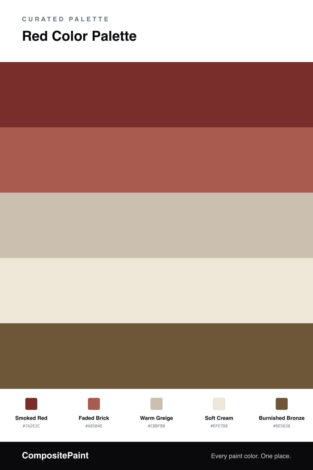
A moody five-color scheme led by a deep smoked red, balanced by warm greys and a soft cream, with one bronze accent — every color matched to real paint you can buy.

By David Chen · Formulation Lead & Resident Chemist

Think of red as a dial, not a switch. A bright fire-engine red is the dial cranked all the way up, but Smoked Red turns it down by folding in a little grey. The result feels like embers rather than flame, and that is exactly why it can carry a whole room in 2026 without tiring your eye.

Around it, Faded Brick acts as a softer echo of the lead, Warm Greige and Soft Cream open up the space, and a touch of Burnished Bronze adds a metallic warmth that ties the reds together. The trick is restraint with that bronze.

Lead with the smoked red on the largest surface, let the neutrals do the calm work in between, and use the brick to bridge them. This is a warm, grounded palette that still feels current, the kind of scheme that looks intentional rather than trendy.

View palette in
Smoked Red
Dominant
Backdrop Stage Beauty · BD-SB
#7C2F2A
LRV 5
Faded Brick
Secondary
Dunn-Edwards Santa Fe Sunset · DET458
#A75A4C
LRV 16
Warm Greige
Base
Benjamin Moore Ashen Tan · 996
#C9BEAF
LRV 51
Soft Cream
Support
Dunn-Edwards Ball of String · DE6190
#F0E8D9
LRV 76
Burnished Bronze
Accent
Valspar Leather & Lace · V088-6
#6F543A
LRV 10

Buy These Colors

Each color matched to the closest real paint in every brand, by ΔE2000. Tap a swatch for its full guide or + to save it — take any SKU to the store, they mix on demand.

Smoked Red
#7A2E2C · LRV 6 · Dominant
Sherwin-Williams · SW 7592 · ΔE 2.37
Behr · S160-7 · ΔE 2.02
Benjamin Moore · HC-183 · ΔE 2.96
Valspar · T503 · ΔE 5.02
PPG / Glidden · PPG1055-7 · ΔE 6.04
Glidden · 09YR 05/305 · ΔE 5.5
Dutch Boy · 305-7DB · ΔE 2.59
HGTV Home by Sherwin-Williams · HGSW 2061 · ΔE 2.59
Dunn-Edwards · DEA147 · ΔE 6.87
Magnolia Home · JG-29 · ΔE 4.43
Farrow & Ball · NO. 297 · ΔE 9.86
Diamond Vogel · H007 · ΔE 5.76
Hirshfield's · 0101 · ΔE 5.36
Rodda · R124 · ΔE 6.42
C2 Paint · C2-519 · ΔE 2.91
Clare · PNT100-DP-67 · ΔE 9.69
Portola Paints · POE · ΔE 12.4
Annie Sloan · BURGUNDY · ΔE 6.01
Backdrop · BD-SB · ΔE 1.27
Rust-Oleum · 285144 · ΔE 26.33
Kompozit · 0101 · ΔE 5.36
Faded Brick
#A85B4E · LRV 16 · Secondary
Sherwin-Williams · SW 6333 · ΔE 1.27
Behr · BXC-39 · ΔE 2.67
Benjamin Moore · 1203 · ΔE 1.12
Valspar · M104 · ΔE 1.26
PPG / Glidden · PPG16-31 · ΔE 2.75
Glidden · PPG16-31 · ΔE 2.9
Dutch Boy · 308-6DB · ΔE 4.91
HGTV Home by Sherwin-Williams · HGSW 2073 · ΔE 1.27
Dunn-Edwards · DET458 · ΔE 0.56
Magnolia Home · JG-36 · ΔE 6.49
Farrow & Ball · NO. 247 · ΔE 1.89
Diamond Vogel · 1075 · ΔE 1.2
Hirshfield's · H0013 · ΔE 2.05
Rodda · CA224 · ΔE 4.78
C2 Paint · C2-556 · ΔE 2.26
Clare · PNT100-DP-30 · ΔE 5.05
Portola Paints · ZION · ΔE 8.65
Annie Sloan · EMPERORS SILK · ΔE 10.25
Backdrop · BD-BA · ΔE 14.58
Rust-Oleum · 329211 · ΔE 10.64
Kompozit · 1075 · ΔE 2.77
Warm Greige
#CBBFB0 · LRV 53 · Base
Sherwin-Williams · SW 7511 · ΔE 0.97
Behr · T12-14 · ΔE 0.8
Benjamin Moore · 996 · ΔE 0.58
Valspar · 6006-1B · ΔE 1.65
PPG / Glidden · PPG1023-3 · ΔE 1.39
Glidden · PPG1023-3 · ΔE 1.02
Dutch Boy · 420-2DB · ΔE 1.99
HGTV Home by Sherwin-Williams · HGSW 2496 · ΔE 0.97
Dunn-Edwards · DEC752 · ΔE 1.26
Magnolia Home · JG-133 · ΔE 2.86
Farrow & Ball · NO. 211 · ΔE 2.7
Diamond Vogel · 0188 · ΔE 1.31
Hirshfield's · 0567 · ΔE 1.58
Rodda · CA034 · ΔE 0.8
C2 Paint · C2-800 · ΔE 3.05
Clare · PNT100-LT-09 · ΔE 7.57
Portola Paints · TOPANGA · ΔE 3.45
Annie Sloan · PARIS GREY · ΔE 6.87
Backdrop · BD-BG · ΔE 10.88
Rust-Oleum · 285143 · ΔE 10.7
Kompozit · 0567 · ΔE 1.58
Soft Cream
#EFE7D8 · LRV 80 · Support
Sherwin-Williams · SW 7563 · ΔE 1.49
Behr · HDC-NT-03 · ΔE 0.55
Benjamin Moore · 947 · ΔE 1.48
Valspar · 7007-1 · ΔE 0.52
PPG / Glidden · PPG1088-1 · ΔE 0.49
Glidden · PPG14-23 · ΔE 0.99
Dutch Boy · 018W · ΔE 0.84
HGTV Home by Sherwin-Williams · HGSW 4033 · ΔE 0.84
Dunn-Edwards · DE6190 · ΔE 0.22
Magnolia Home · JG-23 · ΔE 1.06
Farrow & Ball · NO. W1 · ΔE 1.24
Diamond Vogel · 0285 · ΔE 1.02
Hirshfield's · 0001 · ΔE 1.32
Rodda · R127 · ΔE 1.15
C2 Paint · C2-596 · ΔE 1.81
Clare · PNT100-LT-62 · ΔE 1.5
Portola Paints · CASA FORMA · ΔE 1.02
Annie Sloan · OLD OCHRE · ΔE 9.52
Backdrop · BD-DS · ΔE 3.51
Rust-Oleum · 329598 · ΔE 4.5
Kompozit · 0001 · ΔE 1.32
Burnished Bronze
#6E5638 · LRV 10 · Accent
Sherwin-Williams · SW 6146 · ΔE 2.85
Behr · MQ2-09 · ΔE 2.47
Benjamin Moore · 2110-20 · ΔE 4.52
Valspar · V088-6 · ΔE 2.42
PPG / Glidden · PPG1079-7 · ΔE 3.82
Glidden · 00YY 09/186 · ΔE 2.65
Dutch Boy · 414-7DB · ΔE 2.6
HGTV Home by Sherwin-Williams · HGSW 3171 · ΔE 2.85
Dunn-Edwards · DEA162 · ΔE 4.03
Magnolia Home · JG-168 · ΔE 8.75
Farrow & Ball · NO. CB5 · ΔE 8.64
Diamond Vogel · 0340 · ΔE 5.98
Hirshfield's · H0132 · ΔE 4.54
Rodda · R041 · ΔE 3.99
C2 Paint · C2-597 · ΔE 8.51
Clare · PNT100-DP-67 · ΔE 16.97
Portola Paints · WONDERLAND · ΔE 13.31
Annie Sloan · PRIMER RED · ΔE 15.06
Backdrop · BD-BA · ΔE 5.31
Rust-Oleum · 391445 · ΔE 22.41
Kompozit · 0193 · ΔE 3.76

Questions

Why does a dark red work as the lead color here?

A smoked red has grey mixed into it, so it reads rich instead of loud. That softness lets it cover a large area without overwhelming the space, while the lighter neutrals keep everything breathing.

How much of each color should I use?

Let the smoked red lead at roughly two-thirds, with the greige and cream as your quiet middle and the brick as a step between them. Save the bronze for small touches like hardware or a frame.

KEEP EXPLORING

Similar Palettes

Closest schemes by color — not by label.