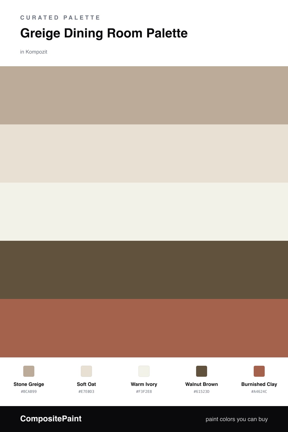
Greige Dining Room Palette — Stone Greige & Warm Clay
A warm, grounding 5-color scheme for dining rooms: a stone greige lead, soft oat walls, creamy trim, walnut wood, and a deep clay accent, with every color matched to real paint you can buy.
By David Chen · Formulation Lead & Resident Chemist
Think of greige as a chord rather than a single note. Stone Greige is gray and beige struck together, and that small tension is exactly what makes it work on dining room walls. On a bright afternoon it leans warm and soft. Under evening candlelight it cools just enough to keep the room from going golden. You get a backdrop that flatters skin tones across a long dinner, which is more than most neutrals can claim.
Around that lead I keep things quiet. Soft Oat below a chair rail or on wainscoting gives the wall a gentle lift, and Warm Ivory on the trim and ceiling stays creamy rather than stark, so nothing in the room snaps too white. Walnut Brown does the grounding, picking up the table and floors and giving the eye some real weight low in the space.
The one place to be bold is the accent. Burnished Clay is a warm, earthy red-brown straight out of the 2026 direction toward grounded, cocooning rooms. Put it on a single feature wall or the back of a hutch and nowhere else. Used on roughly one-fifth of the room it reads as a deliberate anchor. Spread it wider and it stops being an accent and starts being the whole story.
Buy These Colors
Each color matched to the closest real paint in every brand, by ΔE2000. Kompozit first; take any SKU to the store — these mix on demand.
Questions
Stay with the lighter, oat-leaning side of greige in a small room. Stone Greige reads warm without sinking the space, since its gray base keeps it from feeling heavy the way a true tan would. Save the deeper Burnished Clay for one wall or the area below a chair rail.
No, and that is the whole point of greige here. It carries both a gray and a warm undertone, so it sits comfortably next to walnut and oak instead of fighting the wood the way a cooler gray would. The shared warmth is what makes the room feel pulled together.
Similar Palettes
Closest schemes by color — not by label.