Brown Color Palette — Dune Drift
A warm five-color brown scheme led by a deep walnut brown and softened with sand, oatmeal, and a clay accent — every color matched to real paint you can buy.
By Emily Roberts · DIY Editor & First-Timer's Guide
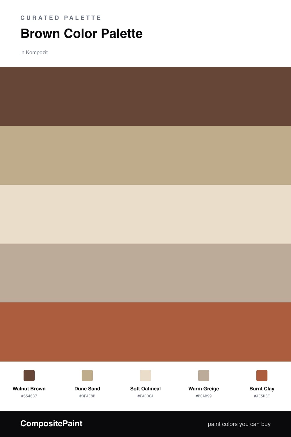
Brown is having a real moment again, and this one is my favorite kind — soft, sandy, and easy to live with. Walnut Brown leads the whole scheme, deep enough to feel grounded but never heavy. It is the color you would reach for on a feature wall or a big piece of furniture.
From there, Dune Sand and Soft Oatmeal keep everything light and breathable, so the brown never closes the room in. Warm Greige is the quiet bridge between them — that in-between shade that makes the whole thing feel pulled together. If you have ever wondered what greige means, it is simply a gray with a warm beige underneath, and it does a lot of gentle work here.
The little spark is Burnt Clay, a sun-baked terracotta that wakes the palette up. Use it in small doses — a cushion, a pot, a strip of trim — and let the browns do the rest. This is a layered, lived-in look that feels right at home in 2026.
Buy These Colors
Each color matched to the closest real paint in every brand, by ΔE2000. Kompozit first; take any SKU to the store — these mix on demand.
Questions
It stays in one warm family, so nothing fights for attention. The deep walnut leads, the sand and oatmeal keep things light, and the clay adds just enough warmth to feel cozy instead of flat.
Let the walnut brown lead on the biggest surfaces, lean on the oatmeal and sand to keep the room bright, and save the burnt clay for small touches like a chair, a vase, or a single accent wall.
Similar Palettes
Closest schemes by color — not by label.